 Discovery
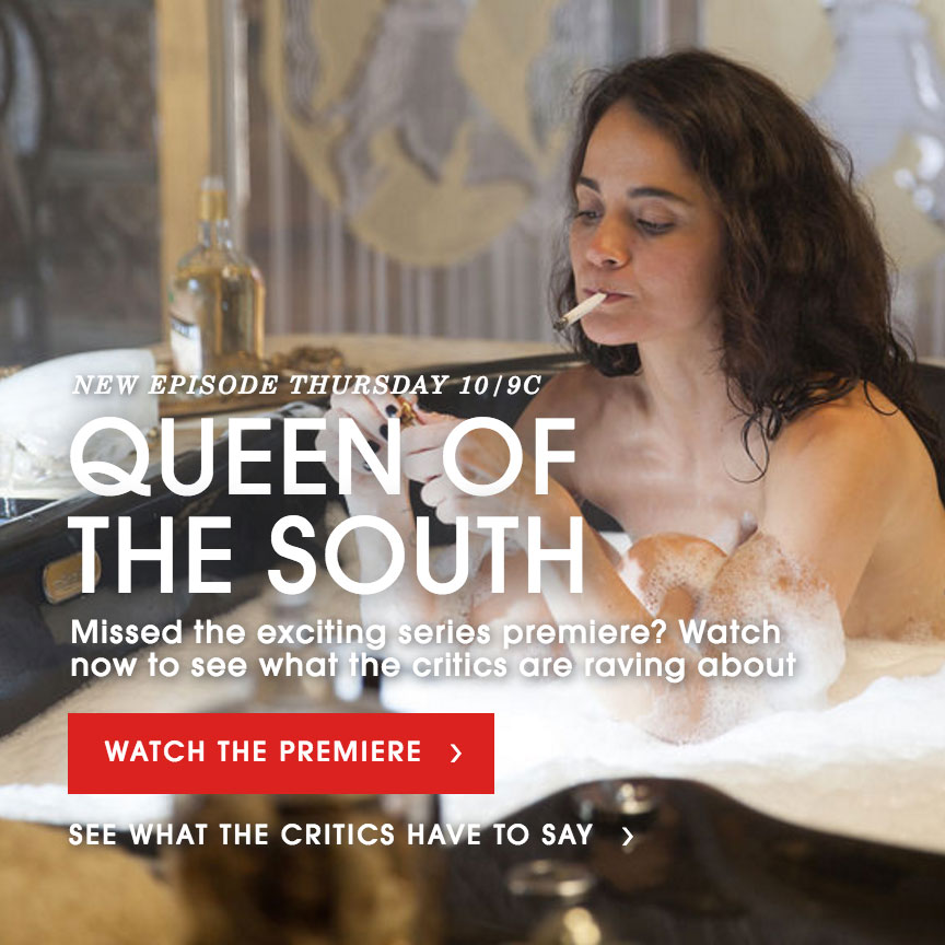
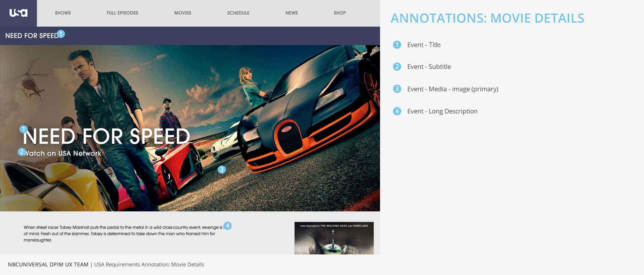
A-Spot Introduction
A-Spot Introduction
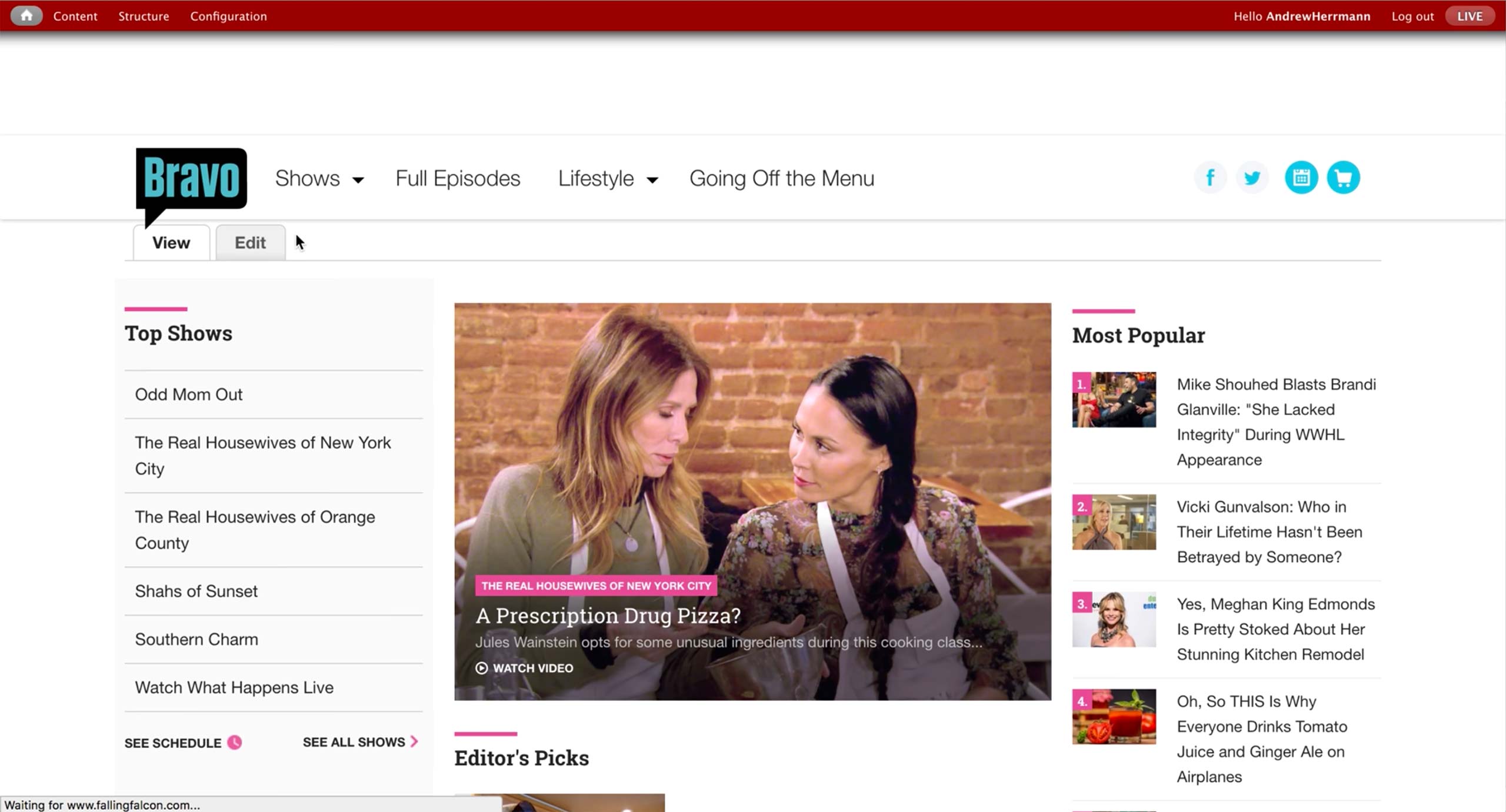
A-spot is the first and top-most spot on the web page that gets the most views from the visitors. There are call to action buttons with labels that invite the user to click and explore other pages on the site.
Producers create A-spots for the homepage and show’s landing pages. They set which elements to display as well as where on the image those elements will go.
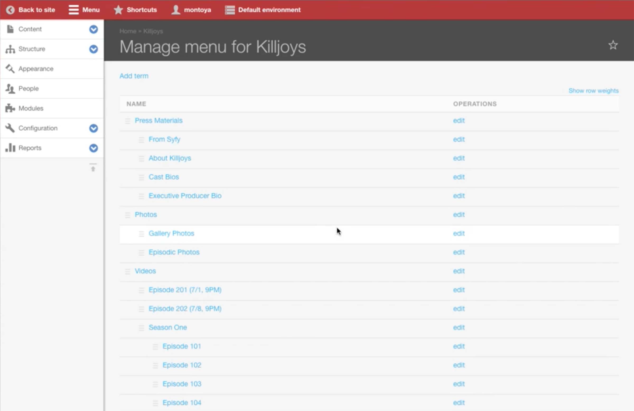
A-Spot Current Workflow
A-Spot Current
Workflow
Workflow
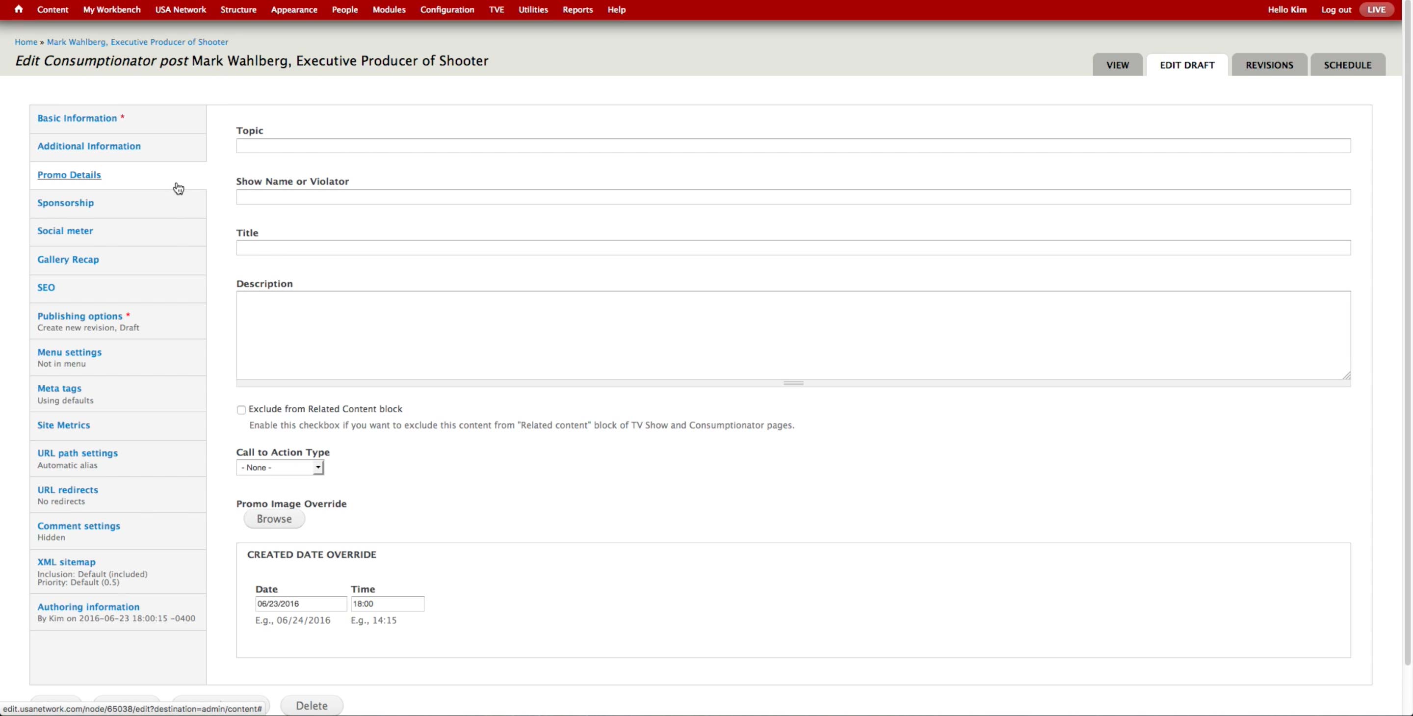
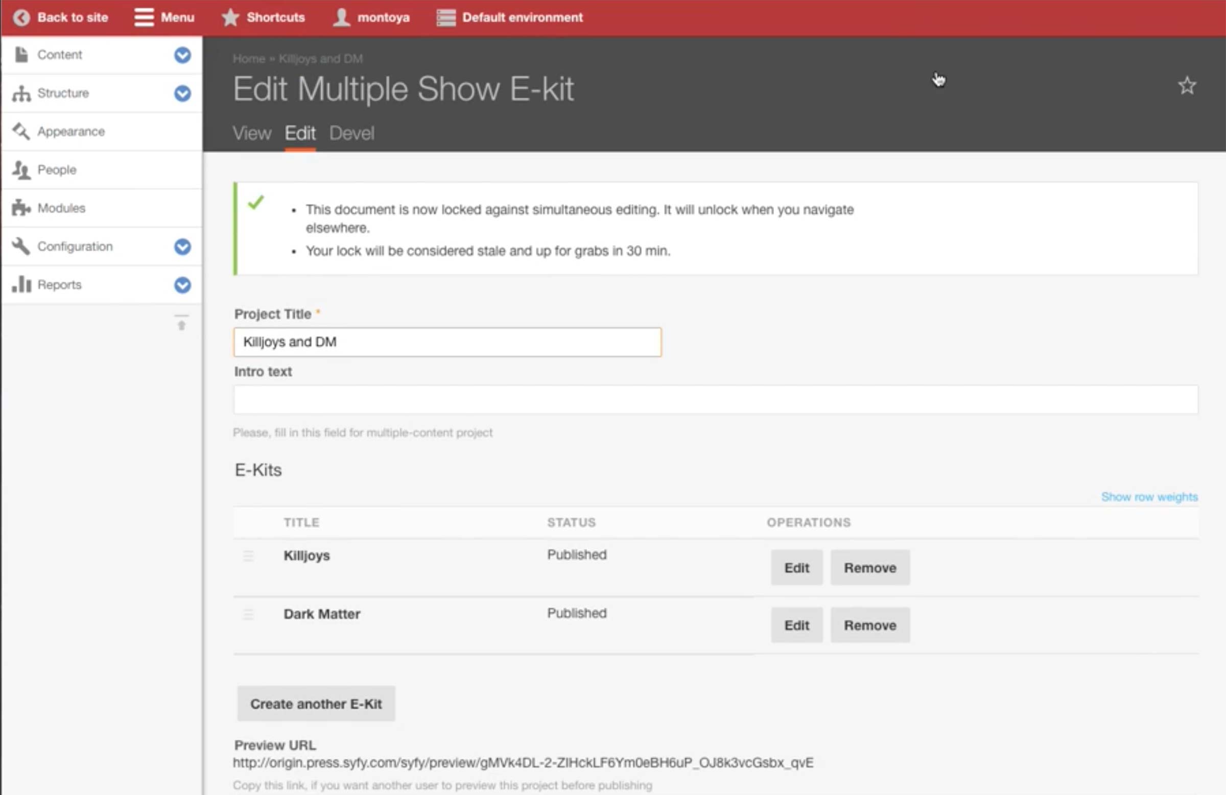
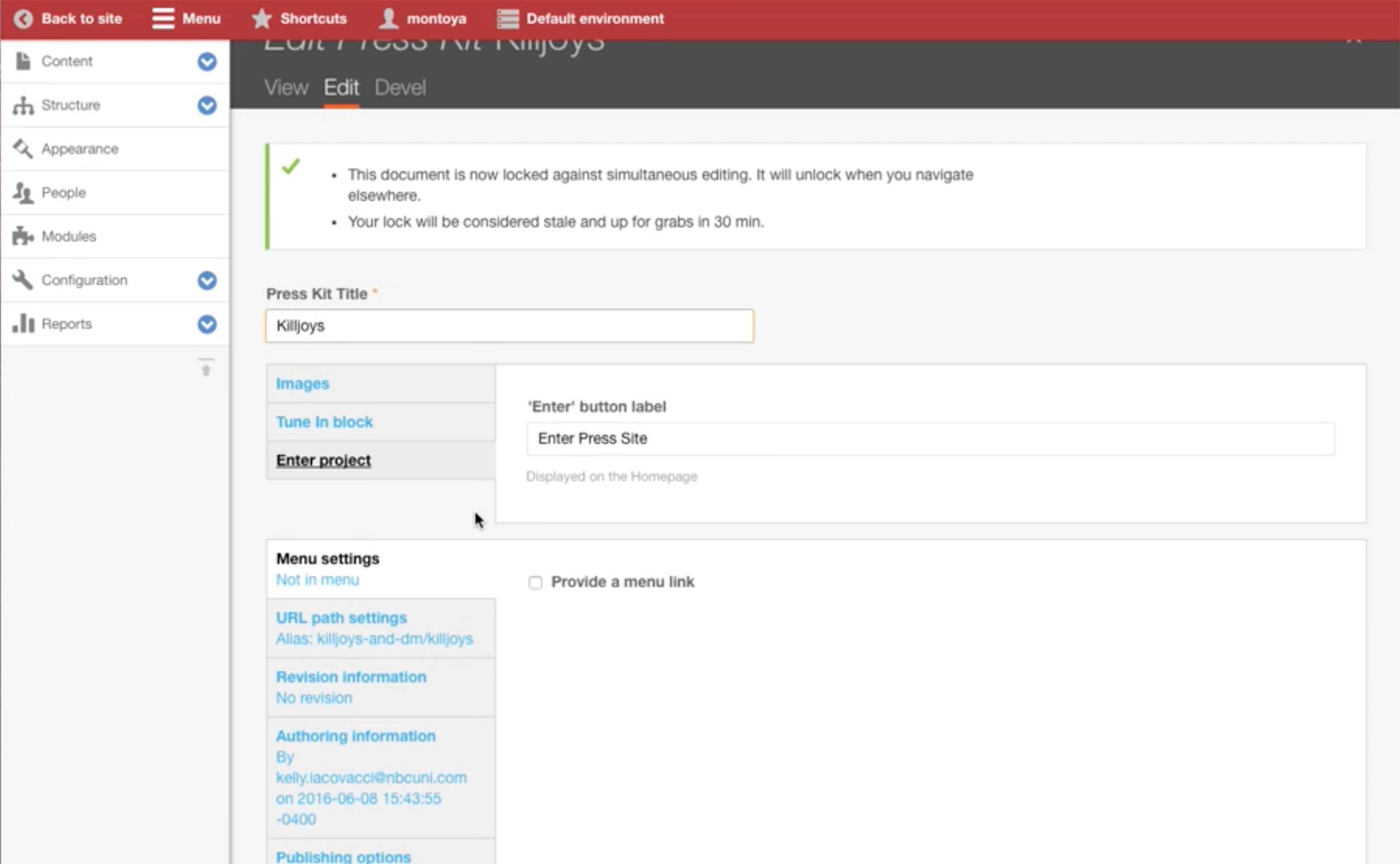
On each Content Type, there is a Promo Details tab to override title, description, and images of the Content when it goes into the Promo spots. However, all the A-spot contents are created manually.
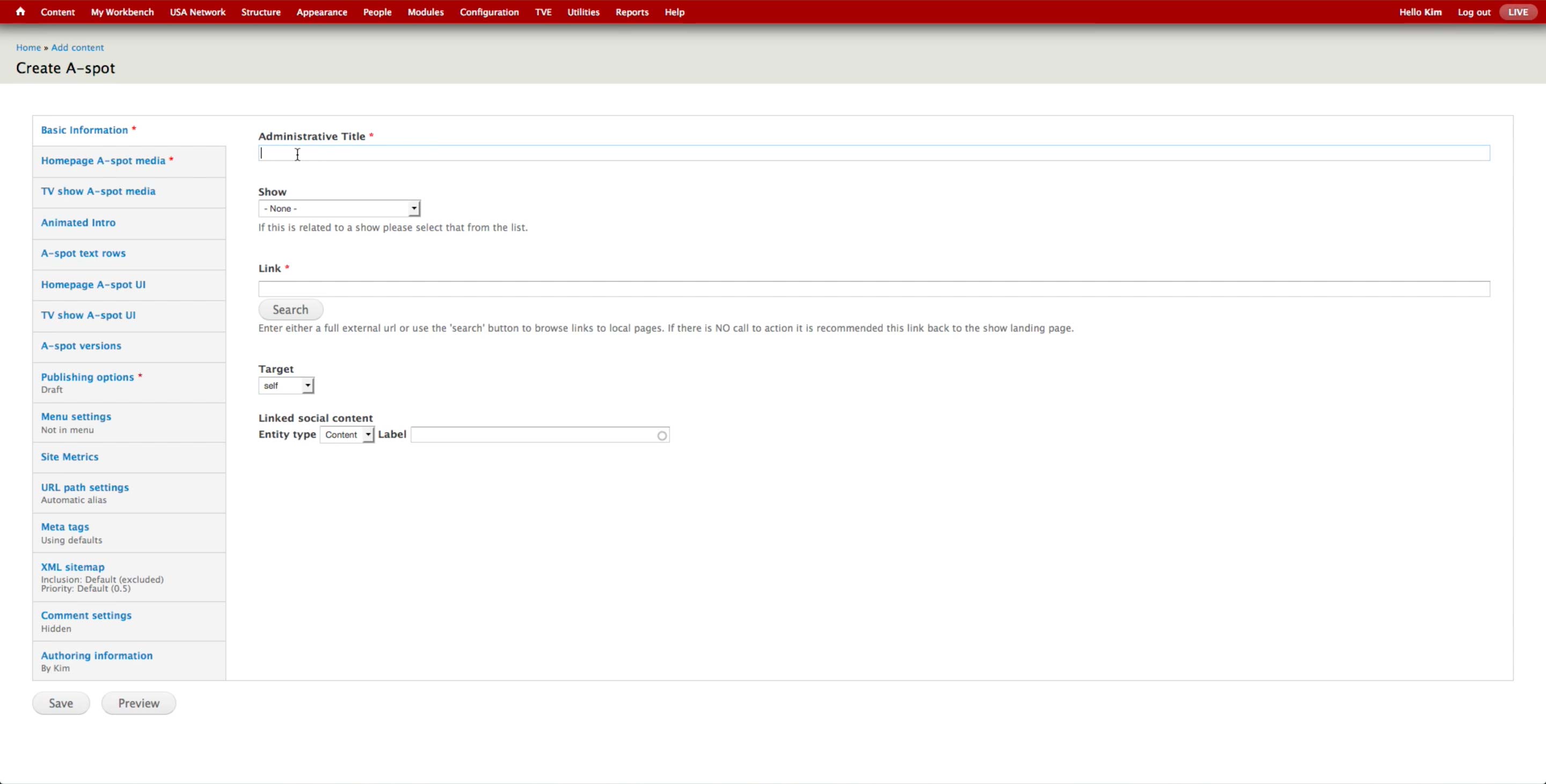
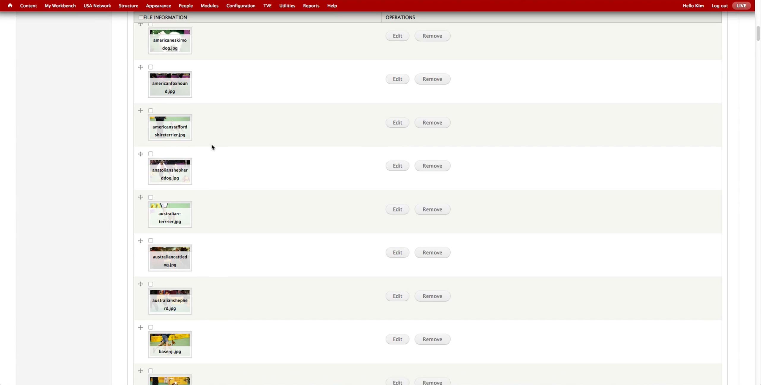
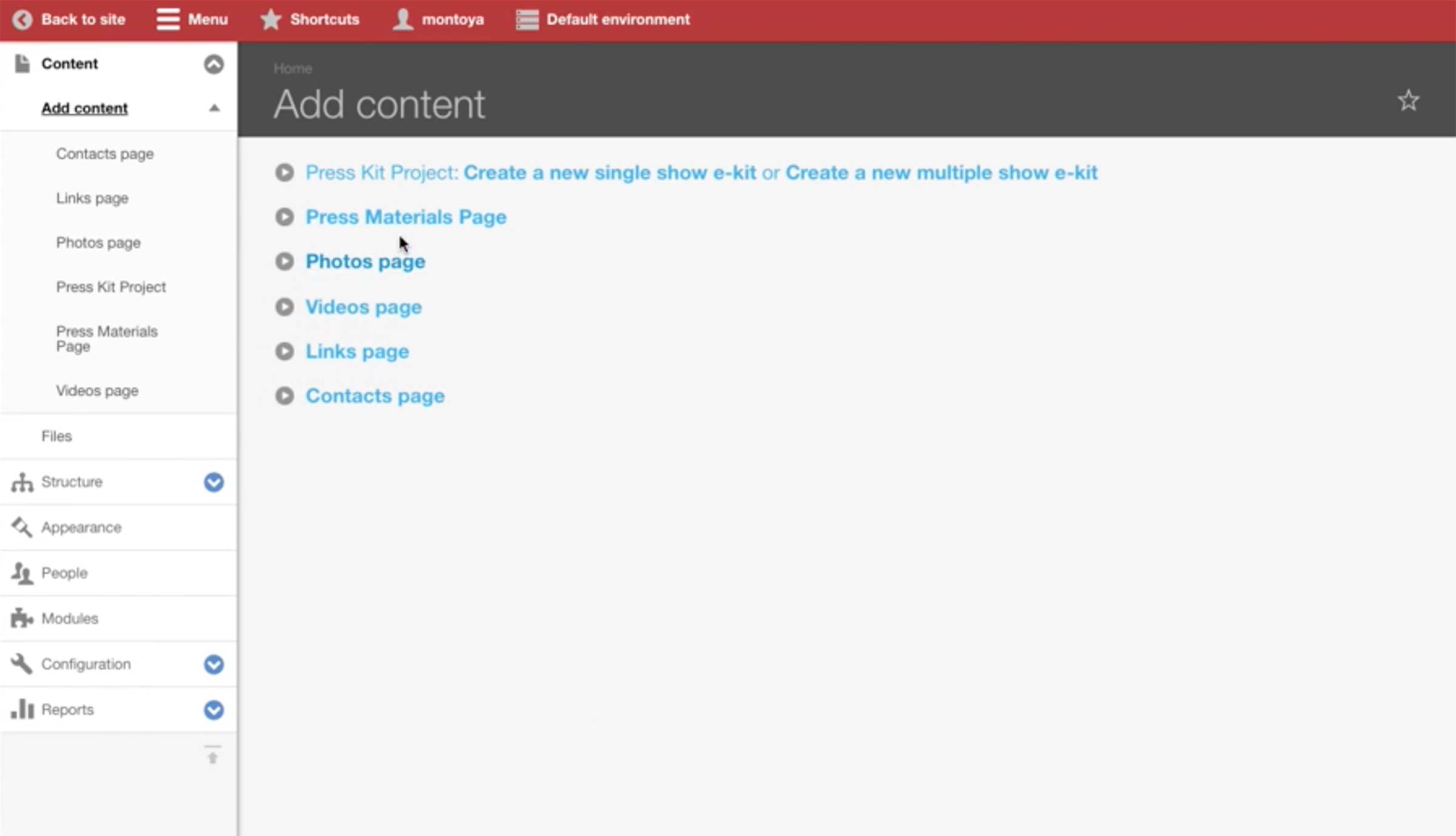
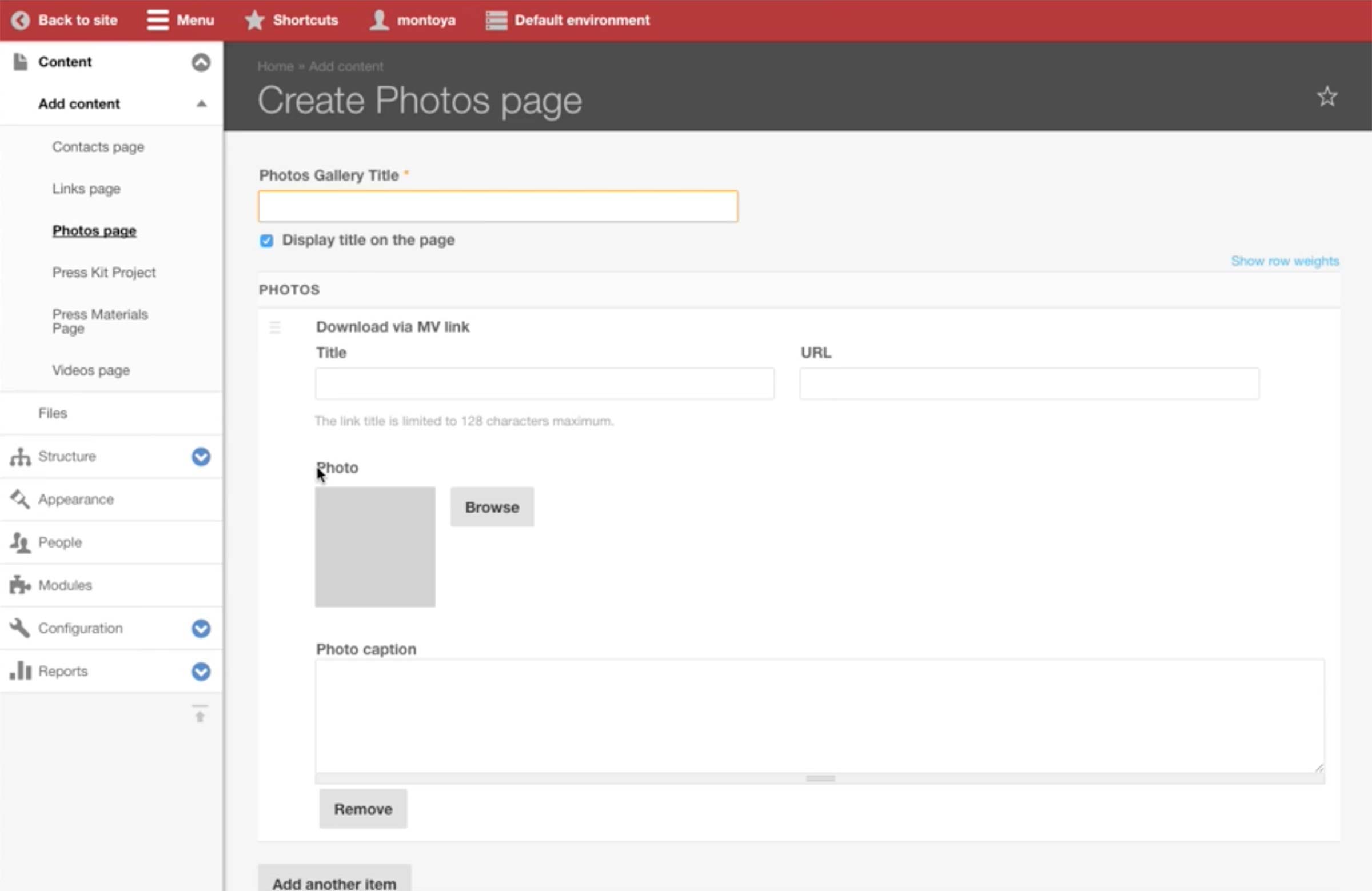
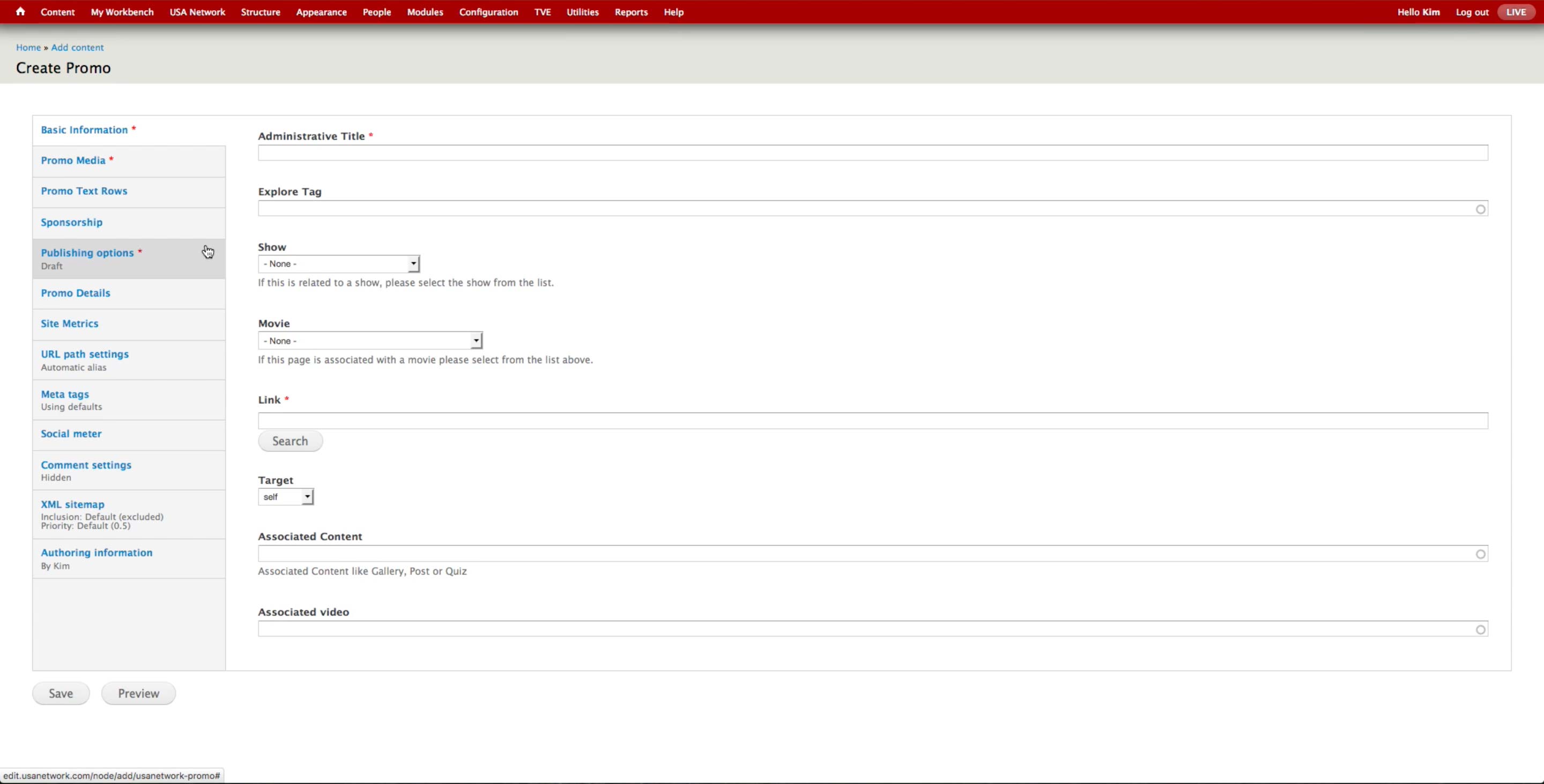
To create an A-spot unit, the producer selects Content > Add Content > A-spot.
- Administrative Title: Only for internal search purposes.
- Show: Association to a show, if any.
- Link: The overall image’s link, which applies to both Homepage and Landing page. Producer can enter the full URL or use Search button to browse the internal pages.
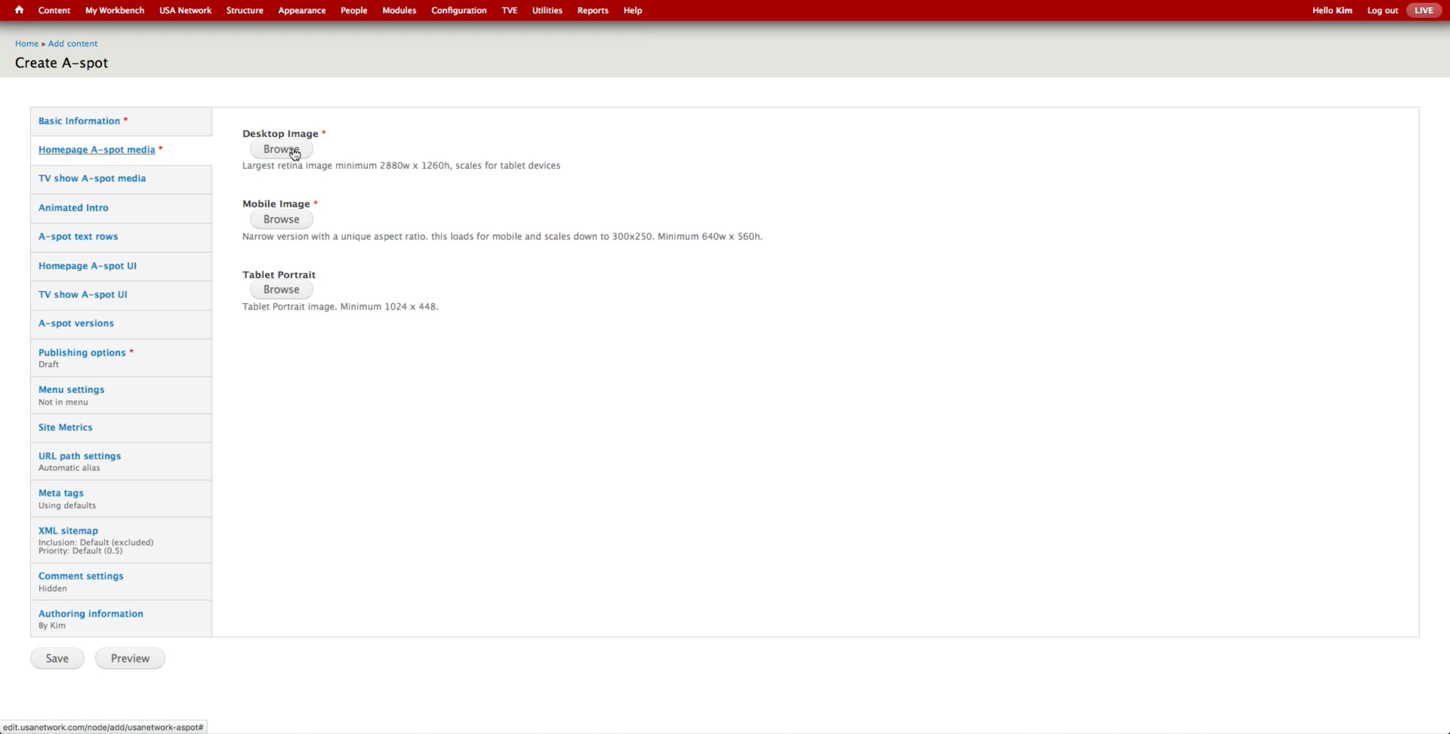
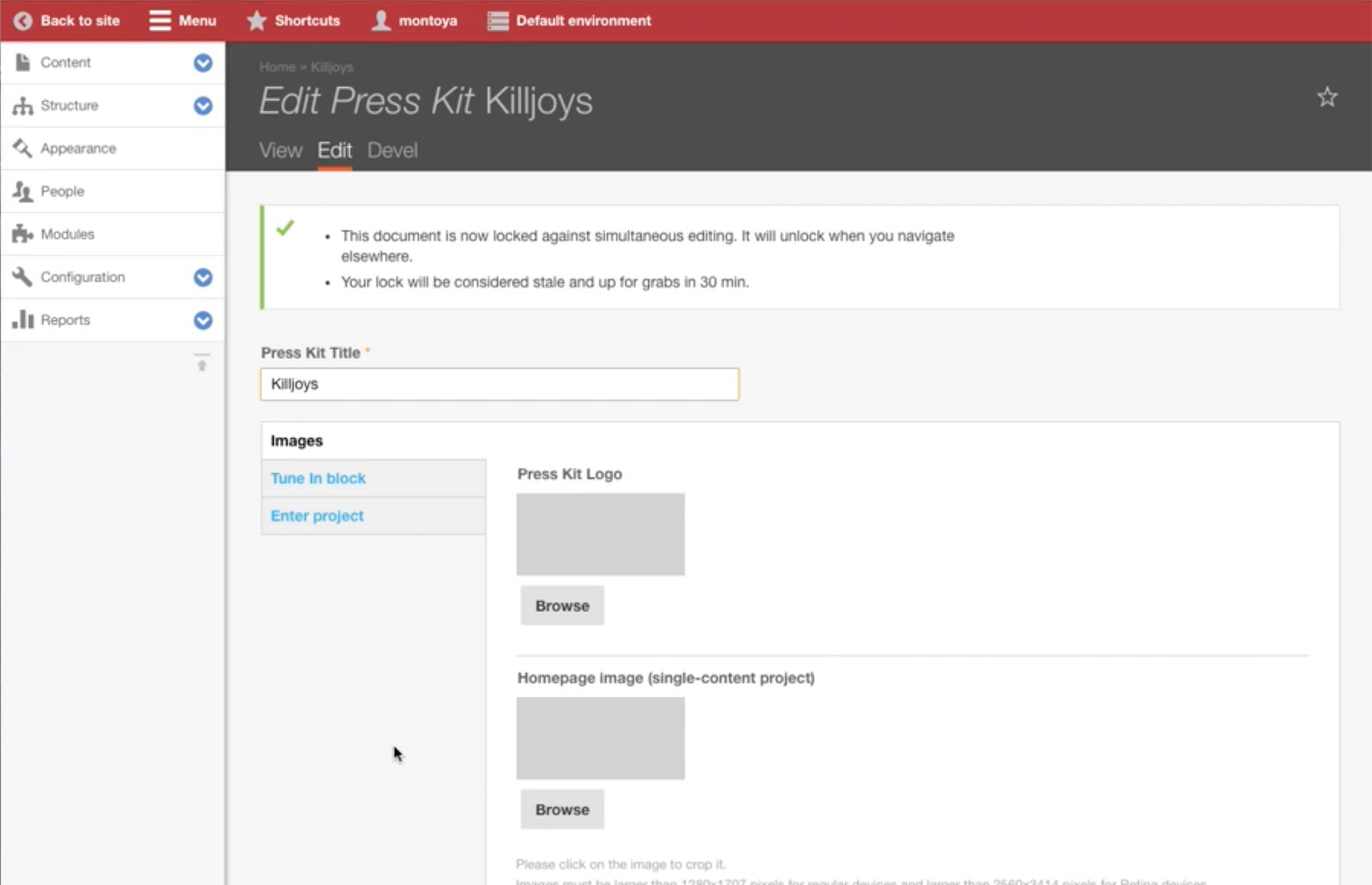
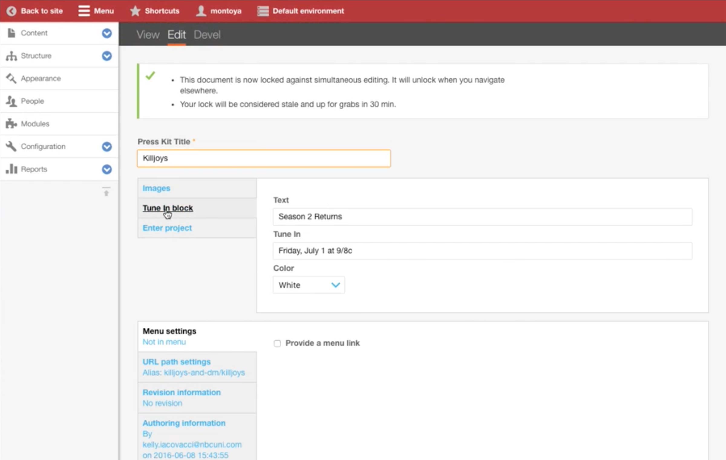
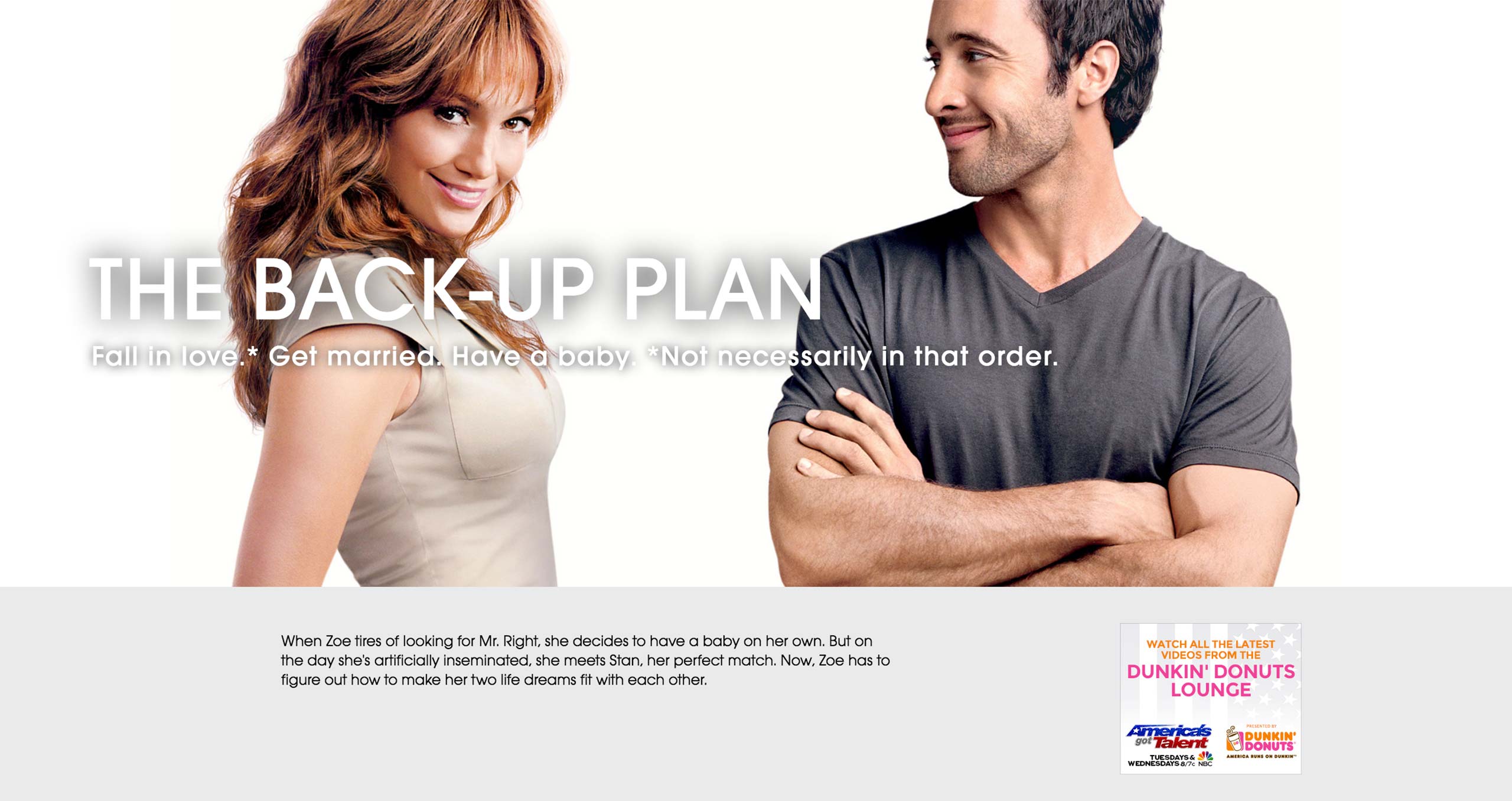
Homepage A-spot Media
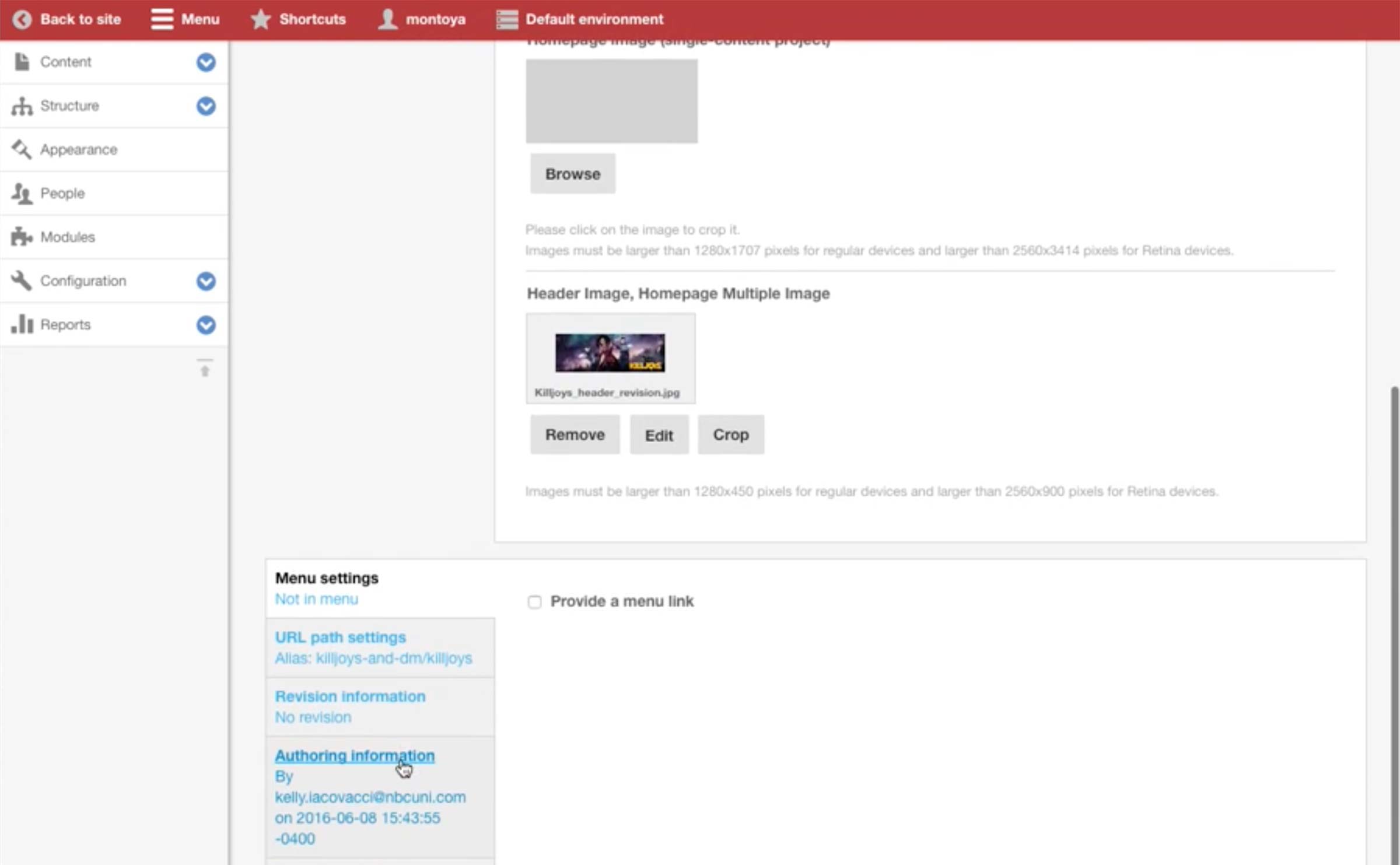
The design team provides the three images with different sizes for Homepage, Show Landing, and Mobile. Producer uploads the images to the corresponding fields.
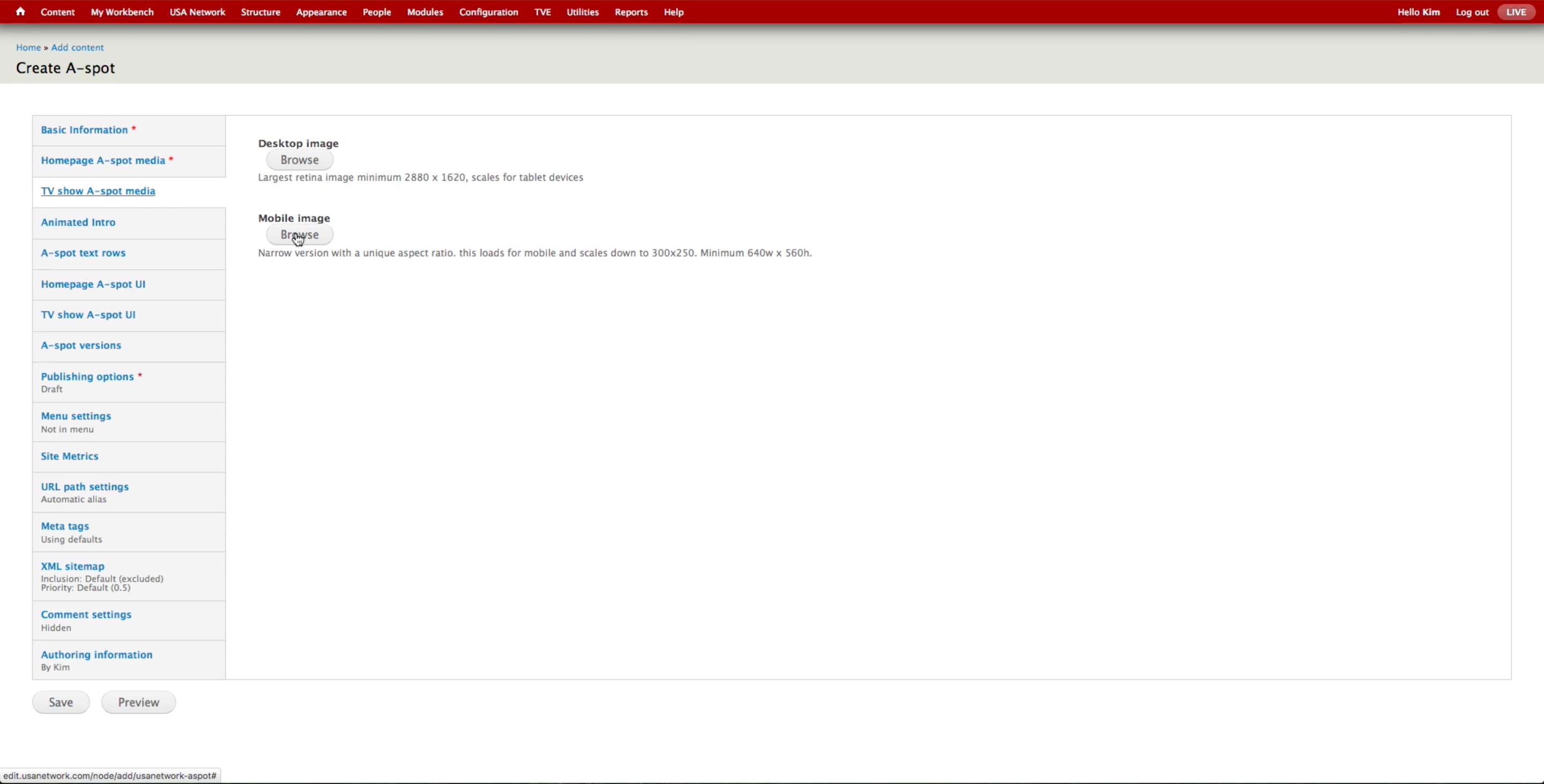
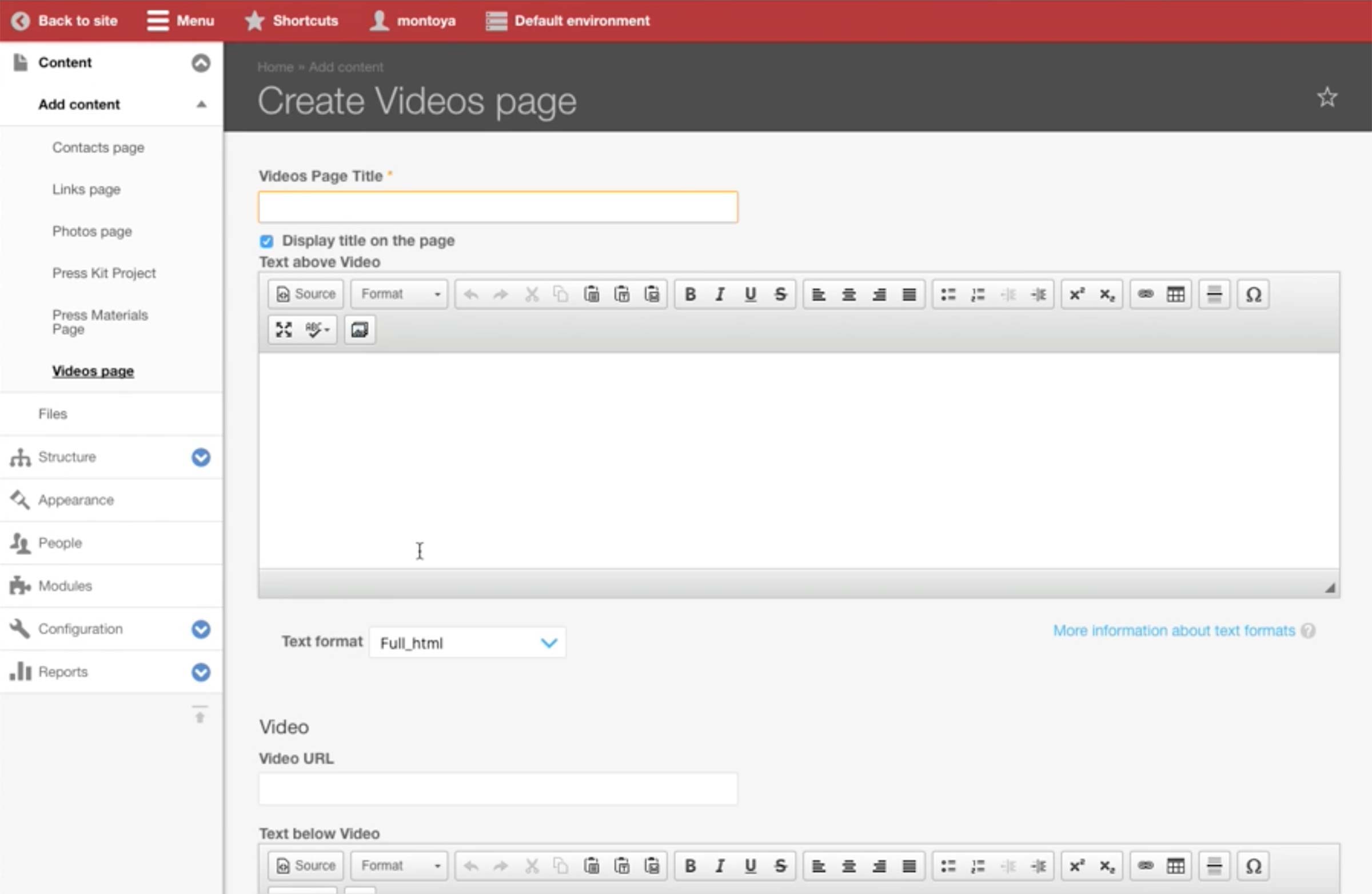
TV Show A-spot Media
The design team provides the three images with different sizes for Homepage, Show Landing, and Mobile. Producer uploads the images to the corresponding fields.
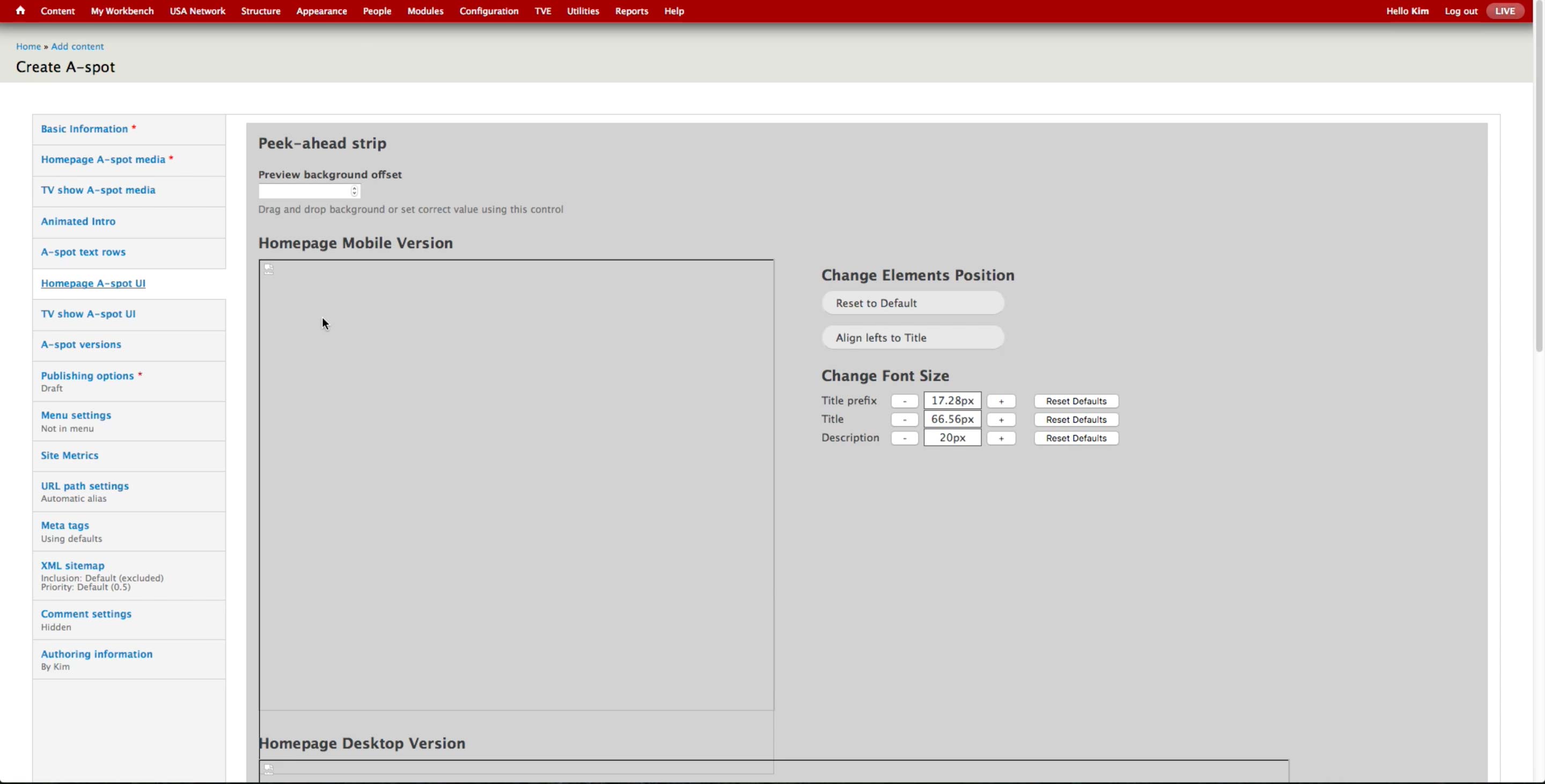
There is an UI to control the front-end appearance of the peek-ahead strip.
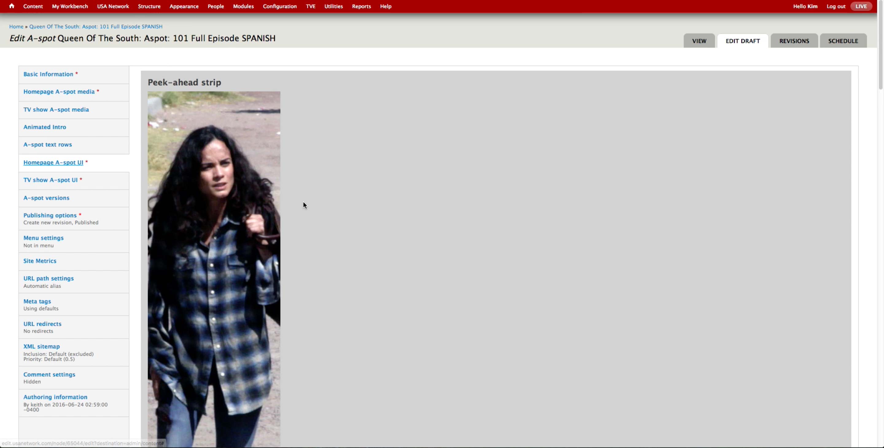
Once the image is uploaded, producer can drag around the preview to set which part of the photo will be used as the peak-ahead. Alternately, they can use the Preview background offset field that appears below the preview and enter the number for the offset.
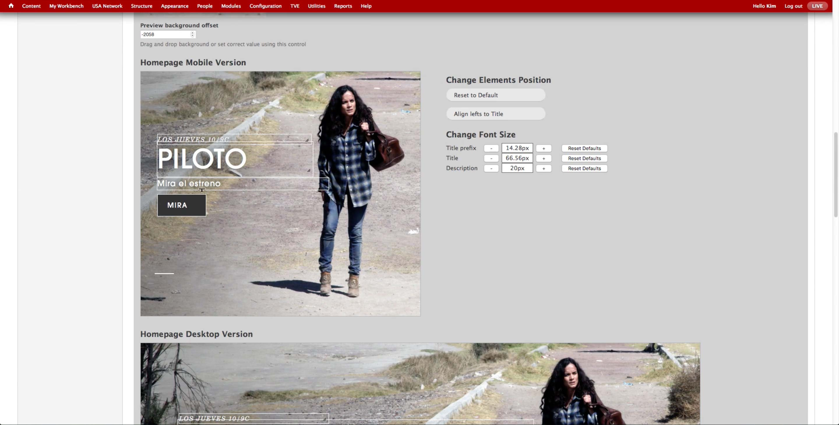
For each of the uploaded images, producer can visually control the placement and size of the text and call-to-action button on the A-spot.
If the default setting isn’t used due to the long text elements, designers would go back in the CMS to check if the elements are visually pleasing.

At the bottom of the image previews, producer can select/deselect the items to appear on the A-spot.

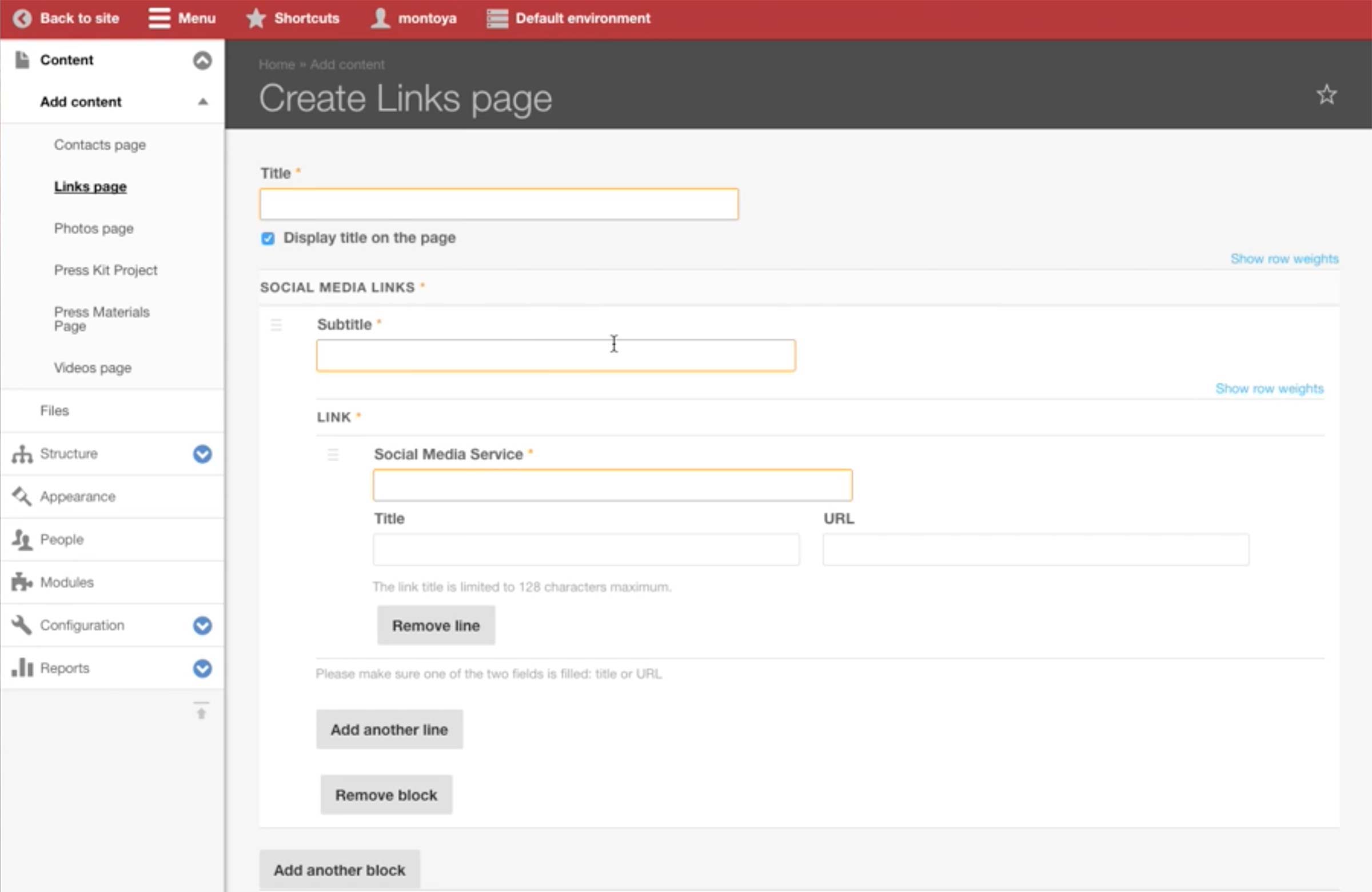
Below, there are text areas for each item to enter the text that will appear on the A-spot. Producer may add additional call-to-action buttons, up to 3. They usually create up to 2, as the front-end UI doesn’t look good with 3.
The label can be as long as 128 characters, and URL is either the URL after the base URL or external. Even if the content is not published, the A-Spots are created beforehand as the URLs are predictable. However, it doesn’t prevent the producer from making typo and publish the A-spot with a broken link.
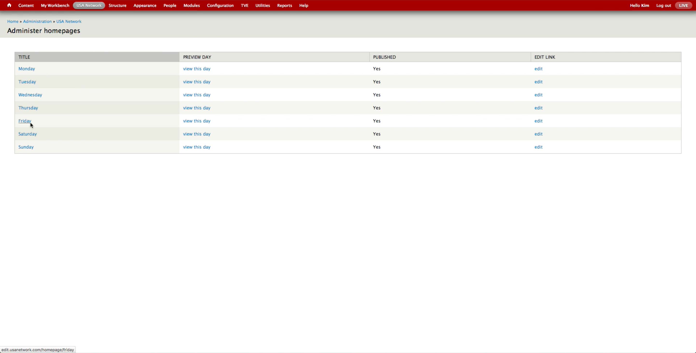
Once all the A-spots are created, the producer goes to USA Network > Administer USA Homepage and hit edit button of the corresponding day.
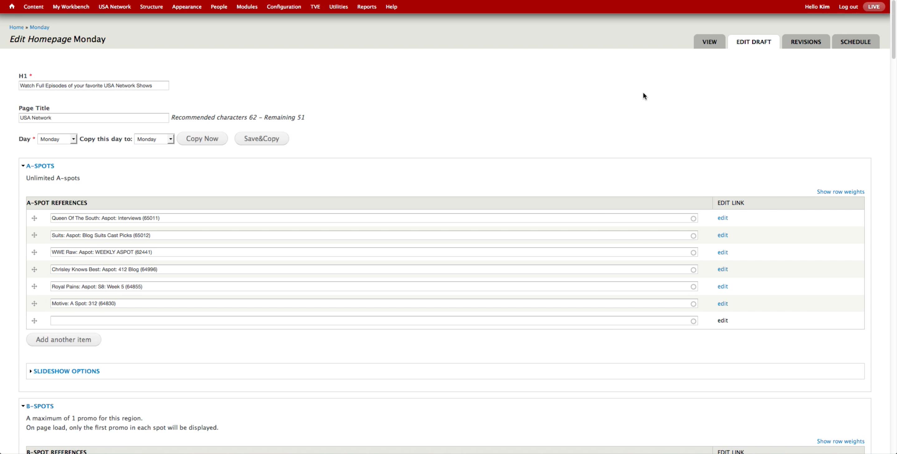
In the A-spot References field, producer can search with the administrative title of the A-spot. They use a set format ([SHOW NAME]: Aspot: [TITLE OF THE A-SPOT]) to name the A-spots so they are easy to retrieve.
When promoting content on other spots, producer can create a Promo content. Currently, they are trying to use the Promo fields attached to each of the content and reduce the number of Promo content types as much as possible. They are currently using Promo for animated GIFs or external links.
After you publish the Promo content type, it automatically appears in the Latest Content block. In order to prevent that, producer has to check the Exclude from Related Content block option.
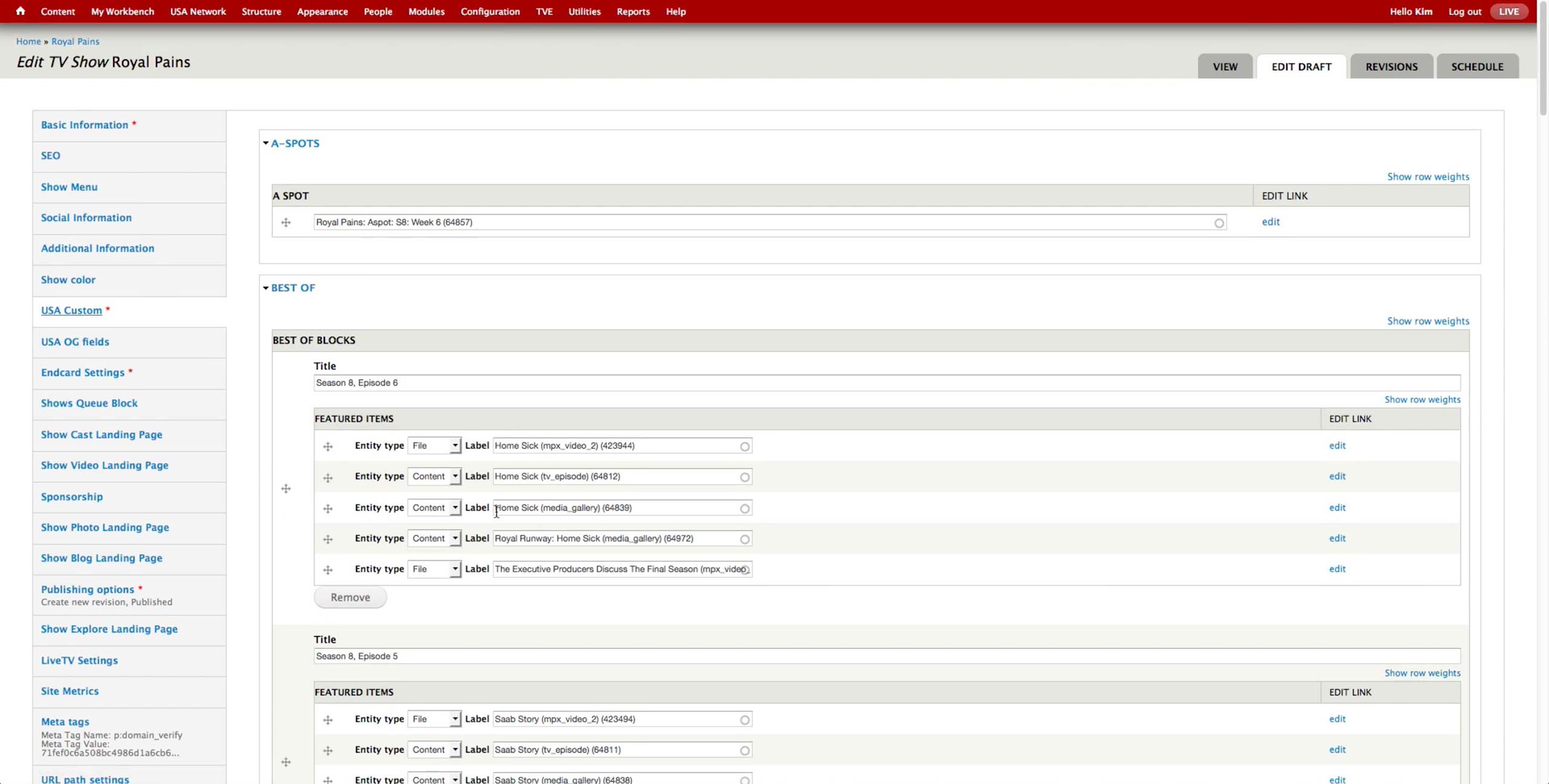
Once all the content’s promo fields are filled and Promo content is created, producer goes to the corresponding show content and goes to USA Custom tab, where all the shelves for promoted content lives.
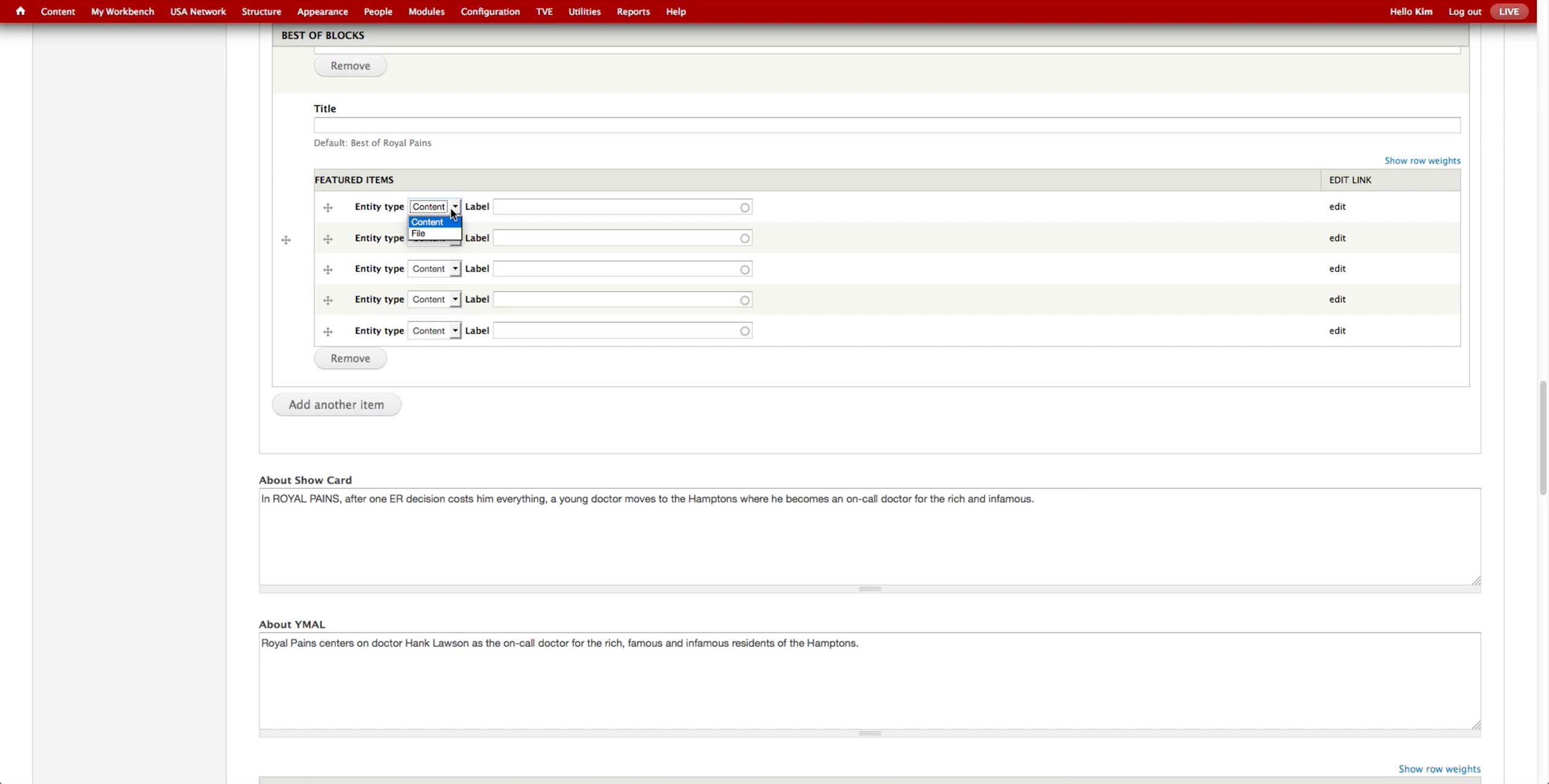
Then, she selects the entity type (Content or File) and can search for the items to promote using their Administrative Title. If the promoted video expires, it automatically comes out of the page.
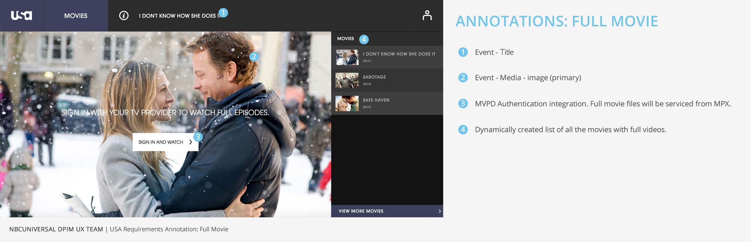
There are 2 types of video files: mpx_video_1 and mpx_video_2. The former is the USA Network MPX account with short form videos that are on the website, and the latter the TVE account, which holds all the long-form videos and any short-forms that are available in the OTT apps.
A-Spot New Workflow
A-Spot New
Workflow
Workflow
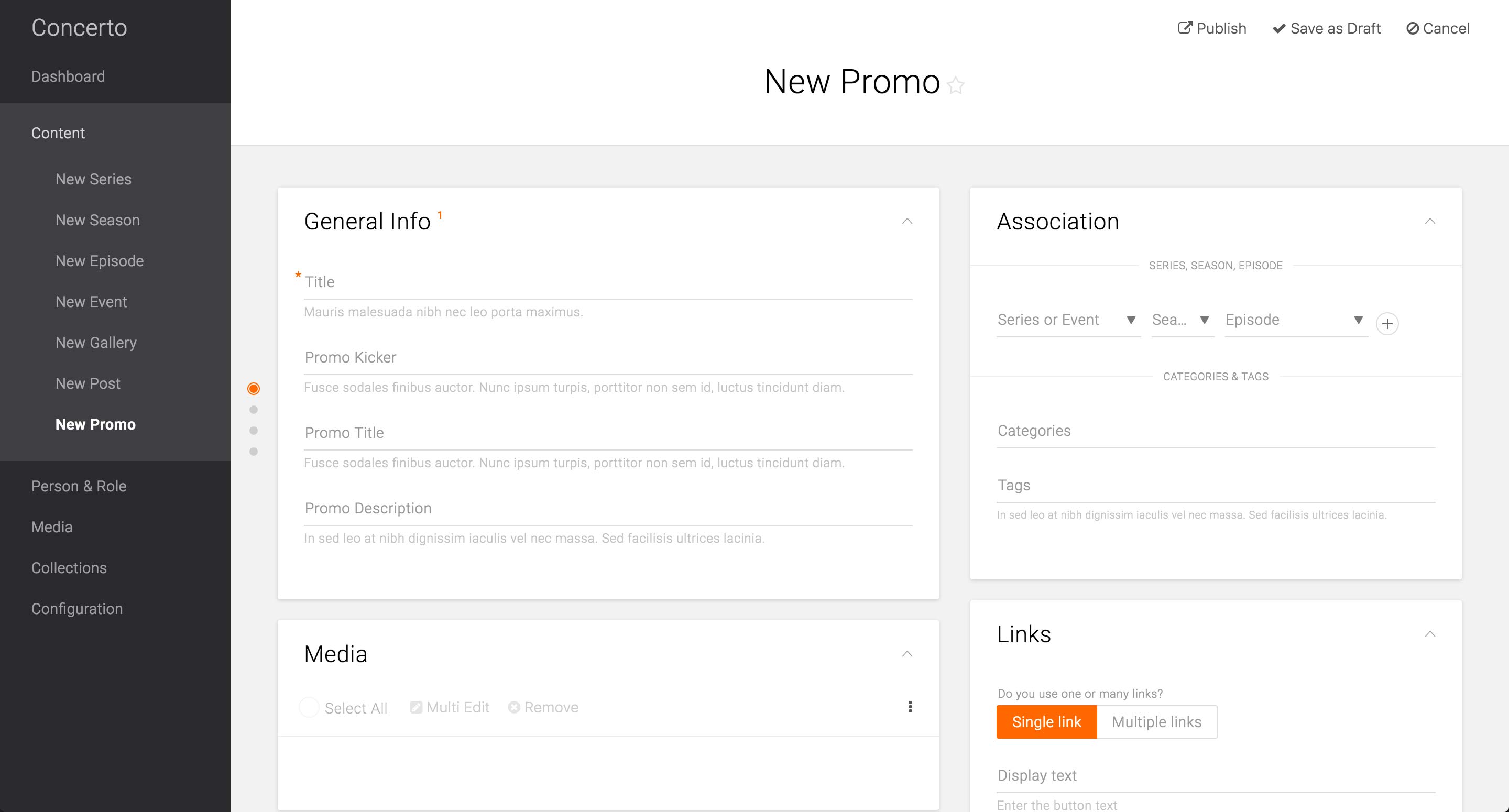
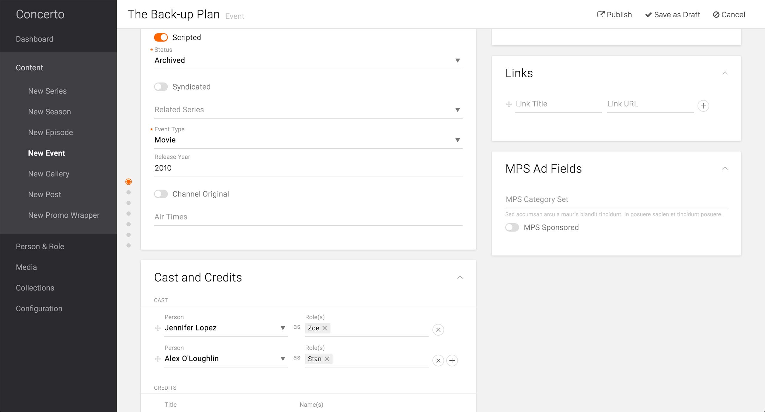
We designed and developed a prototype for Promo content type and user-tested it with producers from each brands, including USA.
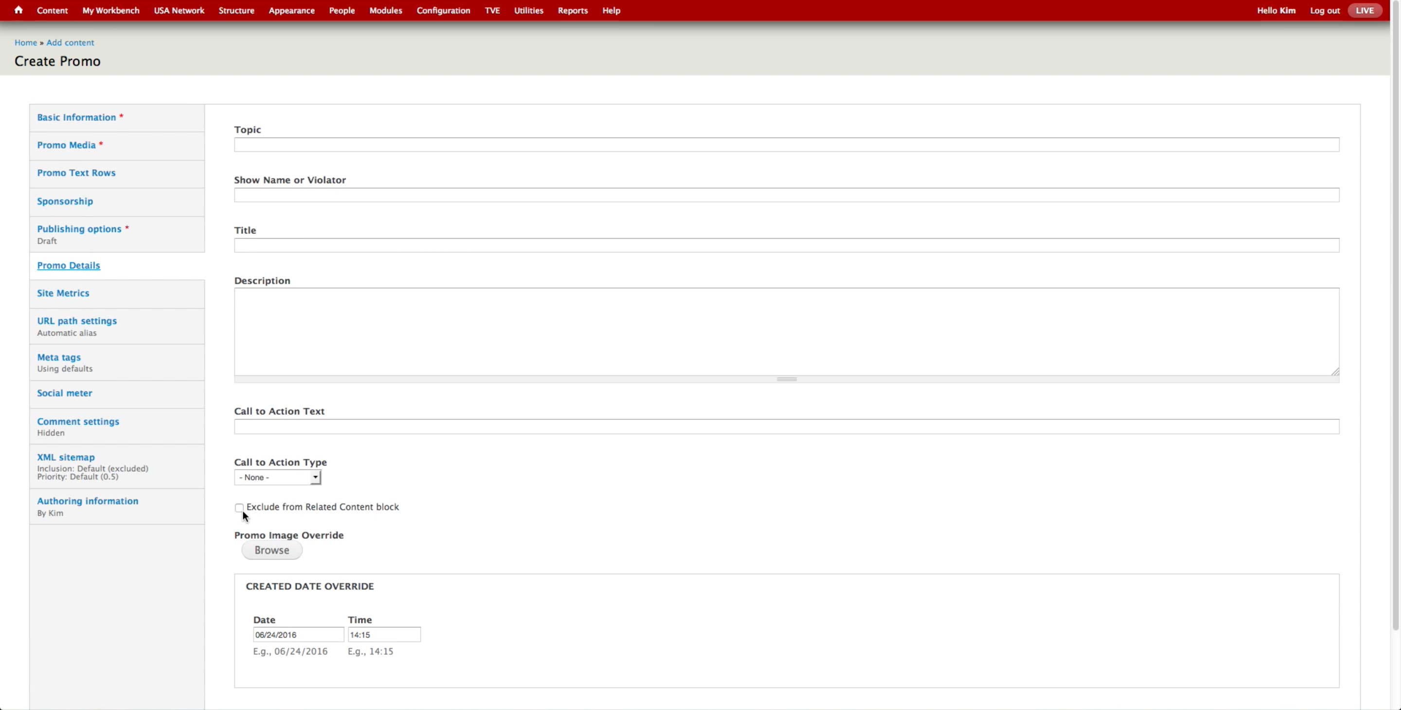
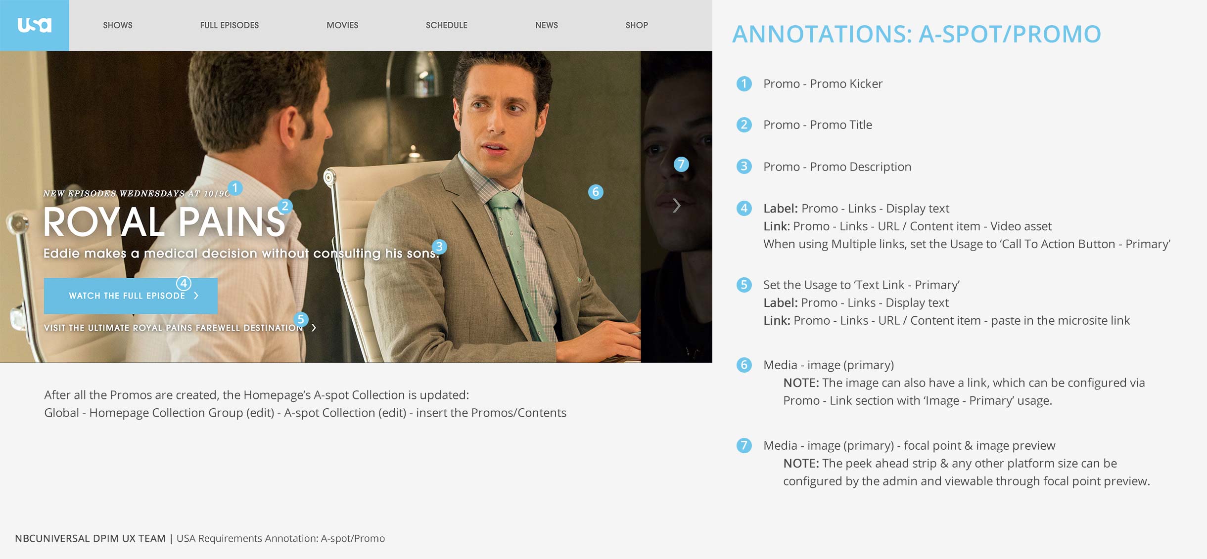
In addition to the required Title field, Association card, and Media card that are common across the Content Types, Promo Content Type has a Kicker field, which is often displayed above the title of the promoted content.
It also features a separate Promo Title field, which would be the consumer-facing title. The required Title field would be only used for the internal searching purposes.

Promo Wrapper page when all the basic information is filled.
The Title field is informative of what this Promo is for, while the Promo Title holds the text that would be displayed on the Promo unit on the front-end.
Since this is promoting a specific Episode of Royal Pains, the producer may choose to identify the Channel Reference, even though it is not required. This helps indexing and categorizing the content and makes it easier to search for in the library.
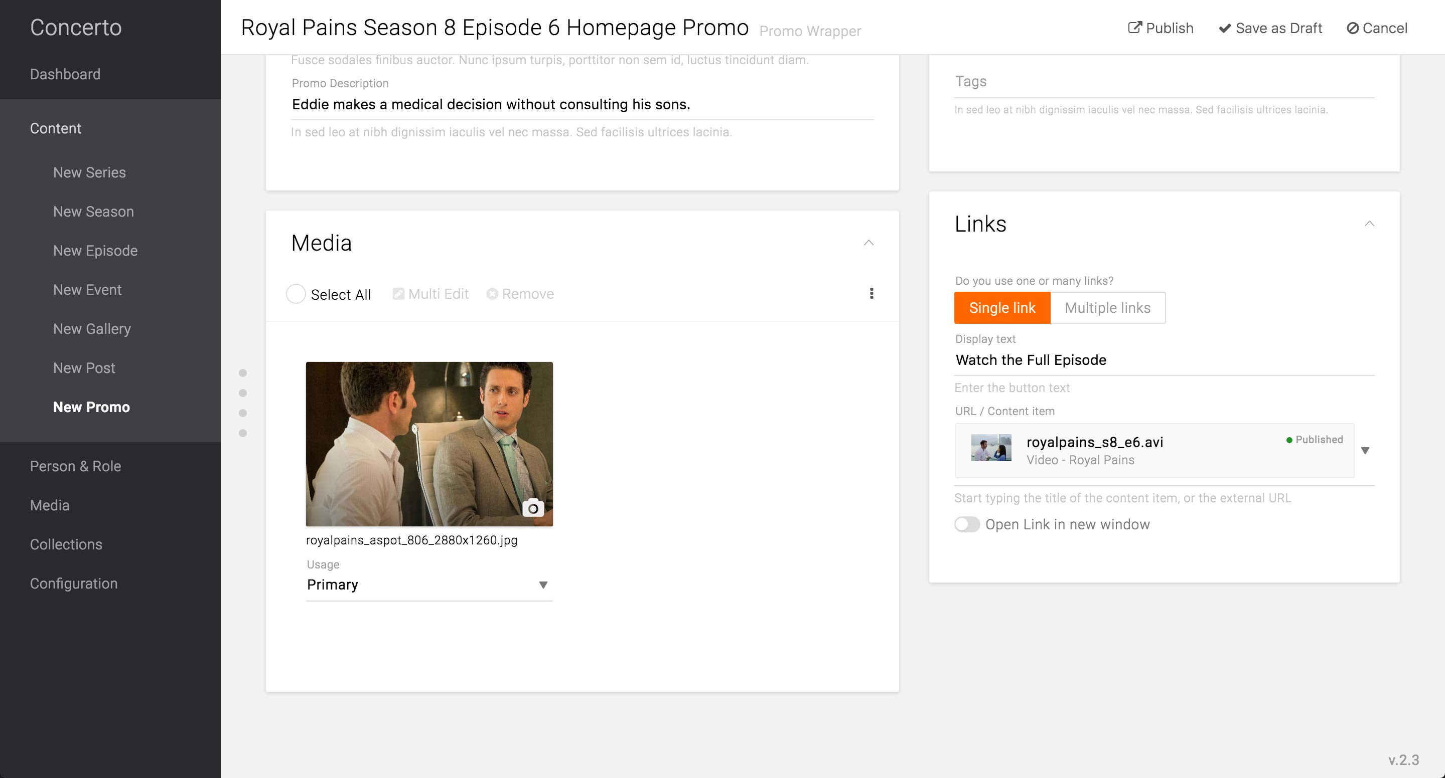
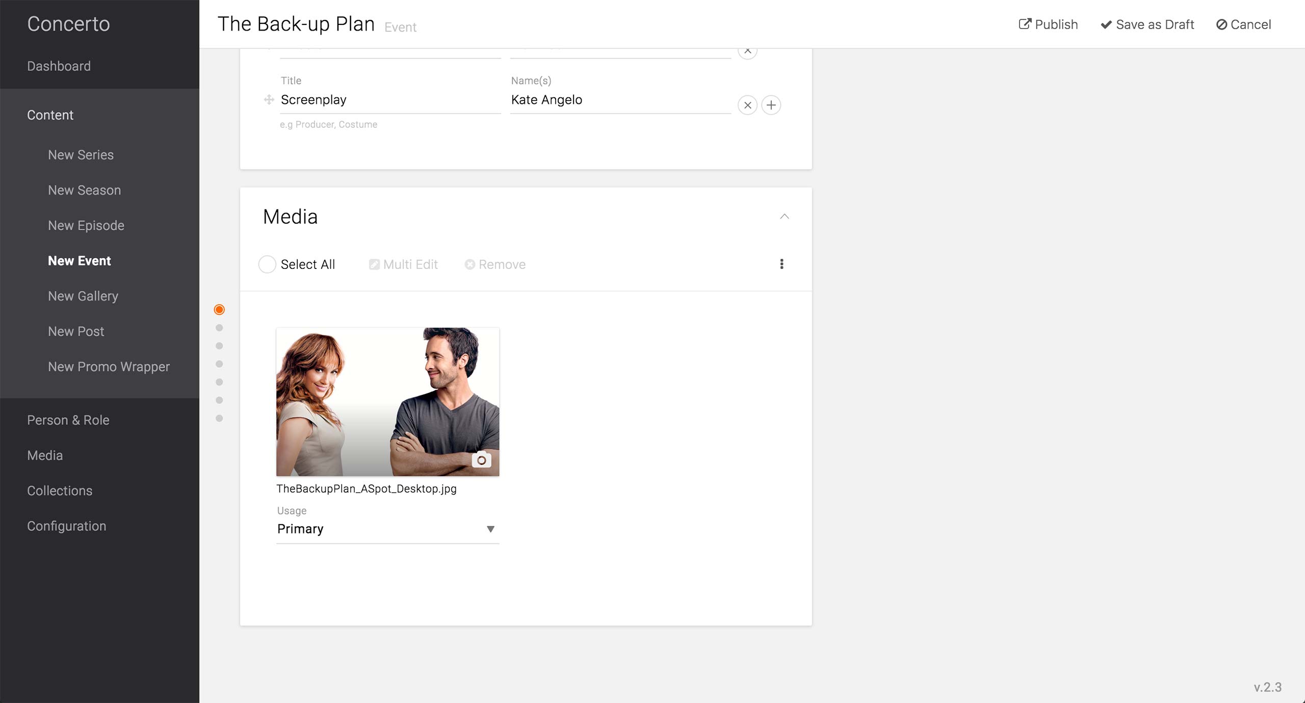
The image to display for the Promo Content type would be a Primary image, as it is the main and only image of the Promo Wrapper Content Type.
In the case the Promo only holds a single call-to-action button, producer can choose Single link option and enter the appropriate label for the button. In the URL / Content item field, she can either choose from the existing content type or enter a URL for the button to link to. There is also an option to select to open the link in new window.
The selected content type will display the published state in order to avoid mistakes of publishing the Promo Wrapper with unavailable content types.
Feature Enhancement:
Each brand should be able to configure the options in image usages. Currently, the tech leads have the ability to expose or hide options via Structure menu.

The focal point on different platform sizes and the see-ahead strip can be configured in the Edit screen of the primary image. After setting the focal point on where she wants it, the producer can preview all the different image styles that specific image generates. A-spot strip and Mobile size A-spot are featured in this example.
Feature Enhancement:
In order to be an effective preview, all the A-spot previews should have text overlay.

By selecting Multiple links option, producer can add multiple links to the Promo. When there are multiple links, each link should be assigned with one of the usages: call to action button, text link, or image link.
In this example, she adds another link to be a text link, which will appear as a hyperlinked text below the call to action on the front-end. This text is linked to the microsite URL, and the option to open it in the new window is selected.
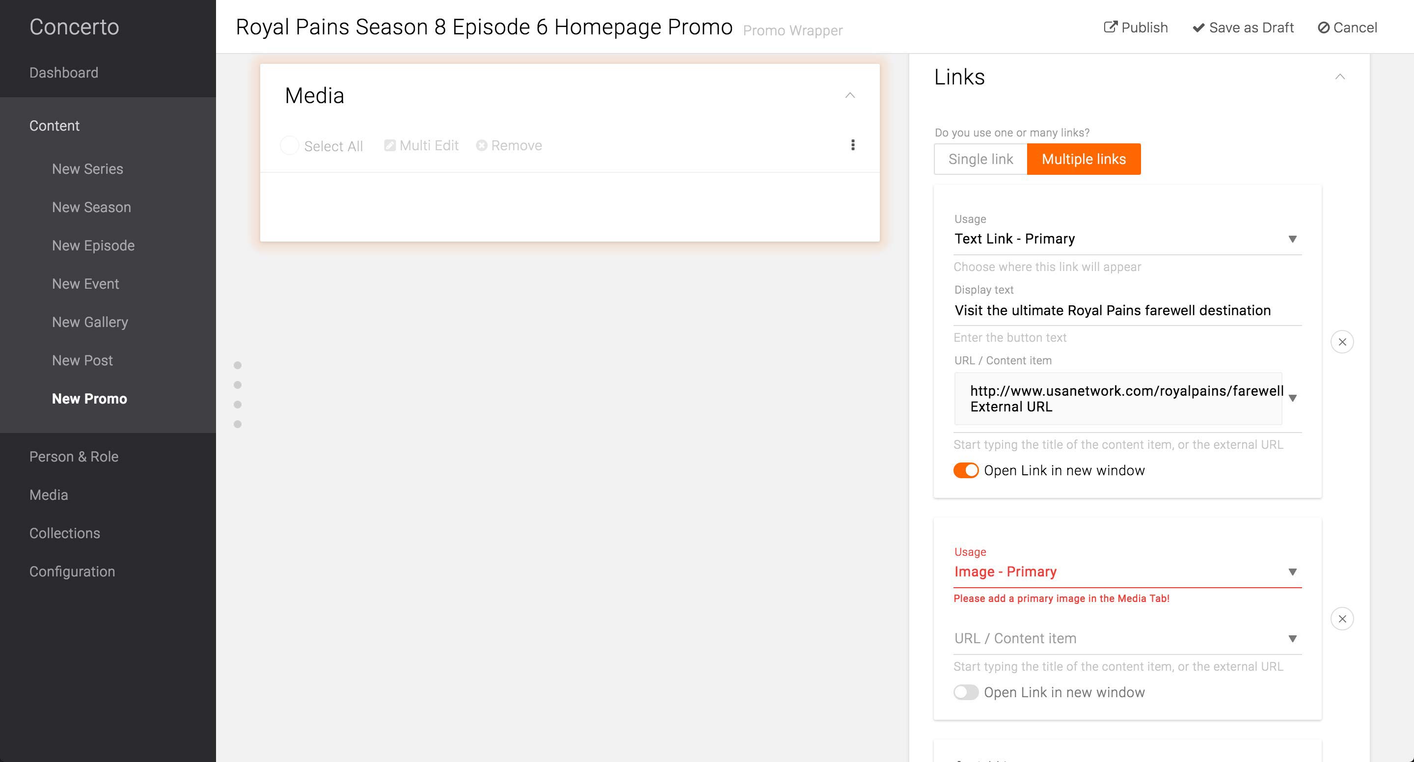
When the Image Link option is selected without the corresponding Primary image set in the Media card, the field will give an error message and the Media card will pulsate to indicate that the producer needs to take an action there.
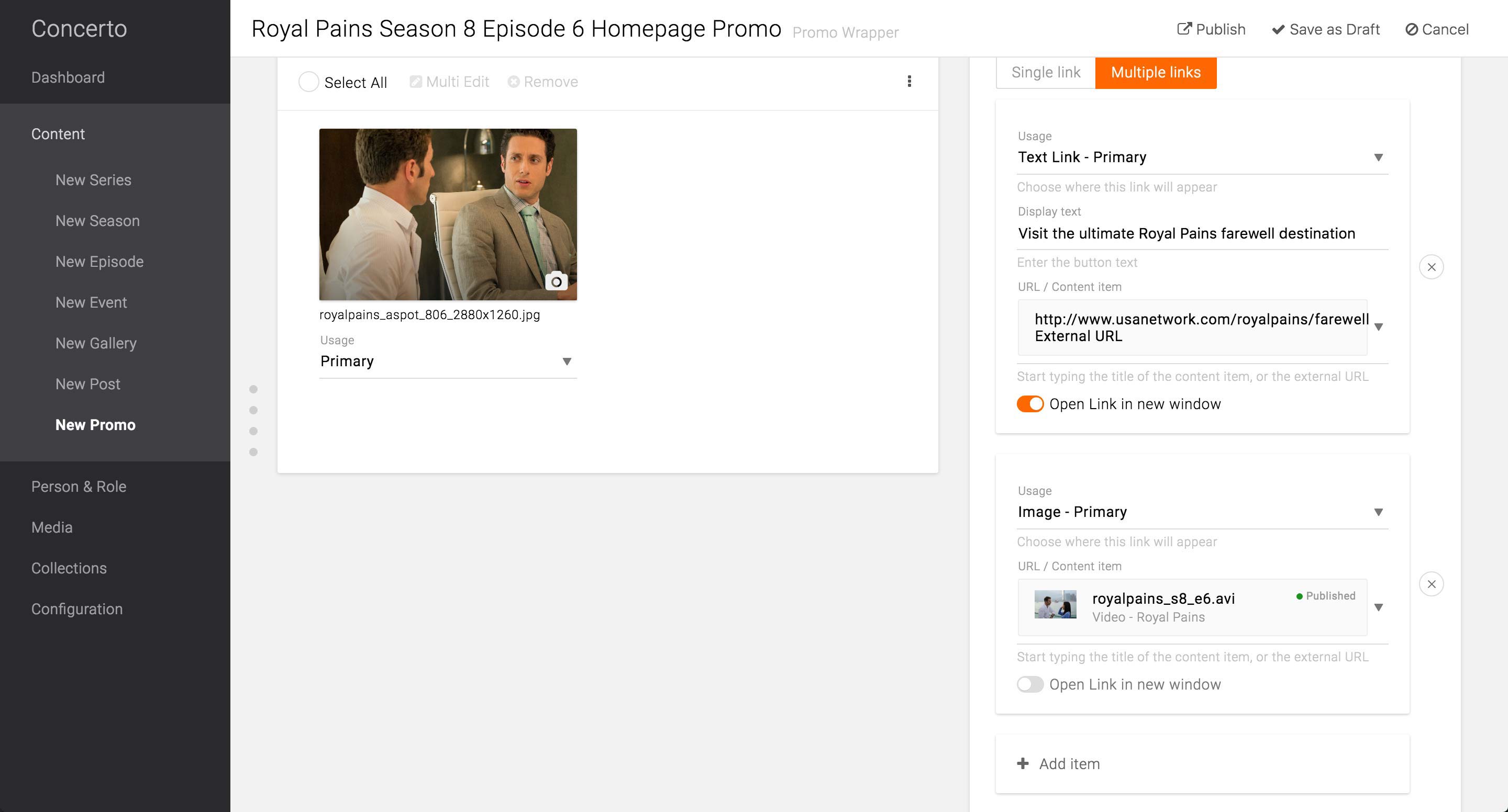
After the Primary image is selected, she can enter the rest of the information.
Feature Enhancement:
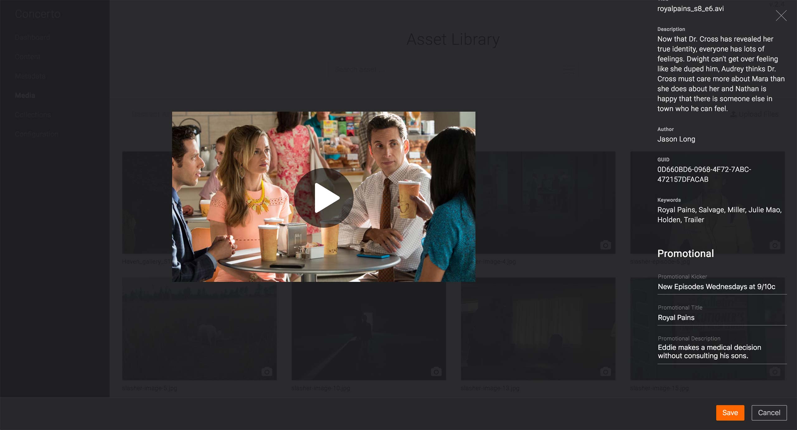
In order for the Content selection to be smooth, there needs to be more information regarding the searched Content. The issue is discussed in detail on page 11.
As an alternative to the Promo Wrapper, the producer may use the Promotional fields available in each Content Type or Video Metadata to set the Promotional information.
This applies only in the case where 1. The link goes to a Content’s or a Video’s page AND 2. There is only 1 call-to-action needed. If the A-spot unit needs to 1. Link out to an External page OR 2. have more than 2 call-to-action, Promo Wrapper should be used.
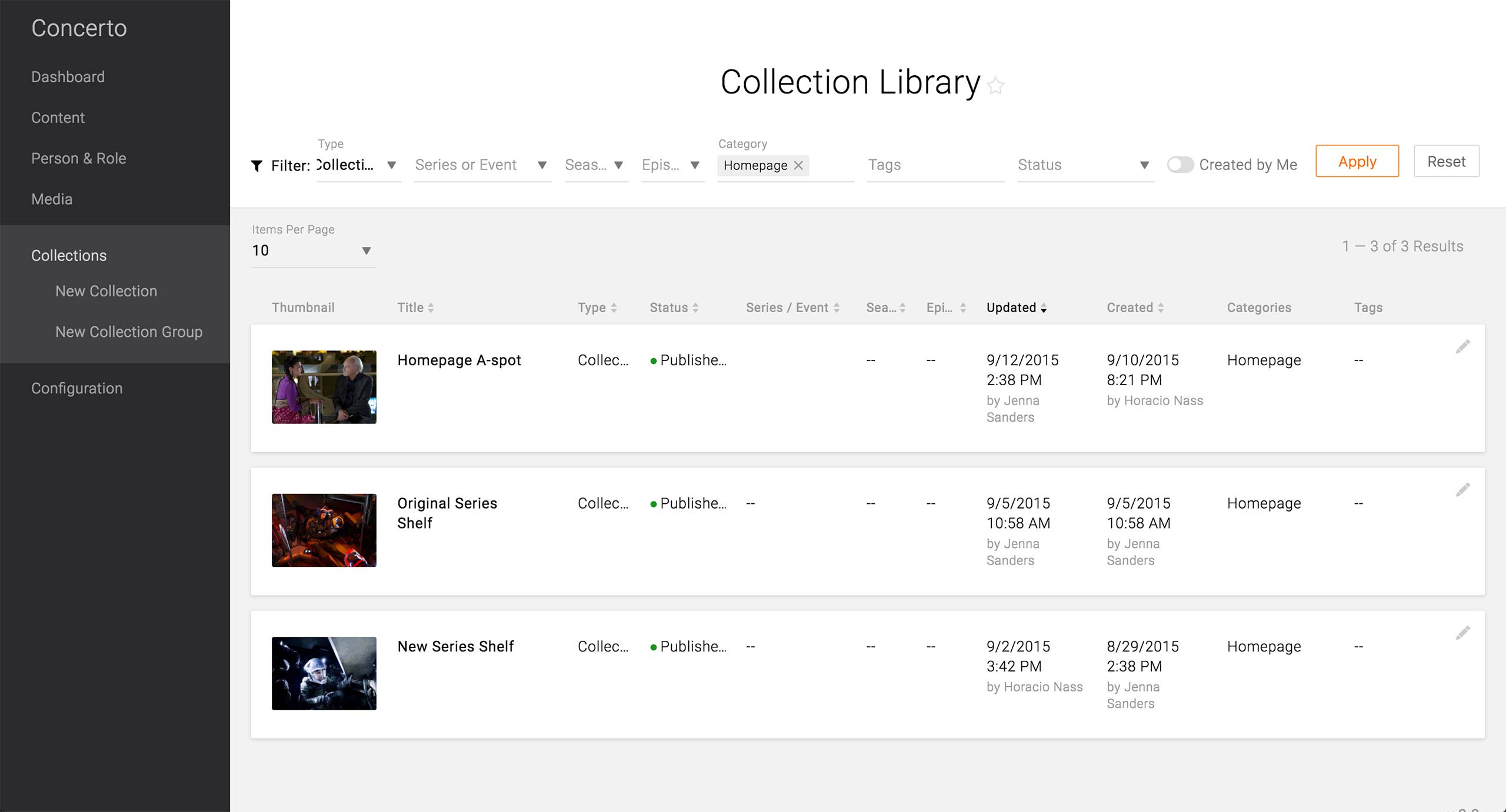
After creating all the Promo Wrappers and/or entering the Promo information in Contents, the producer has to update the Homepage’s A-Spot. The quickest way is to find the Homepage A-spot Collection in the Collection Library. The producer needs to know the right filter and the Title of the Collection in order to use the Collection Library.
Feature Enhancement:
In the future, it is vital to offer a keyword search in the Libraries. Currently, all the Libraries’ result can only be narrowed down by Filters. This makes it difficult to retrieve Contents that do not have Channel Reference, Category, or Tags. Producers may now start adopting the habit of making the appropriate Associations, but the massive amount of content that already exists would not have those association upon migration, not to mention the fact that not all content to be created after launch might have appropriate associations to make.

If the Collection Library does not work, the producer can go to Global Configuration to find the Homepage’s Collection Group.
Design:
The Global Configuration page that holds all things global - e.g. site logo, navigation settings, homepage content, etc. - was built in D7 and D8 as well as in the API, but the UX design team needs to work on the design and experience of the Configuration pages.
Feature Enhancement:
The producers should be able to jump to the edit screen of the Collection Group or Collection in context.

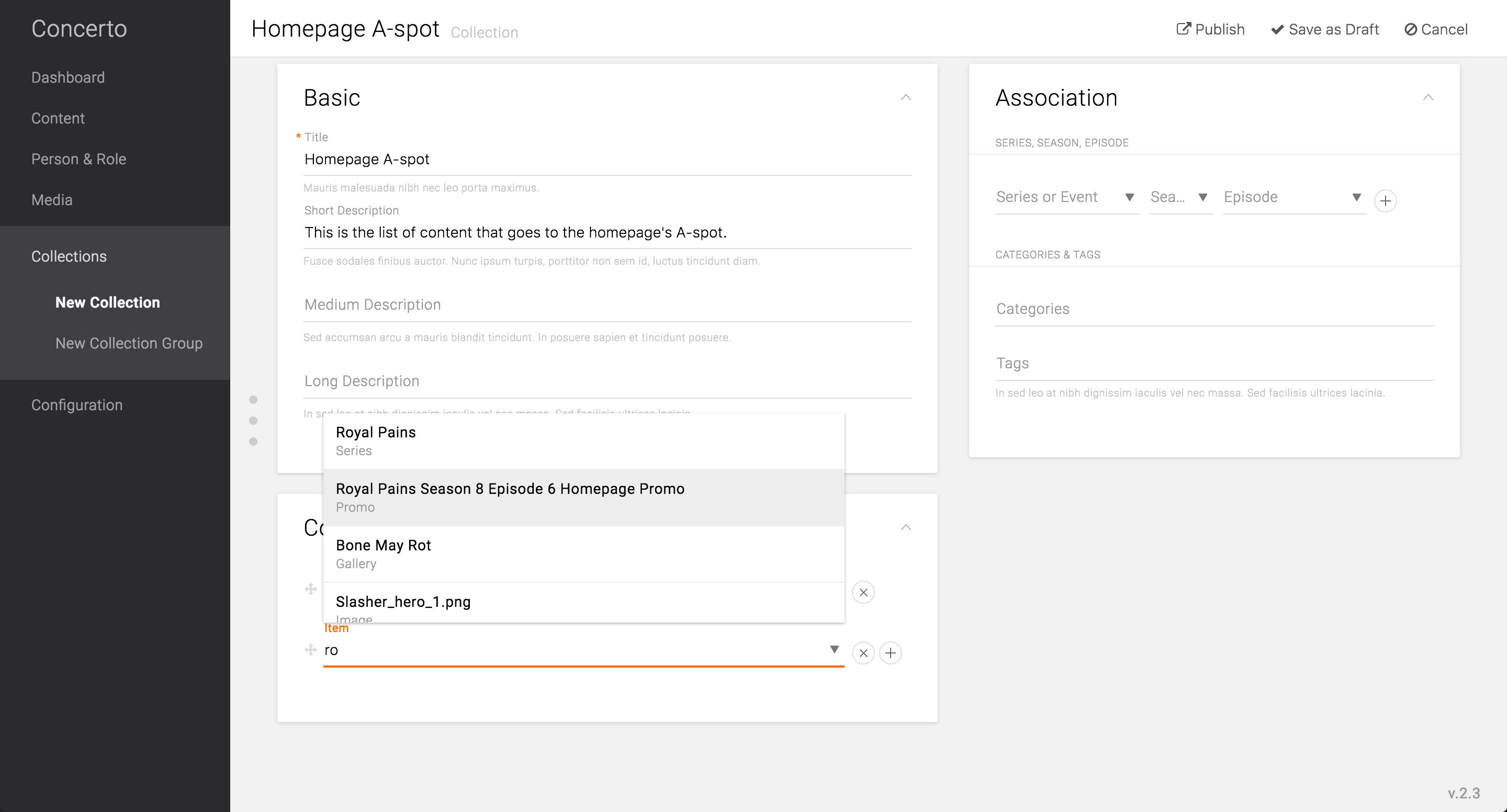
Going into the edit screen of the Homepage’s A-spot Collection, the producer can choose the Promo Wrapper by start typing the title.
Feature Enhancement:
The item search in Collection needs to offer more information than just the title and the content type, as well as the option to further filter down the result. As Promo Wrappers’ titles would be consumer-facing, the titles may be quite generic, like the title of the series as in the example. Thus, there can be multiple Promo Wrappers and Content Type itself that have the same title, and it would become impossible to distinguish one from the others. There should be a thumbnail, unique number ID, date created/modified, and/or the creator/modifier in order to distinguish the items from the massive library of content.
Alternatively, each content type can have “Administrative Title” that is only for internal search purposes. Then the producer can give unique title to the Promo Wrappers and other contents without having to name it for consumer-facing purposes.
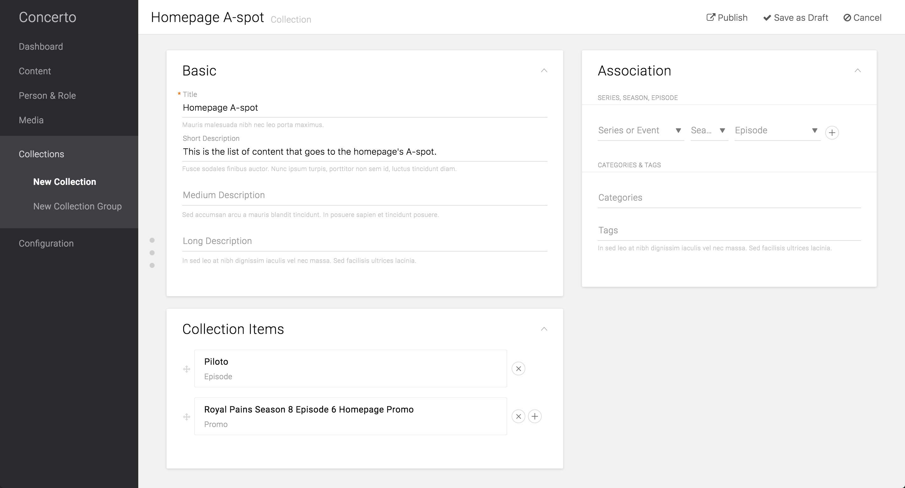
After selecting the Contents and Promo Wrappers to promote in the A-spot, the producer would hit Publish in order to make it go live on the site.
Feature Enhancement:
Based on USA’s current use case, there is a need to schedule the time of the A-spot content to go live. This can be achieved by one of the following two options:
1. Each item can be scheduled to go into/removed from the Collection. This option reuses the “Homepage A-spot” Collection and reduces the number of Collection that lives on the CMS. The downside of this is that the producers can’t reuse the Collection that was previously up on the site. Use case of this case, however, would be very minimal, if any.
2. Entire Collection can be scheduled to go into/removed from the Collection Group. This saves all the Collections that were ever created on the CMS, thus makes it easy to retrieve the A-spot that was created in the past. However, this would create new Collection each day - USA schedules to update the Homepage A-spot every day - and eventually weigh down the CMS.
A-Spot Annotations
A-Spot Annotations
A-Spot Use Cases For Other Brands
A-Spot Use
Cases For
Other Brands
Cases For
Other Brands
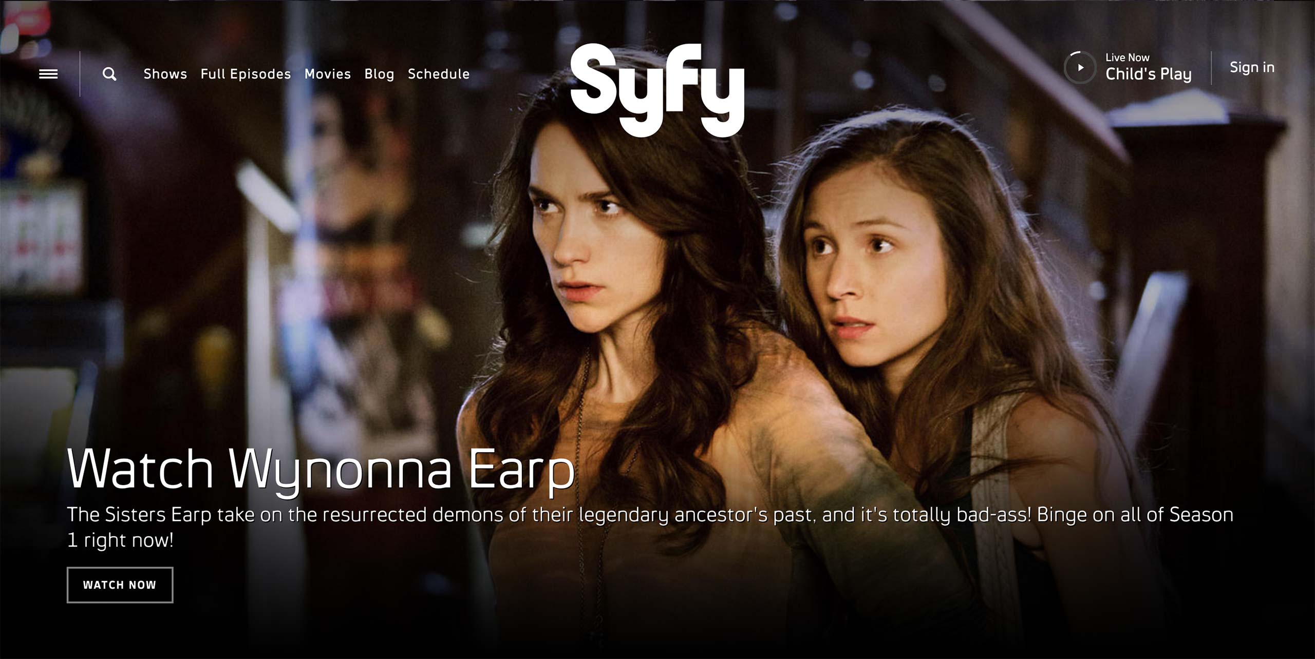
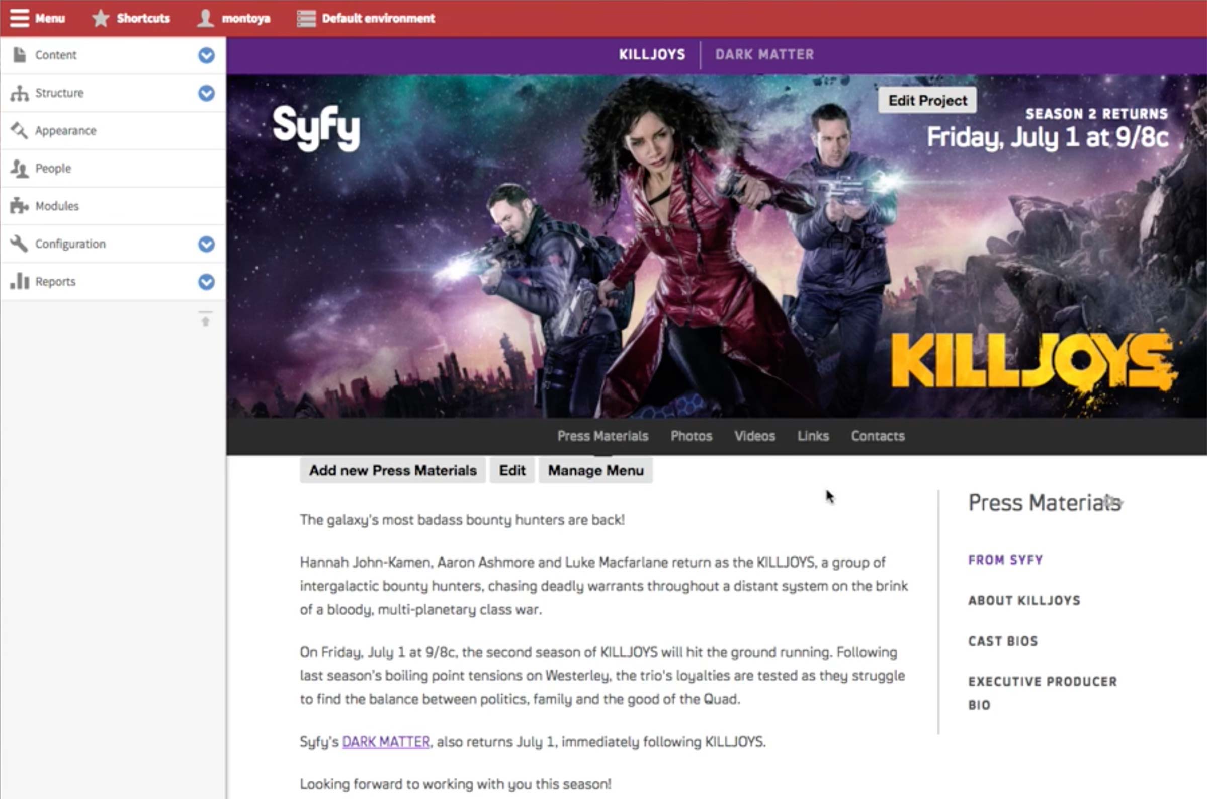
There are 2 use cases for Syfy’s Promo content type: Homepage and the feature body.
There are 2 use cases for Syfy’s Promo content type: Homepage and the feature body.
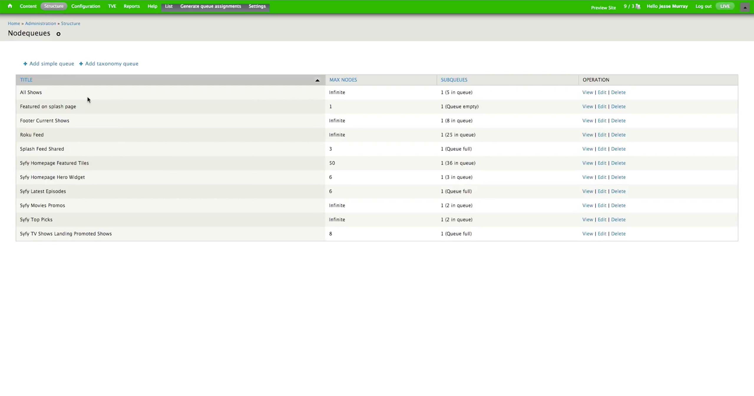
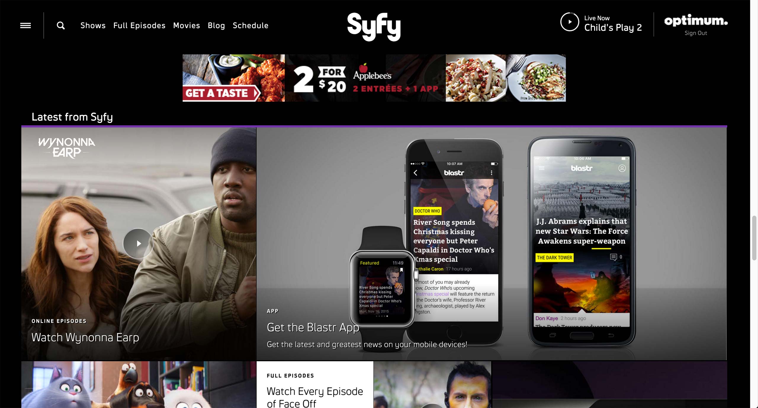
Structure > Nodequeues page holds all the collections that have contents for the page. The number of assets is specified for each nodequeue.

Homepage Hero Widget nodequeue is a curated collection, which producer needs to manually insert and remove the content to be displayed in the hero.
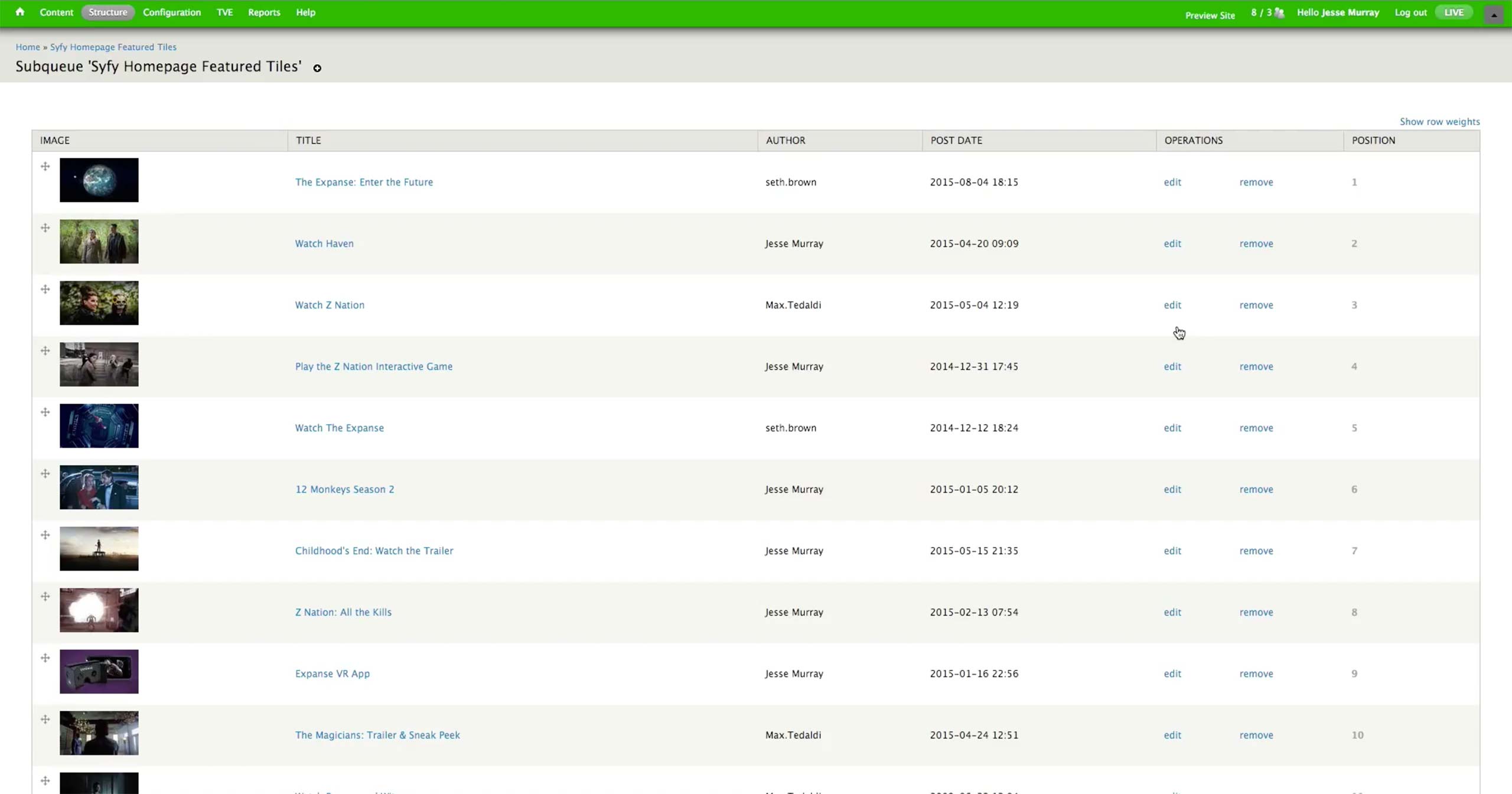
Featured Tiles Widget is a dynamic nodequeue; whenever there is a new content created, it automatically populates the Featured section in the homepage.

In the individual Promo content, there are Tagline (equivalent of Kicker), Title, Link, and image fields. There is also an option to opt out of the Show Landing Page’s Dynamic Collection if the Promo is meant for the Homepage only.
Bravo has a different access point; when the producer is logged in, he can always see View and Edit options. Edit takes him to the Layout screen.
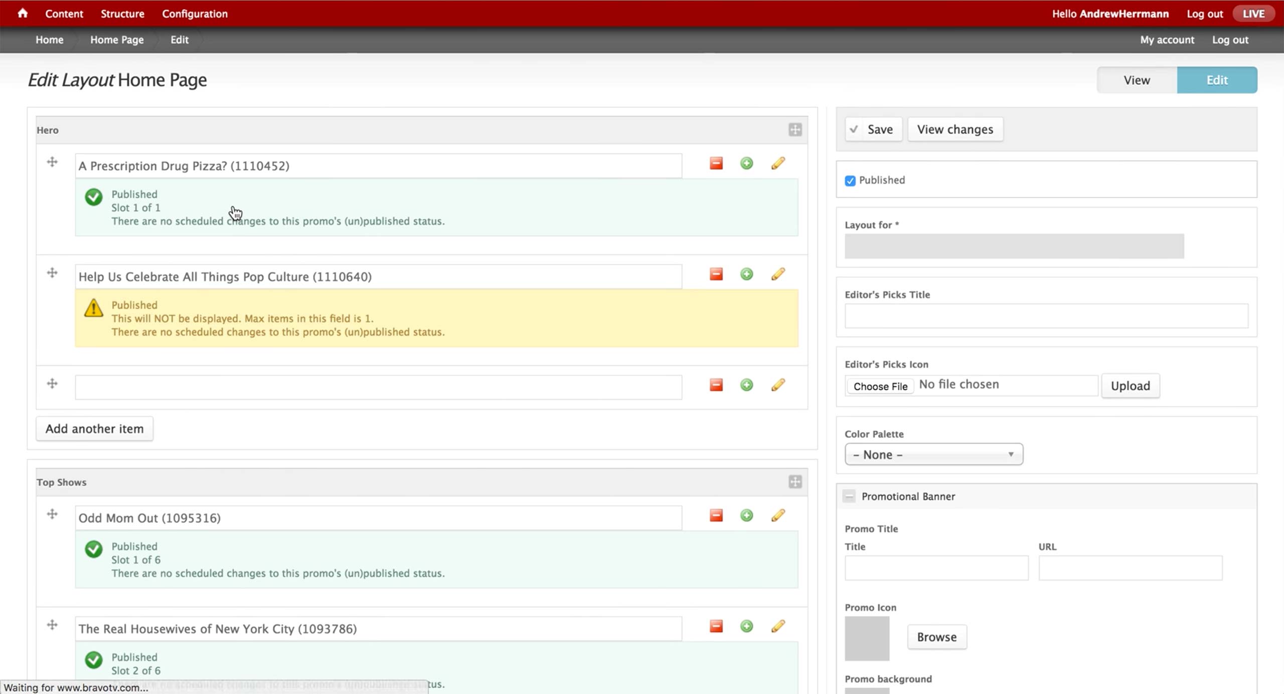
Layout defines what content that each section holds. Each section has a limit of contents that can be shown in the front-end page, and it clearly lets the producer know which content is published, scheduled, and not displayed.
By clicking on the plus icon, producer can add a new Promo.
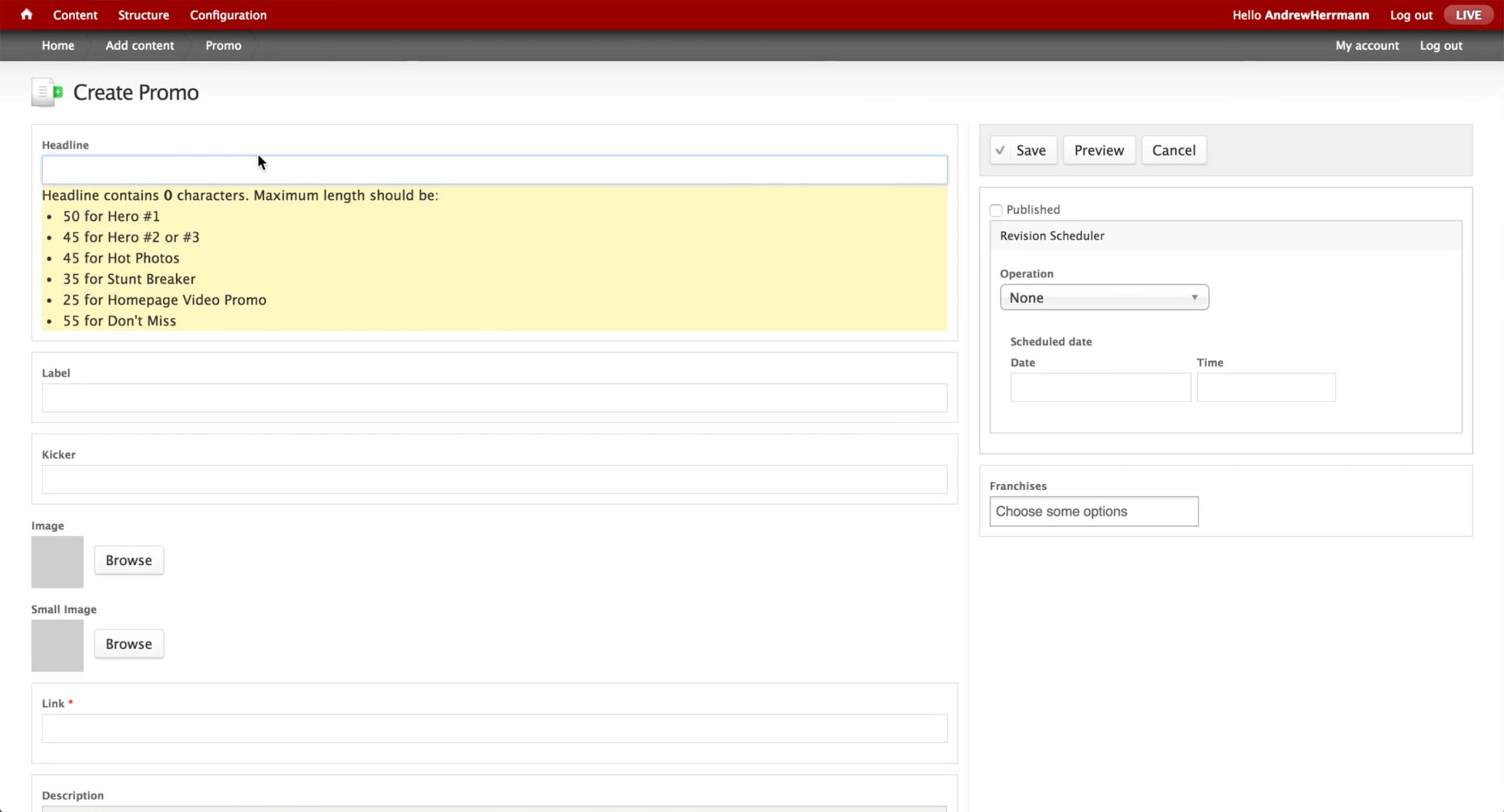
In the Promo page, the producer needs to enter the Headline, Label, Kicker, Link, Description, and Call To Action.
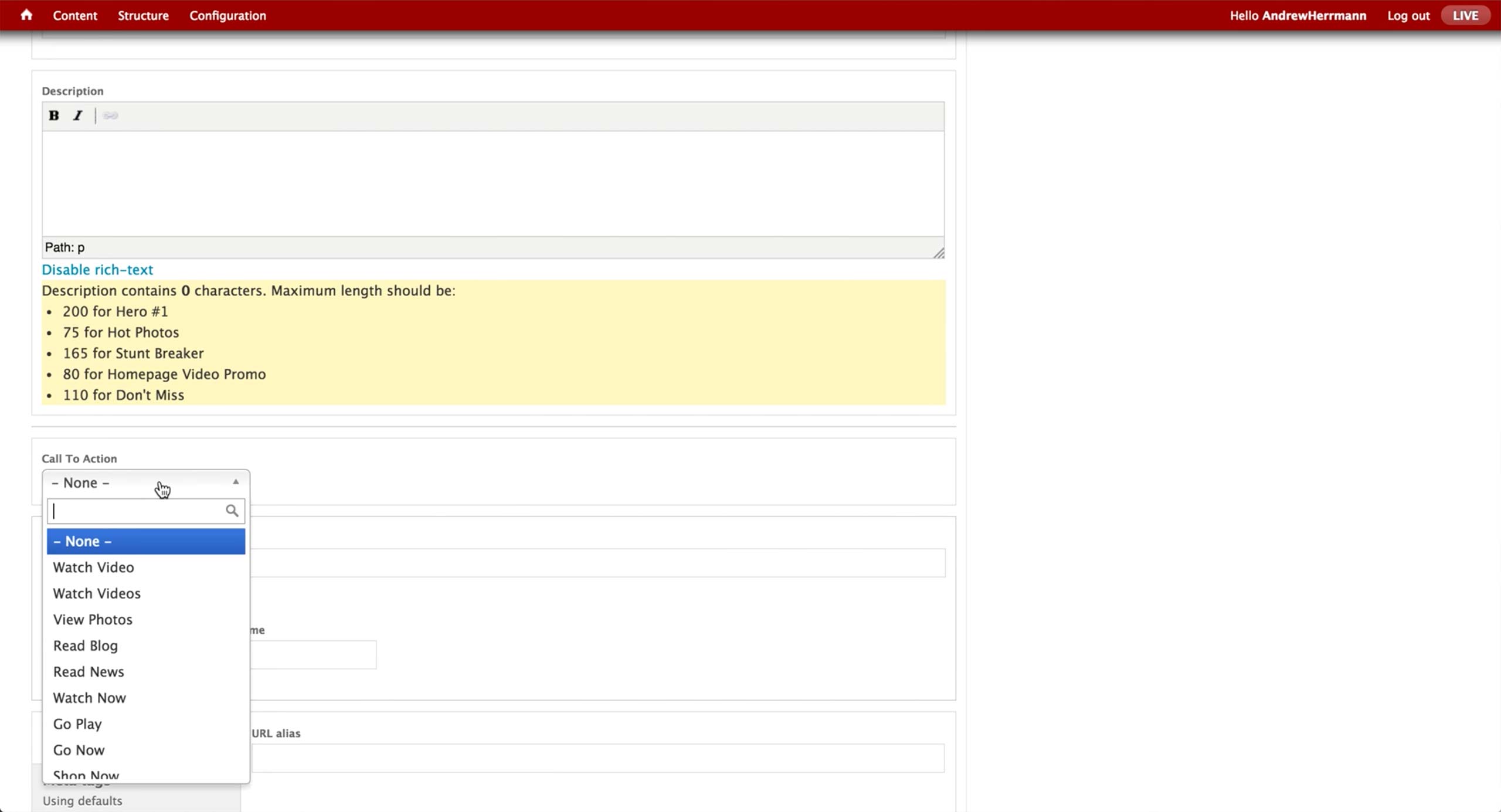
All the Call To Action button labels are pre-defined, and the producer chooses the appropriate one depending on the promoted content.

For NBC, producer curates 3 sections in the show’s landing page. First is the Dynamic Lead hero area, where a number of content is autoplayed in the carousel.

Next, there is a Marketing Band in the middle of the page, where internal marketing ads are placed.
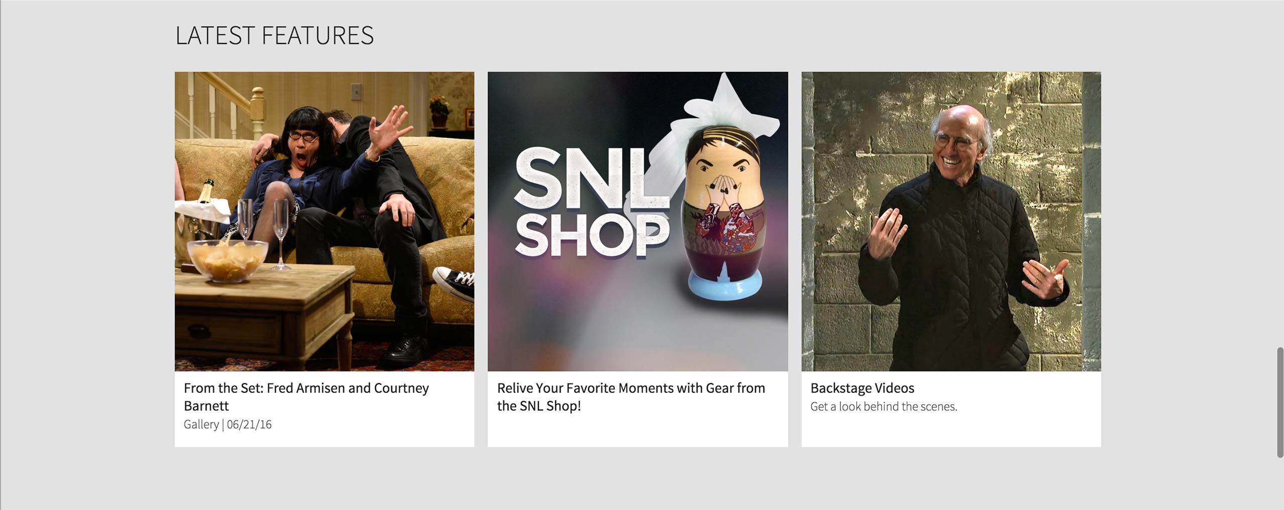
Last is the Features section at the very bottom of the page, where show-related contents are promoted.

In NBC, producer has to search for the Collection of Collection with the title in the library.

If he doesn’t know the exact title of the Collection of Collection, he can find the corresponding Series and go to the Collections tab to find out which Collection of Collection is being used.
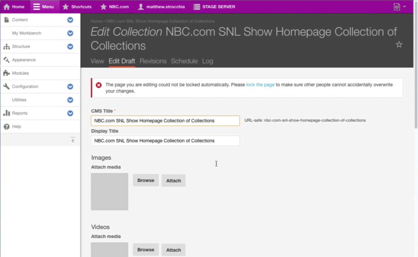
This is the Collection of Collection that holds content for the landing page of Saturday Night Live.

There are three Collections in this Collection of Collection: Dynamic Lead Collection for the Hero area, Marketing Band Collection for the internal ad section right below the dynamic video shelf, and Features Collection for the very bottom shelf that displays promoted contents of the Series.
Collection Content Type can not only be a Collection that has various contents, but also be a Collection of Collection that has multiple Collections inside. Thus, each collection mentioned above has the same structure and interface with this screen, only with corresponding sections filled out with content. For example, Dynamic Lead Collection would have DL Slides section filled with Dynamic Lead Content Type.

This is how a single Marketing Band Content Type looks like. Producer needs to upload multiple images for different layouts and screen sizes.
After the Marketing Band is created, producer can find this Marketing Band in the corresponding Marketing Band Collection, which belongs to a Collection of Collection that ultimately displays this content to the assigned Series’s landing page.
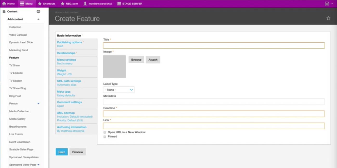
This is the initial screen of a Feature Content Type. This is closer to the Promo Content Type of other brands; it has Title, Image, Headline, and Link.
After the Feature is created, producer can find this Feature in the corresponding Feature Collection, which belongs to a Collection of Collection that ultimately displays this Feature on the assigned Series’s landing page.
A-Spot Next Steps
A-Spot
Next Steps
Next Steps
As we are designing the preview and schedule functionality, we will user-test the Promo content type within the full configuring Homepage workflow.
Catchall Page & Microsite Overview
Catchall Page &
Microsite Overview
Microsite Overview
Catchall page allows any type of custom content on it with full HTML, CSS, and JavaScript capabilities. It is typically used for one-off content with custom or embed code, such as voting.
Microsite is a sectioned page with contents that are related to a specific series. Many microsites are sponsored and tracked with custom analytics from the sponsor. Each section accommodates content from CMS as well as external code.
Catchall Page & Microsite Current Workflow
Catchall Page &
Microsite Current
Workflow
Microsite Current
Workflow
Catchall Page
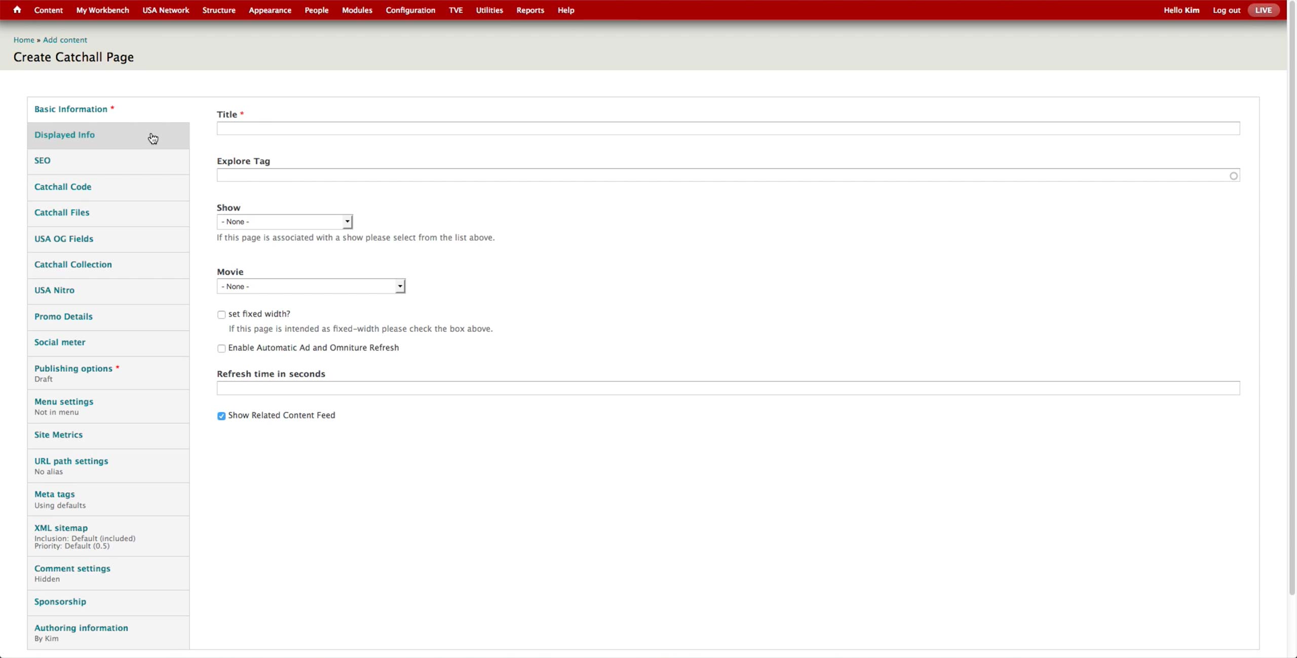
This is the initial screen of Catchall Page with the basic information.
- Title: This is the title of the catchall page.
- Show & Movie: Association to a TV Show or Movie.

Catchall Code section has three fields for CSS, JavaScript, and HTML code. Producer receives code from designers and programmers and pastes the code in the separate boxes.
Microsite
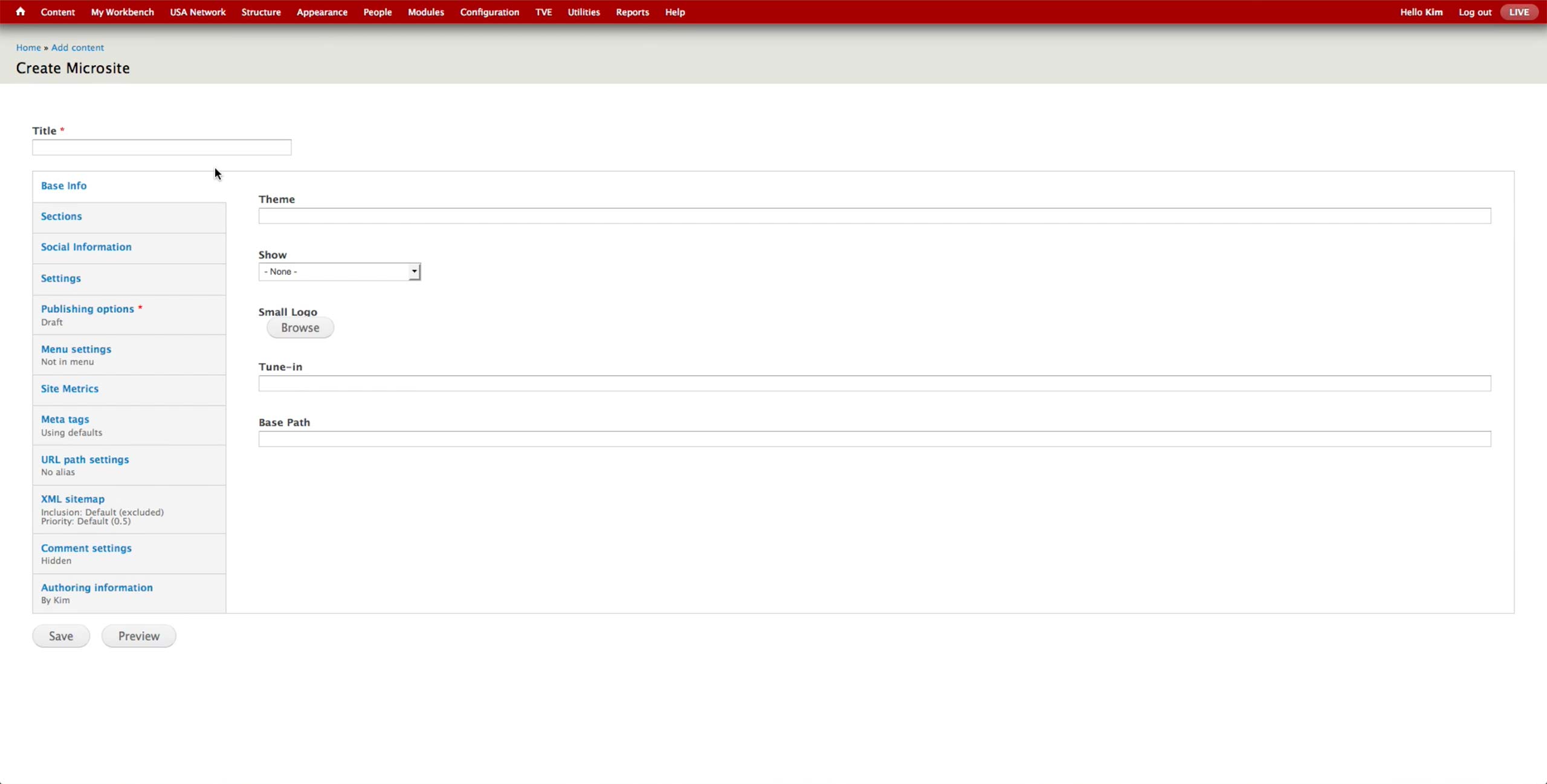
This is the Basic Information screen for Microsite Content Type. Developers would pre-configure the Theme and Base Path fields and hand the node to the producer. A microsite is typically on a single TV show, and producer makes the association in the Show dropdown.
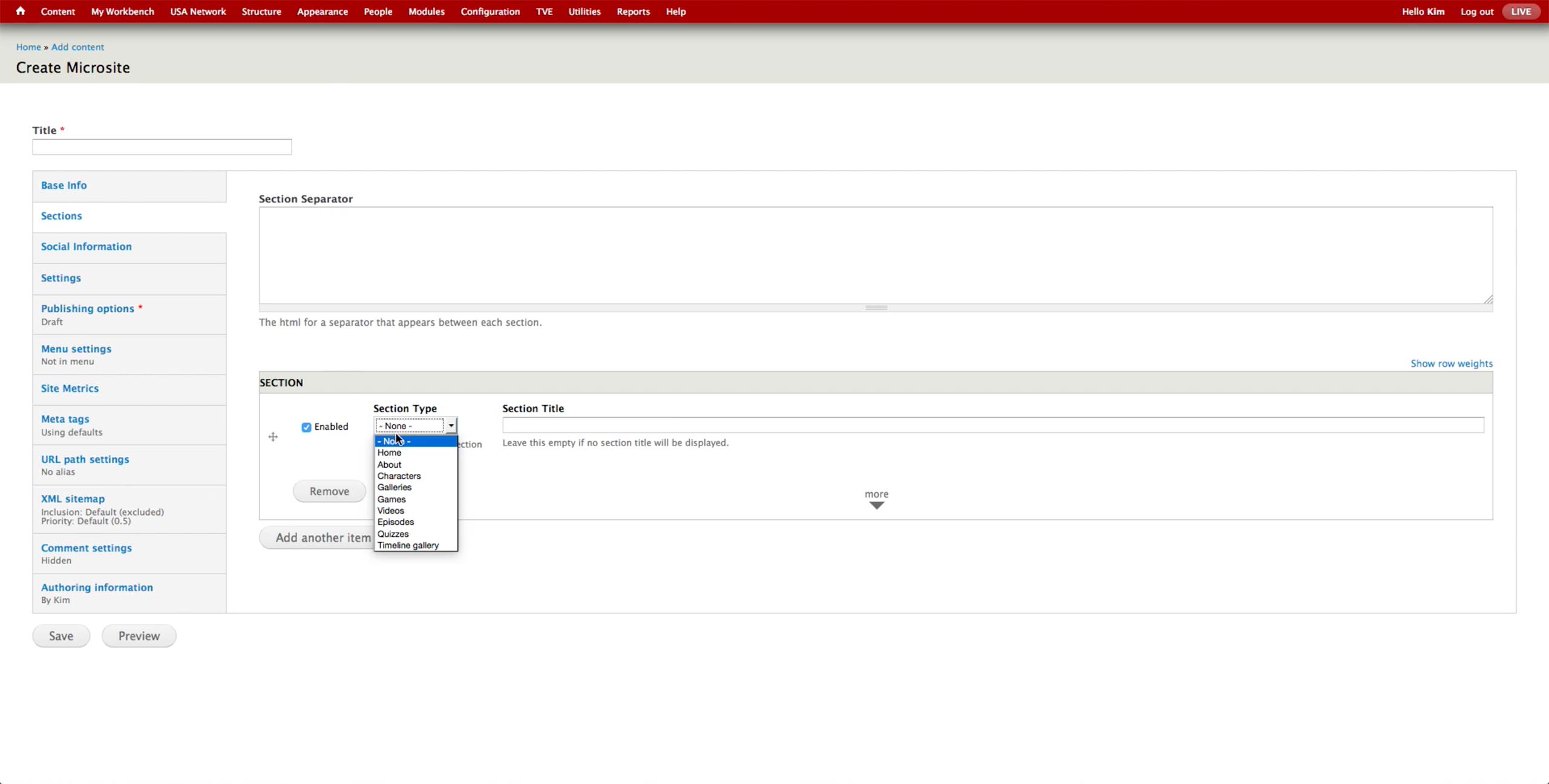
Each section can be one of the menu items in the Section Type dropdown. Producer adds contents that are appropriate for each section’s type.
Microsite is easier to build out than Catchall page for producers, as all the content is visually laid out.
Catchall Page & Microsite New Workflow
Catchall Page &
Microsite New Workflow
Microsite New Workflow
Potentially, both Catchall page and Microsite can be served by a single Page Content Type. They are both one-page, one-off pages that potentially has content from CMS and/or custom code. Microsite is more structured with the navigation and potential sponsorship opportunities compared to Catchall page. In a way, Microsite is containing sections divided with navigation as their titles, and each section has the same capability that Catchall page has.
Thus, the unified content type would have a Type selector, which would display additional sections and fields for the navigation and sponsorship upon selecting Microsite option.
Catchall Page & Microsite Use Cases For Other Brands
Catchall Page &
Microsite Use
Cases For
Other Brands
Microsite Use
Cases For
Other Brands
Catchall Page
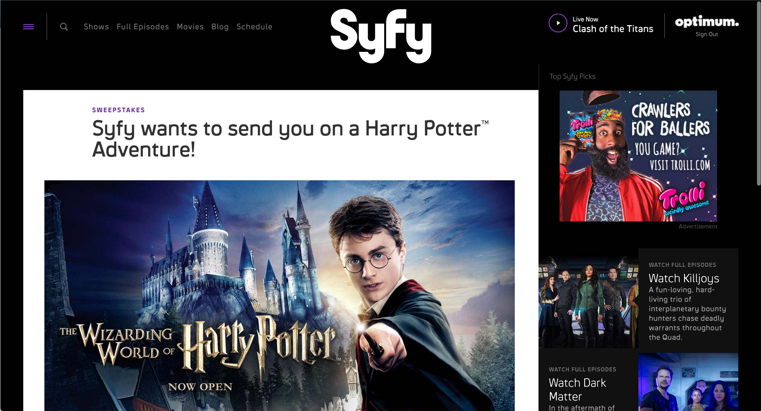
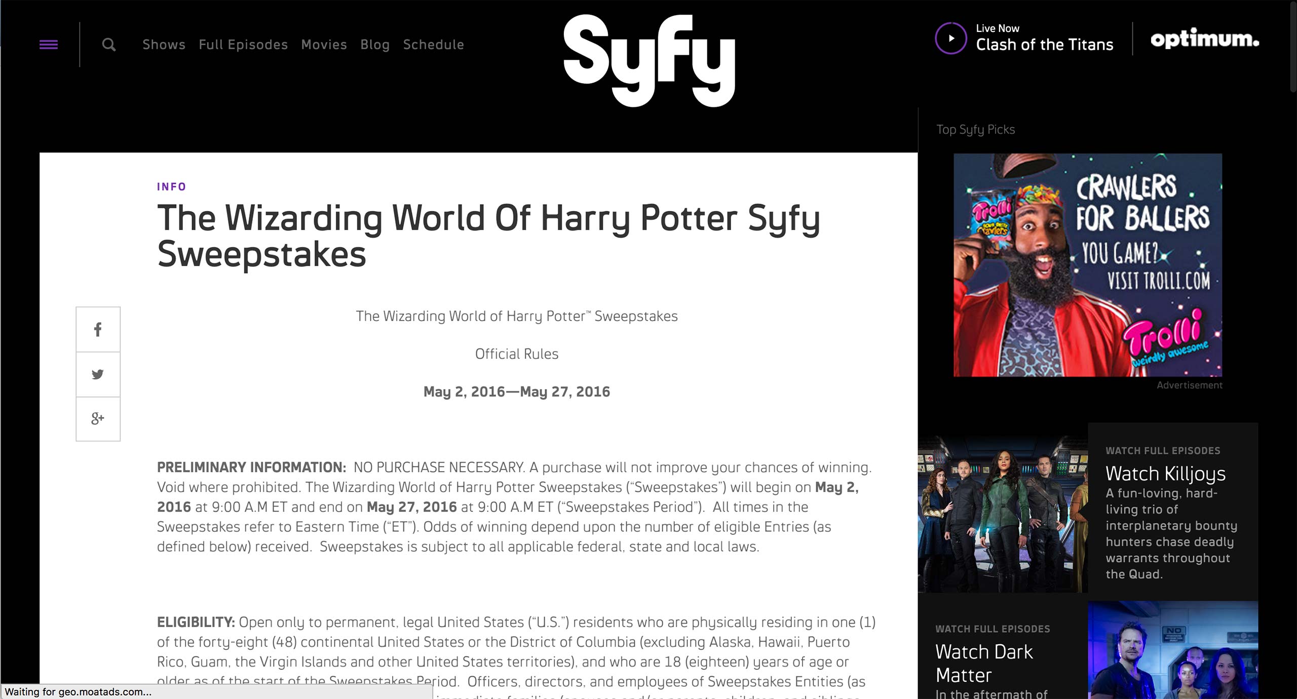
Syfy has a content type called Basic Page, where any content that doesn’t belong to a specific show goes. It is usually used for Sweepstakes and rules.
Catchall Page
Syfy has a content type called Basic Page, where any content that doesn’t belong to a specific show goes. It is usually used for Sweepstakes and rules.
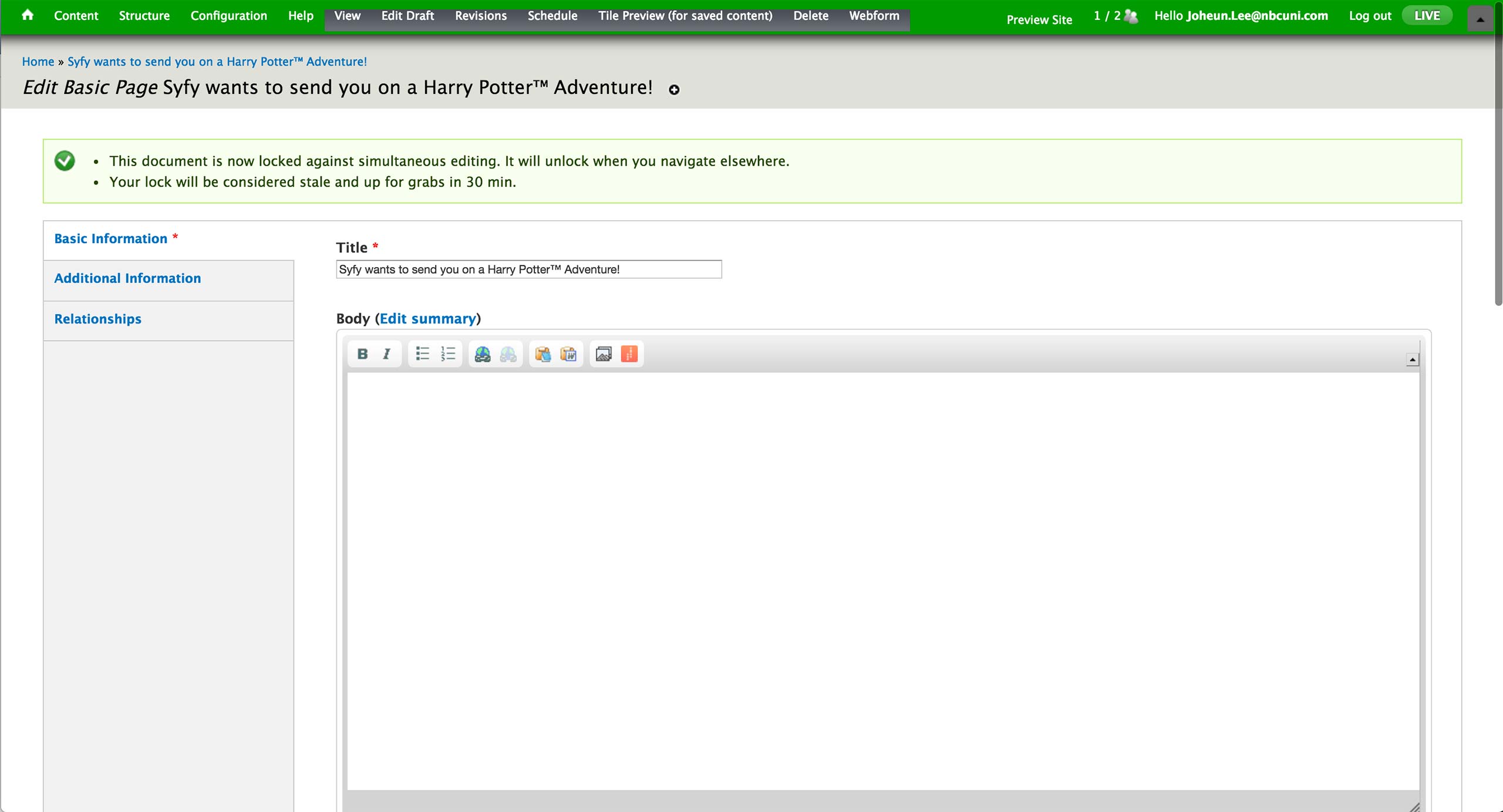
In the CMS, producer fills out the Title of the page as well as any body content. The sweepstakes rule would use Body area’s WYSIWIG editor; WYSIWYG, Plain Text, and Display Suite Code options are available to an editor.
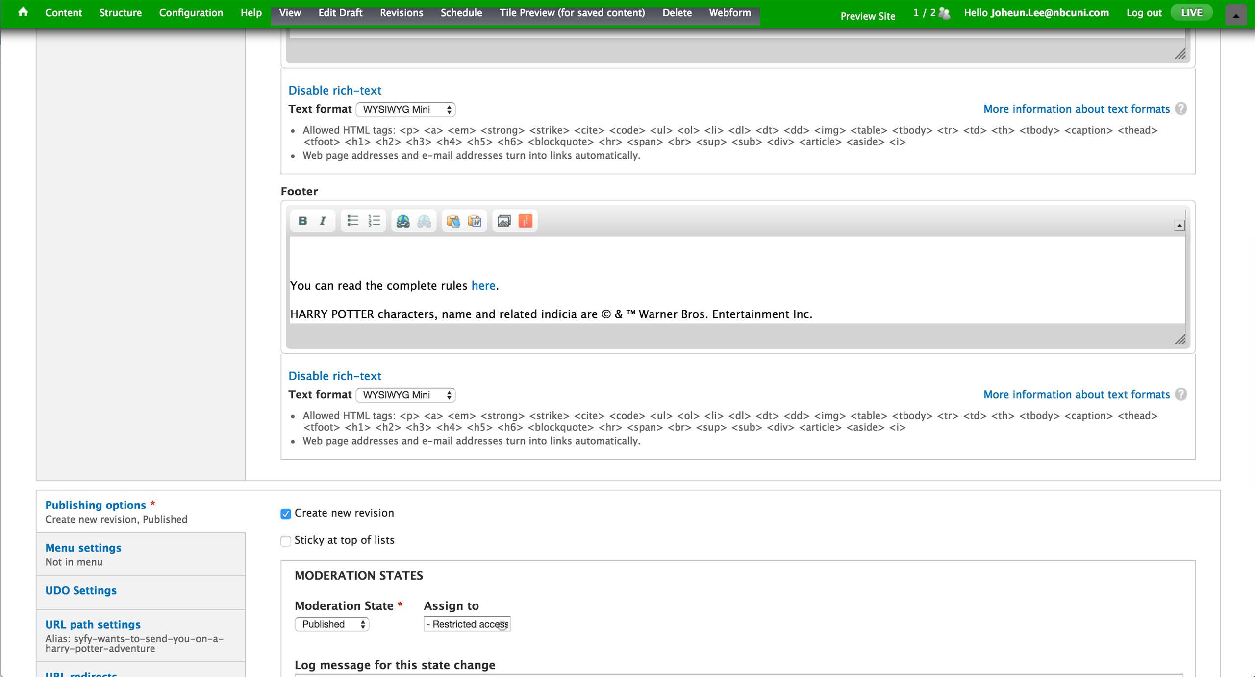
Below, there is a footer section. This field is used when there is Sweepstakes form in the body area and there needs to be additional text below.
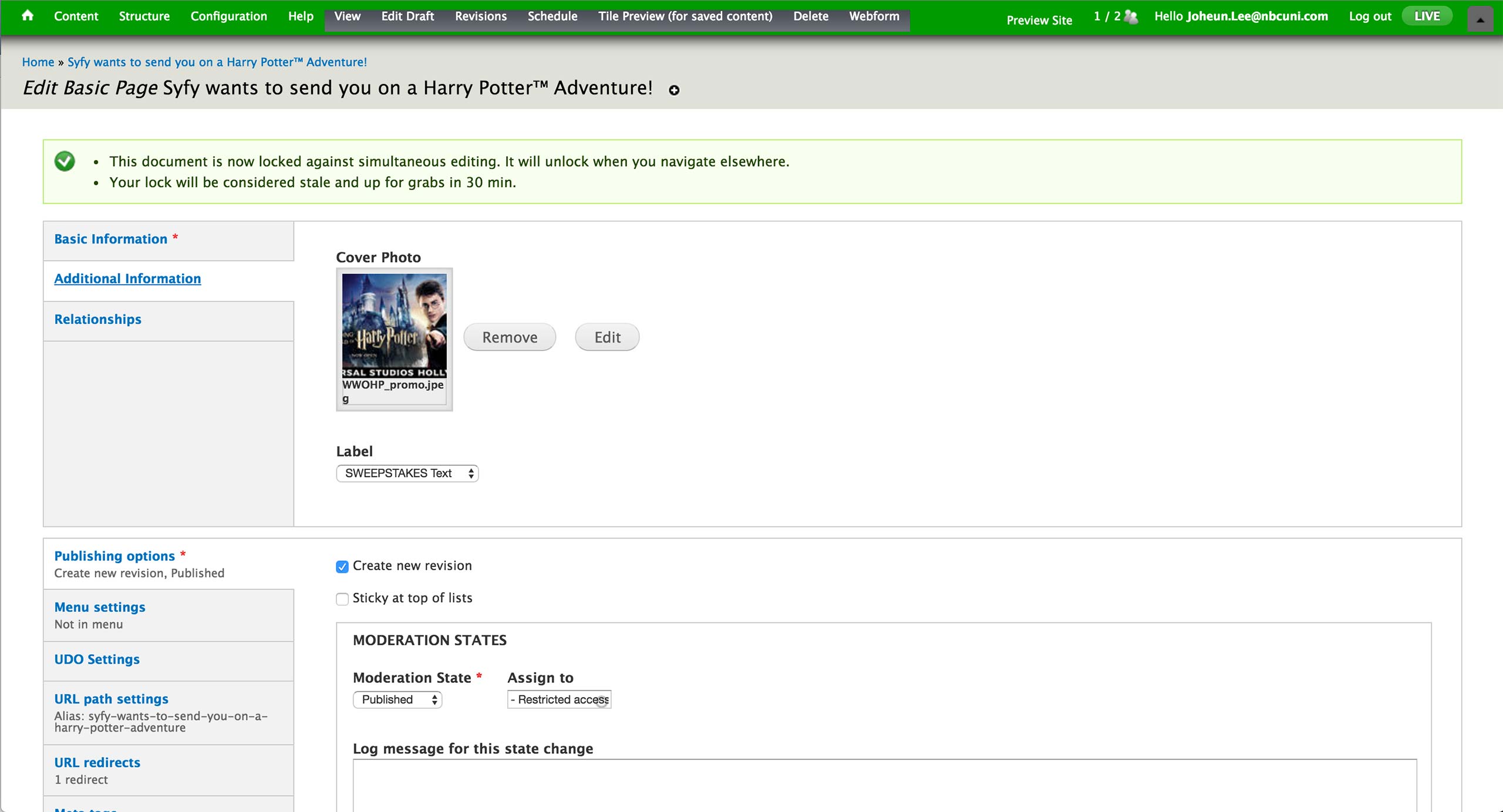
In the Additional Information tab, producer can set the cover photo that appears at the top of the page, as well as the Label that appears above title text. Labels are all pre-defined, and most used labels are SWEEPSTAKES and INFO.
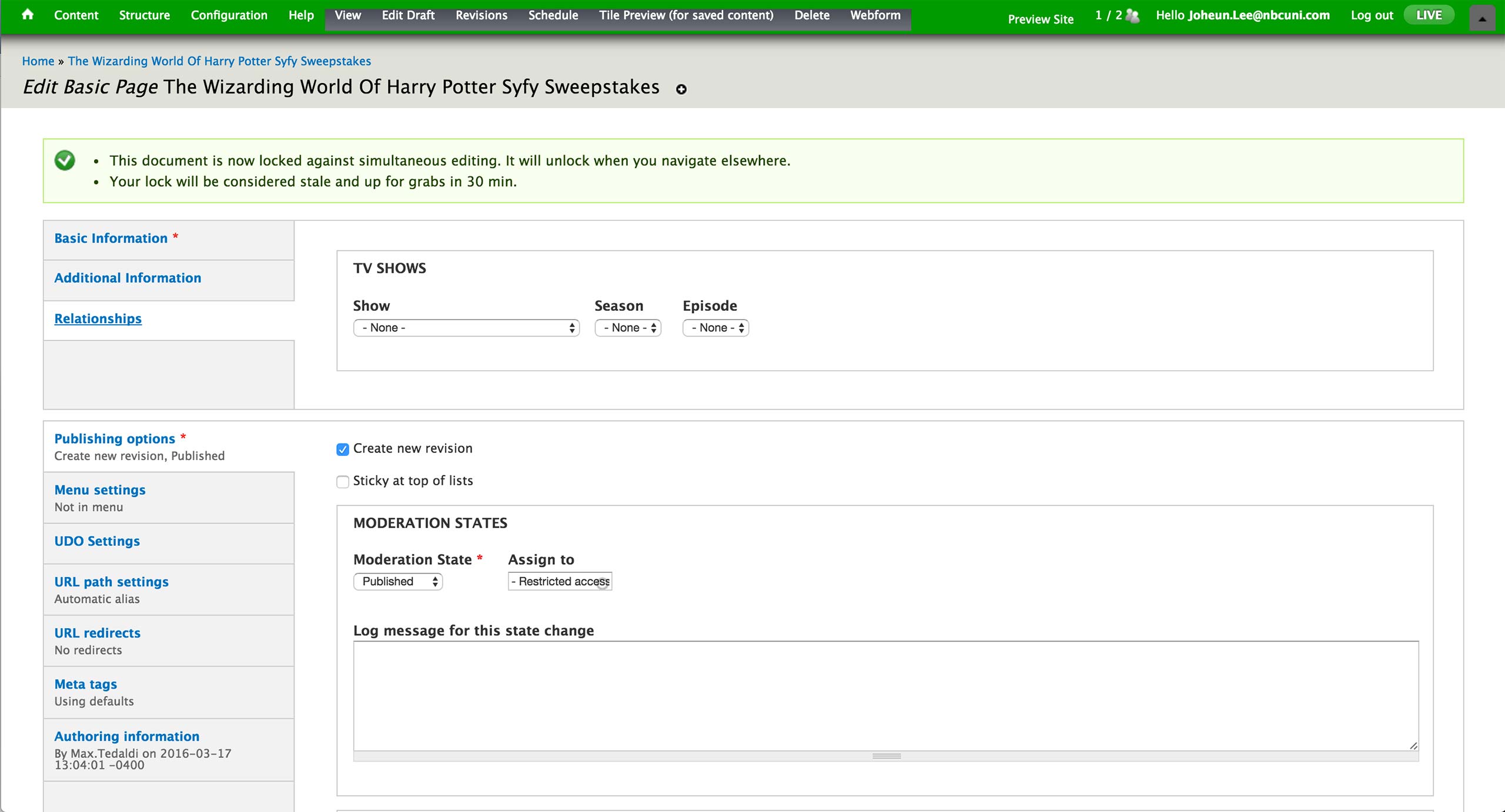
Lastly, the relationship to the show, season, episode is set in the Relationships tab if the page is associated with a specific show in Syfy.
Microsite
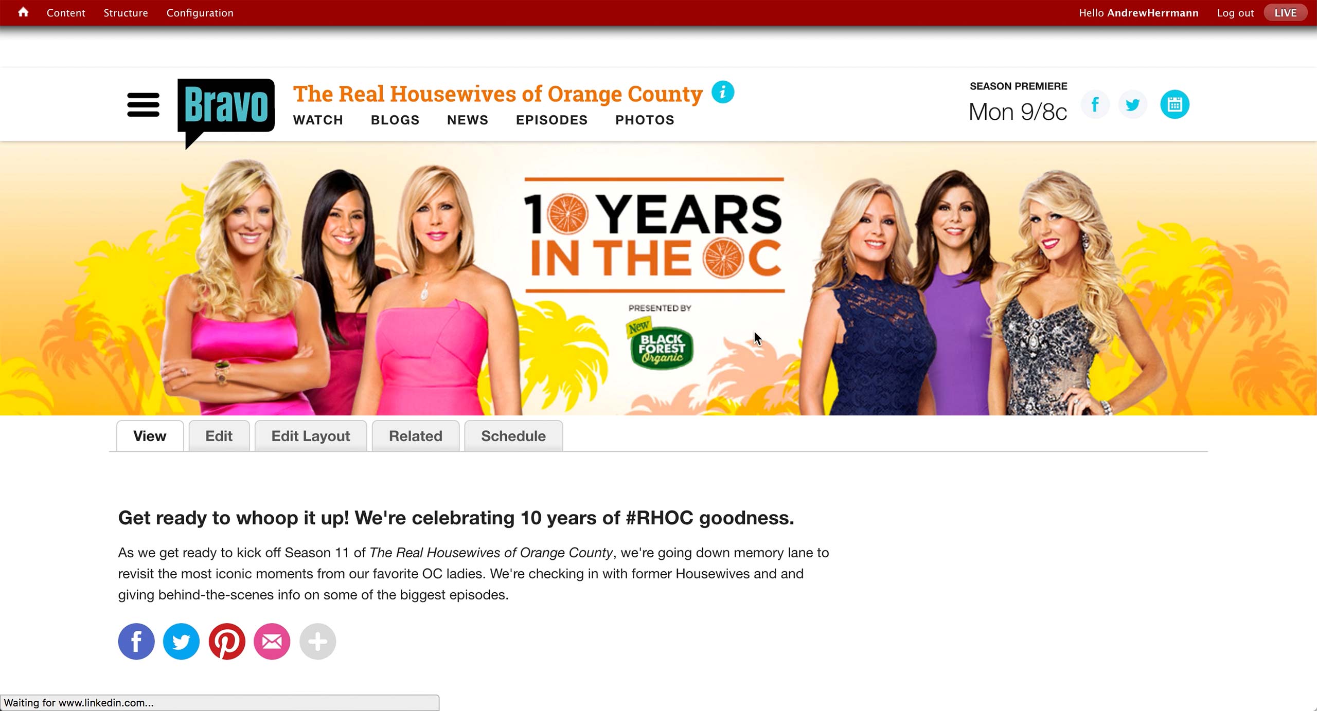
This is how a typical microsite from Bravo looks like when the producer is logged into CMS.
There is a banner at the top with short introduction text below. There is a sponsored logo in the banner for this sponsored campaign.
Microsite can be created for special occasions like the 100th episode or any kind of hub that producers editorially decided to create.
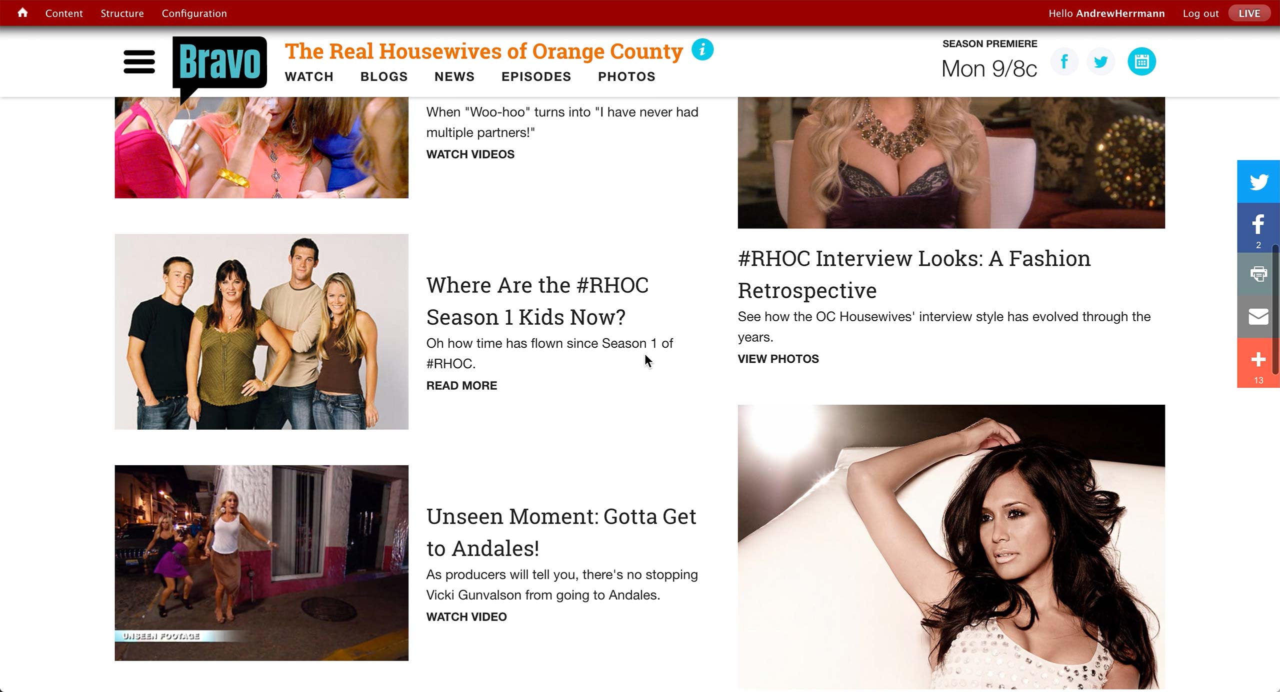
Rest of the page has various content that producer curates. Left rail holds up to 10, and right rail up to 4 content items.
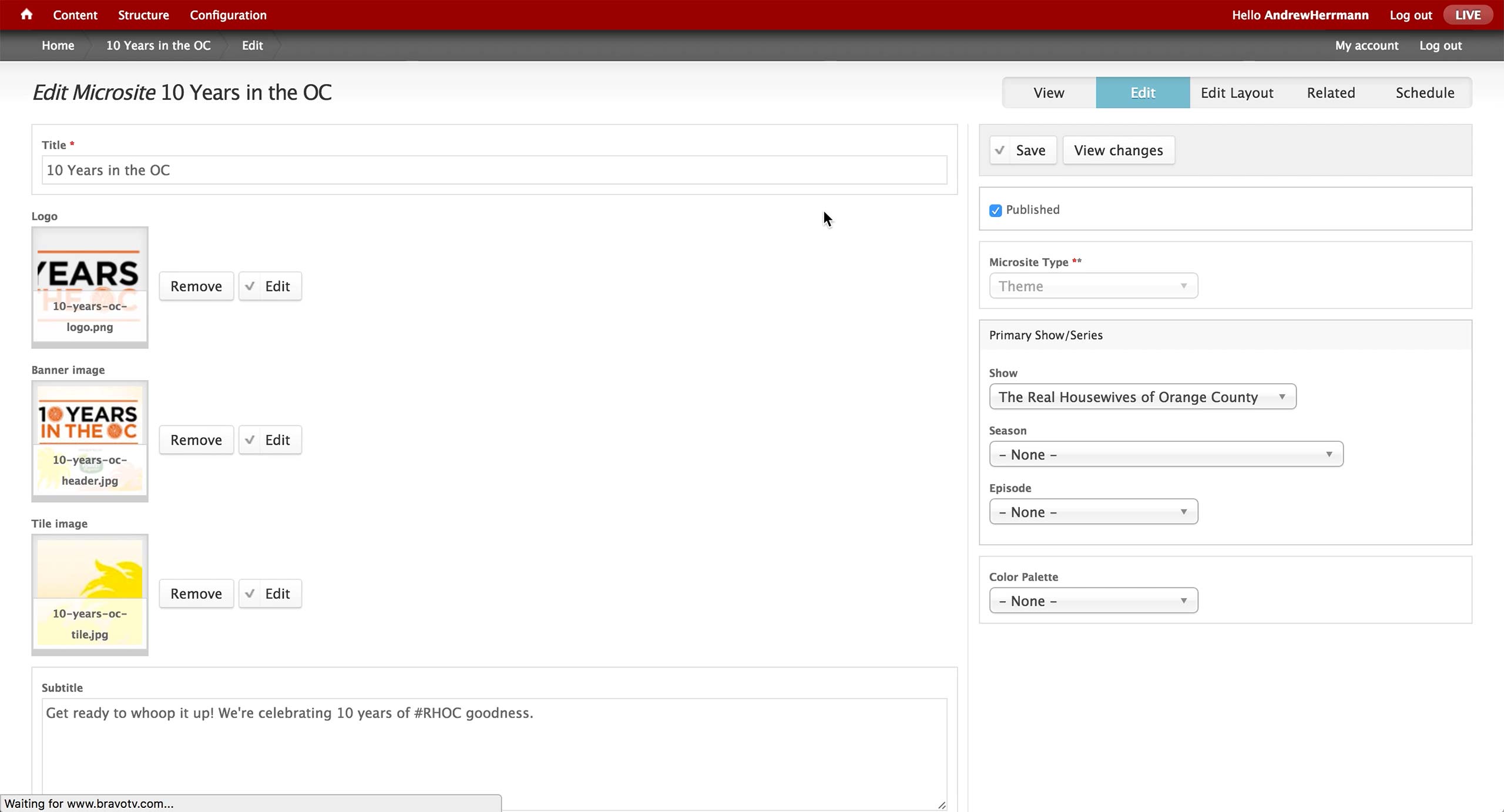
This is the initial screen of the Microsite Content Type in the CMS. On the left, producer enters the title of the microsite and attach images for each of the section. Subtitle appears right below the banner image.
On the right, there is a dropdown to select Microsite Type. There’s Cast Blog, The Daily Dish, Awards, Lookbook, Popup, and Theme. Depending on the label, the content renders in a different layout and design on the front-end website.
Also, an association to show, season, and episode is made if the microsite is related to a specific show in Bravo.
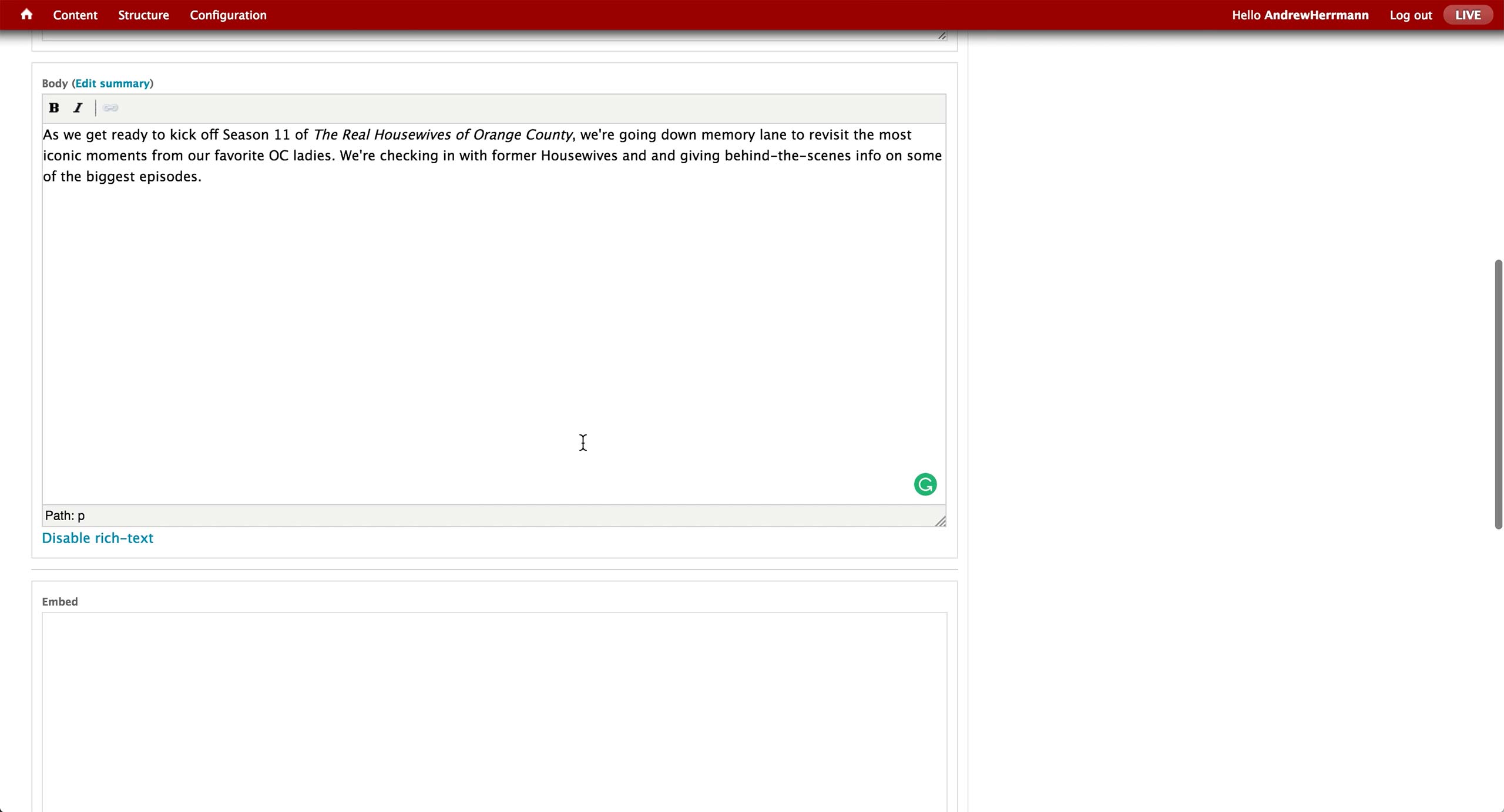
Below the subtitle is the body text area, where producer enters the introductory text. There is an Embed text area to copy and paste any embed code to be displayed on the microsite.
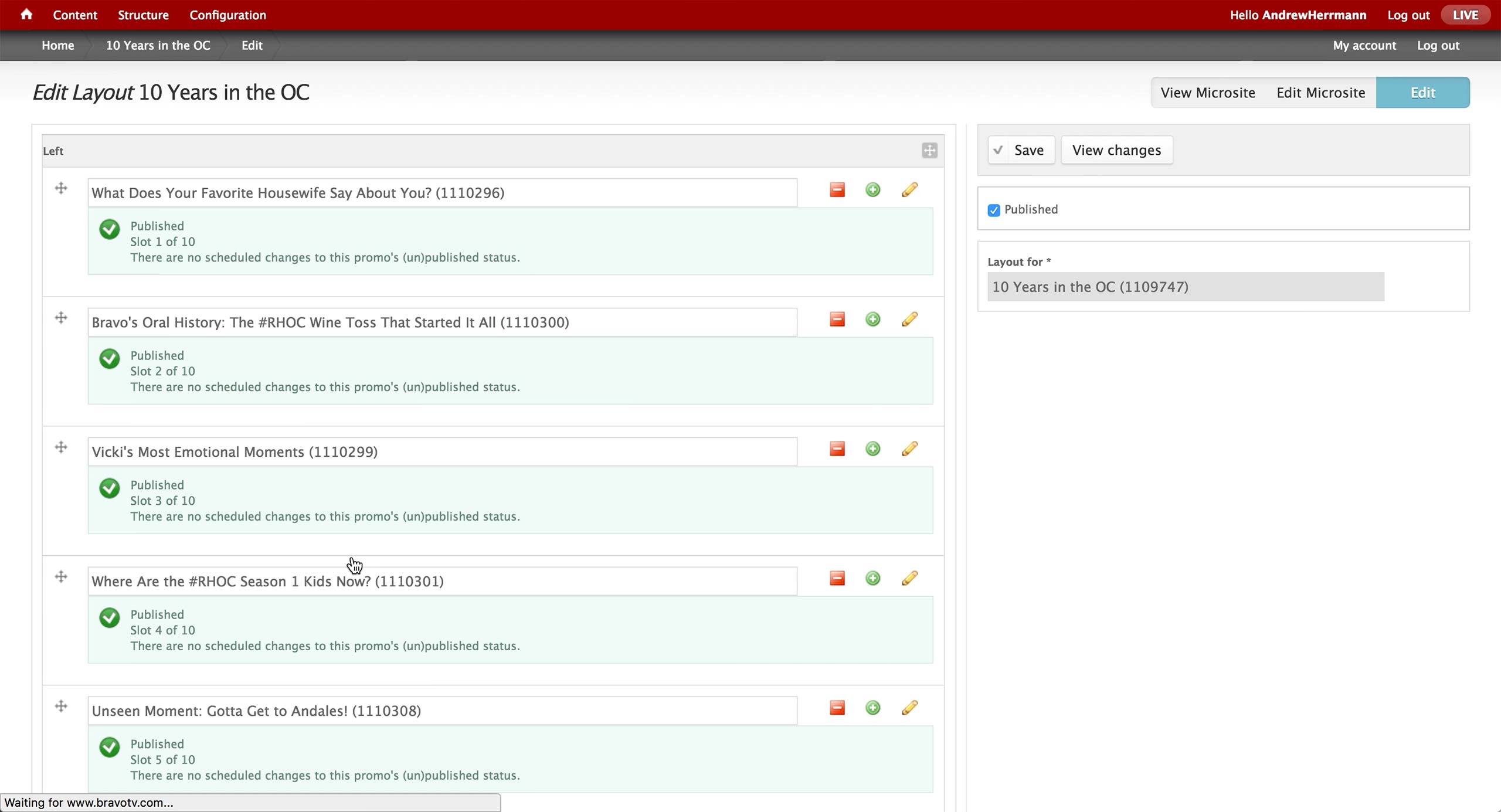
Once the microsite is created, a Layout content can be created with appropriate Promos. Then, the layout is associated to the microsite on the right rail.
Microsite
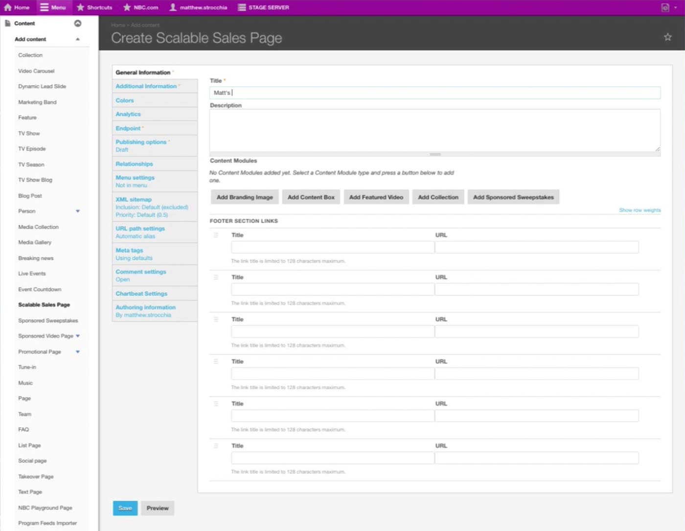
NBC is moving away from a free-form site and towards page as a saleable unit. They have a Content Type called Scalable Sales Page for any one-off page.
There are standard Title and Description fields, and underneath is the Content Modules section where producers add content in blocks.
Producer can also configure the Footer section with custom Title and URL. The design would be the same with the overall NBC.com website.
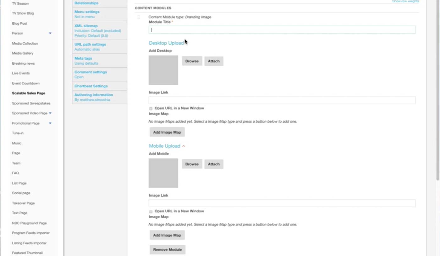
This is the Branding Image module. After the title, producer uploads two separate images for different platforms/sizes and sets link URL for each. If certain area of the image needs to link out to a different URL, he can click on Add Image Map button and set the area and link.
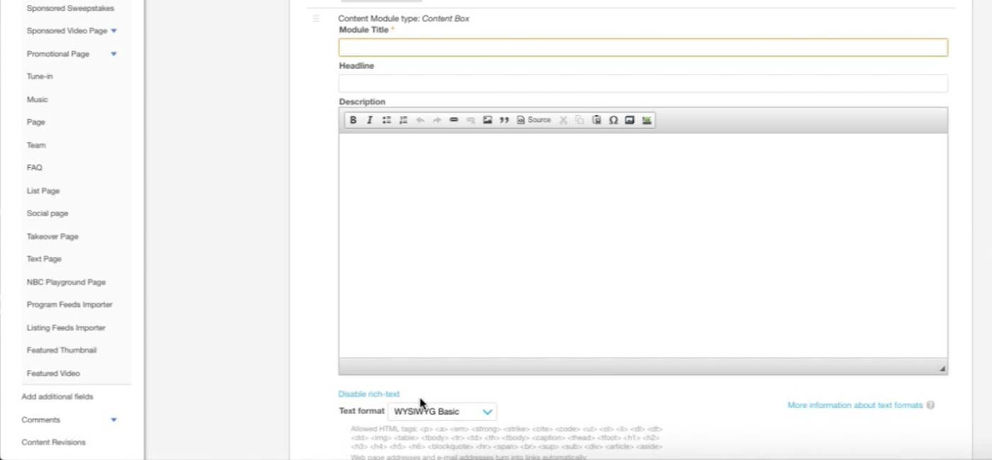
This is the Content Box module. Producer can enter text or any iFrames that sponsor asks to insert here.
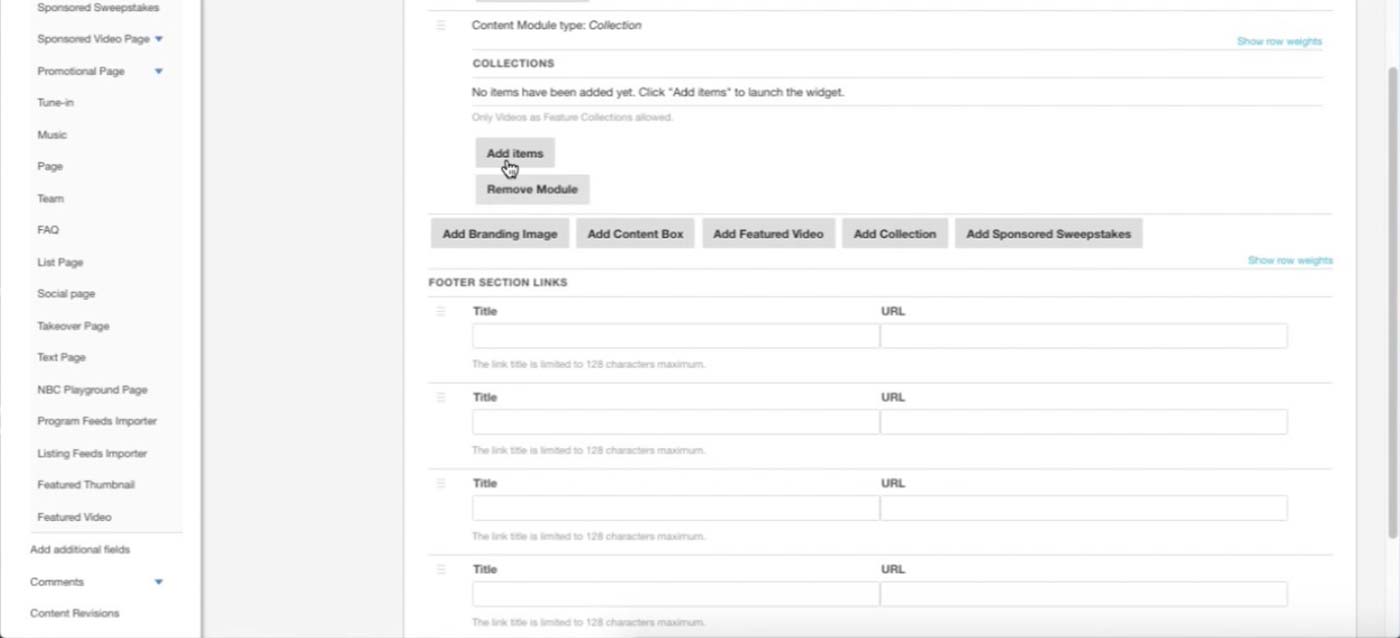
This is an example of the Collection module. Right now, producers can only add Videos to Collection, and they will be rendered as a playlist on the site.
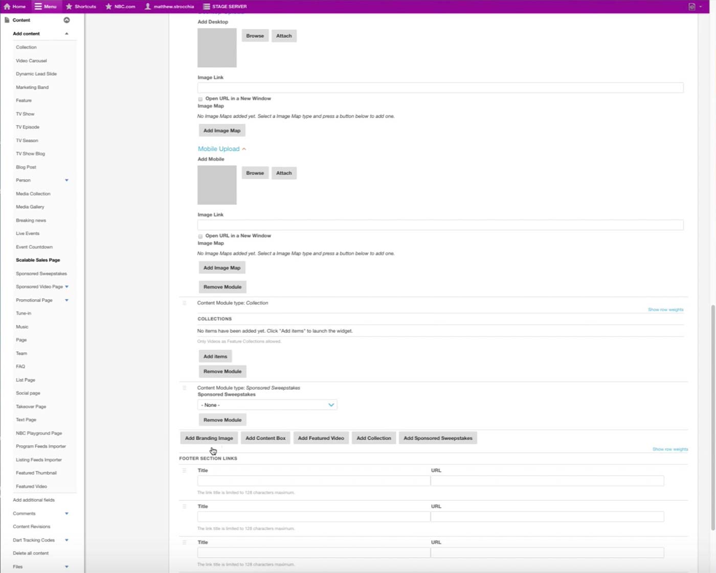
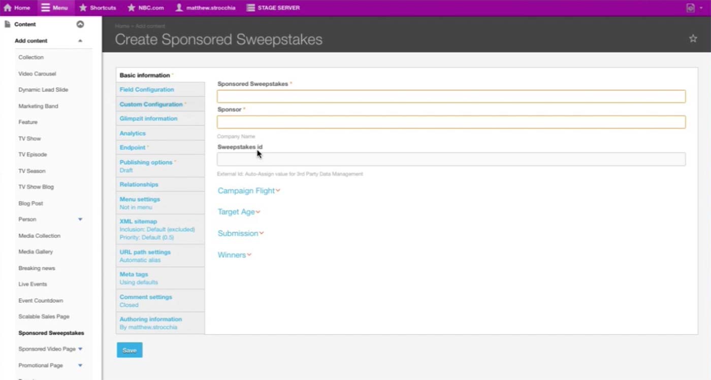
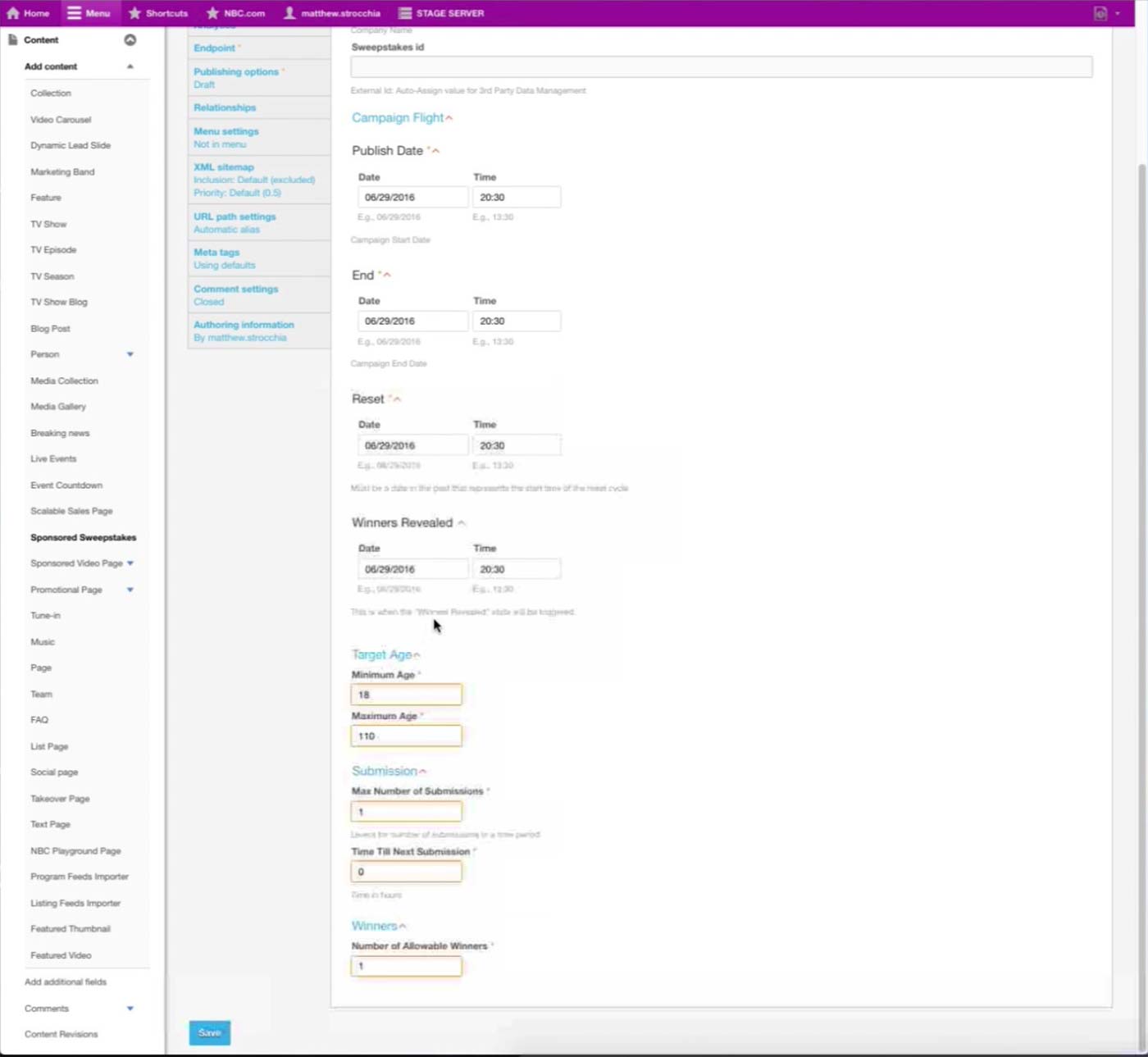
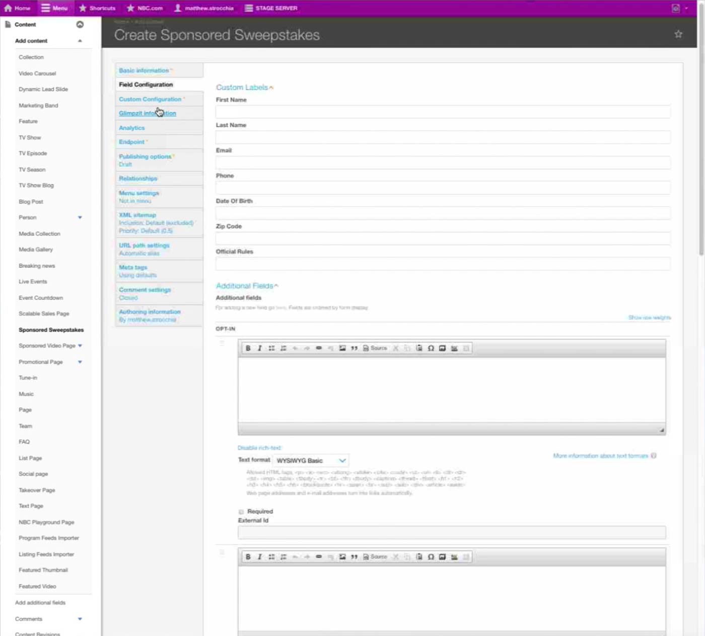
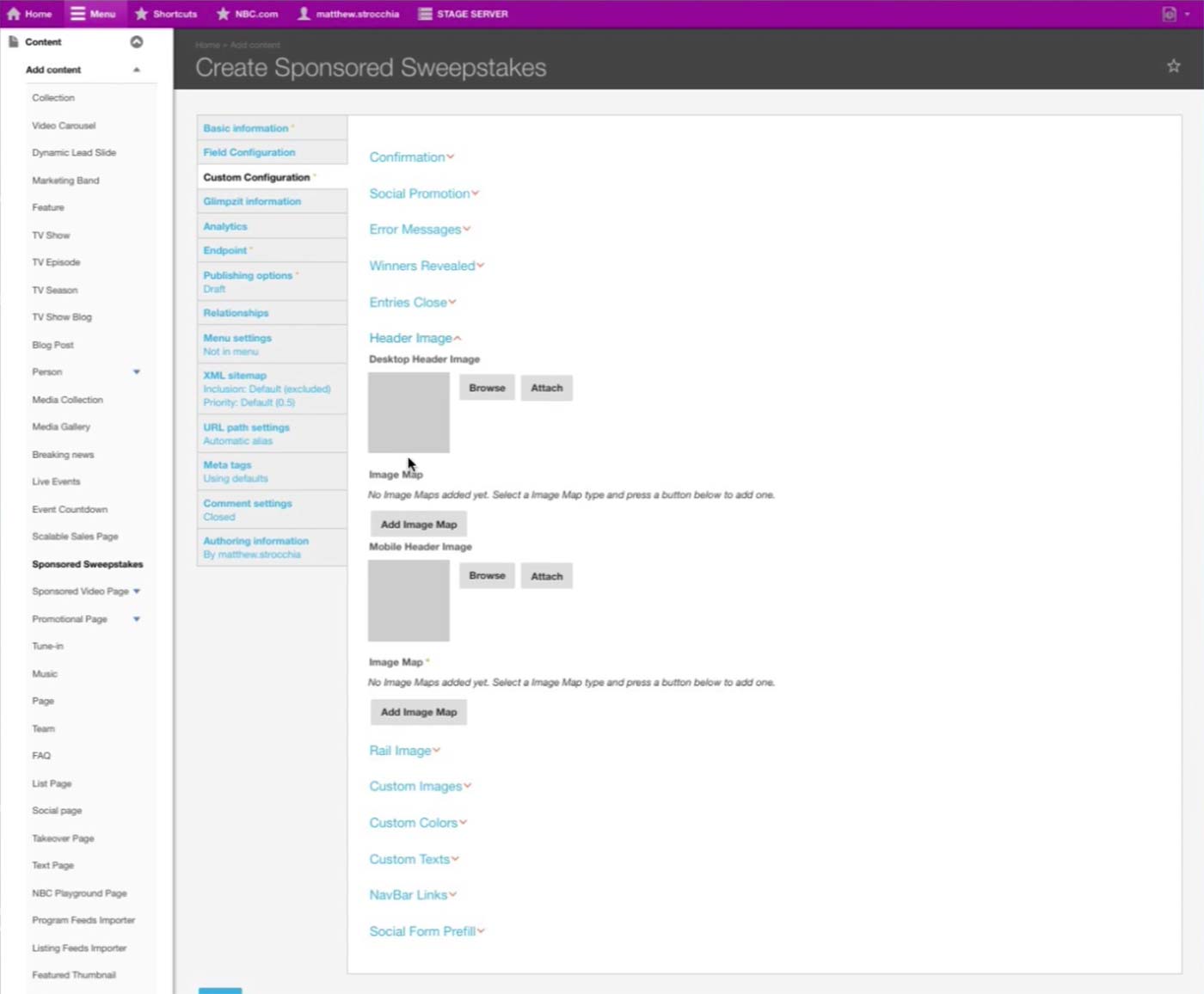
Finally, Sponsored Sweepstakes simply refers to a Sponsored Sweepstakes content type and displays the form in the site.
Once multiple modules are added, they can be dragged for rearranging. Sponsor often gives feedback regarding where content lives on the page, so producer would need to use this feature often.
Other module
Featured Video: Featured video player on the page.
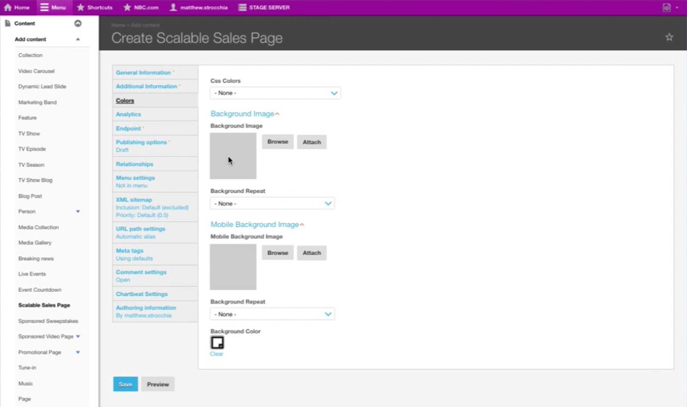
In the Colors tab, producer sets Background images for different platform/sizes.
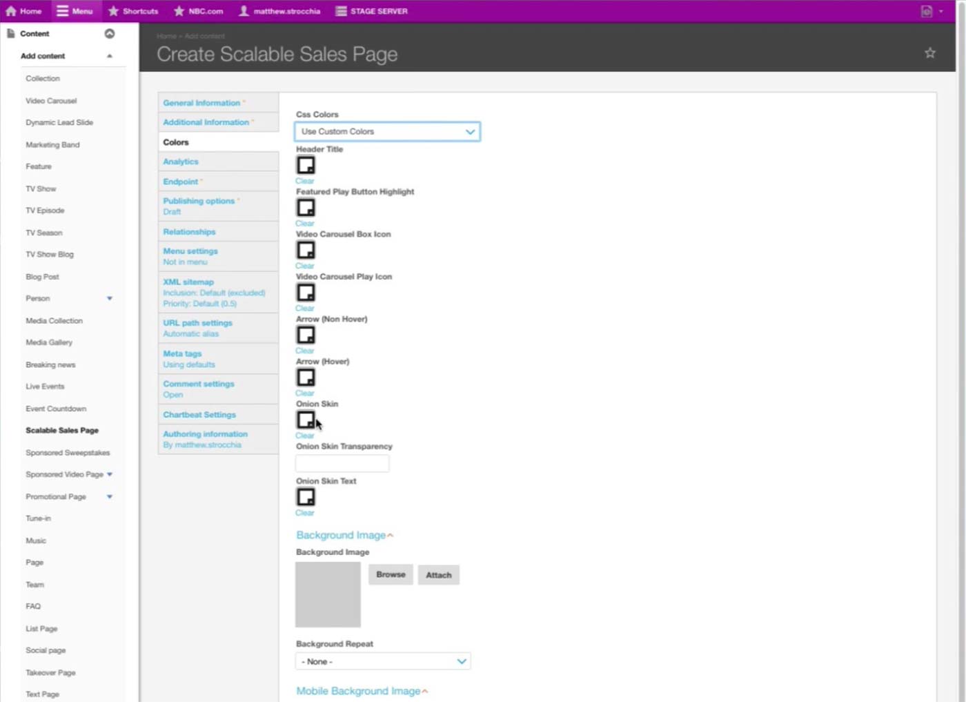
Once Use Custom Colors option is selected under CSS Colors, then color selectors for each fields appear.
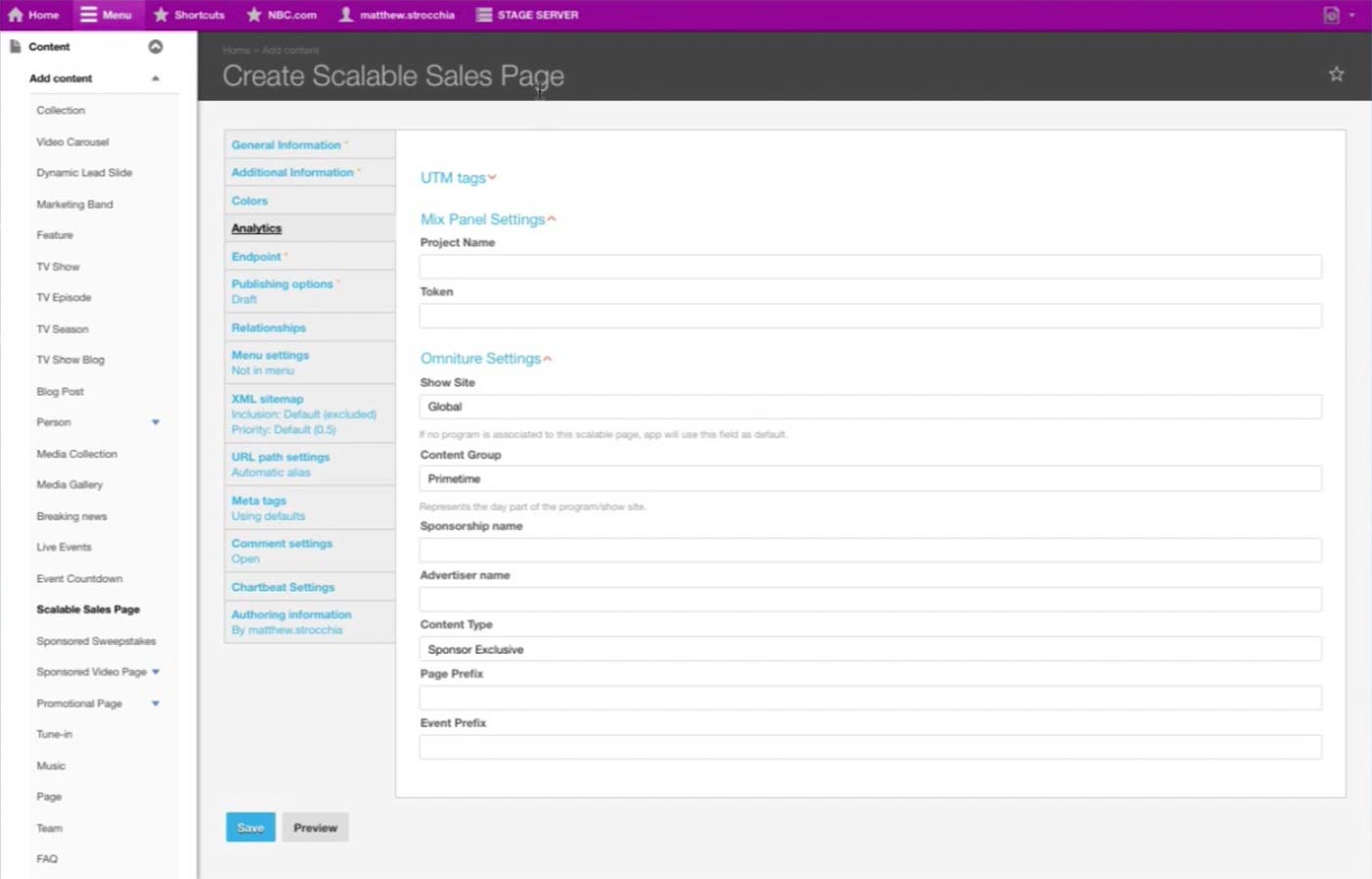
In the Analytics tab, Product Managers put in the analytics information specific to the page. It is important to override the default Analytics information with the sponsor’s.
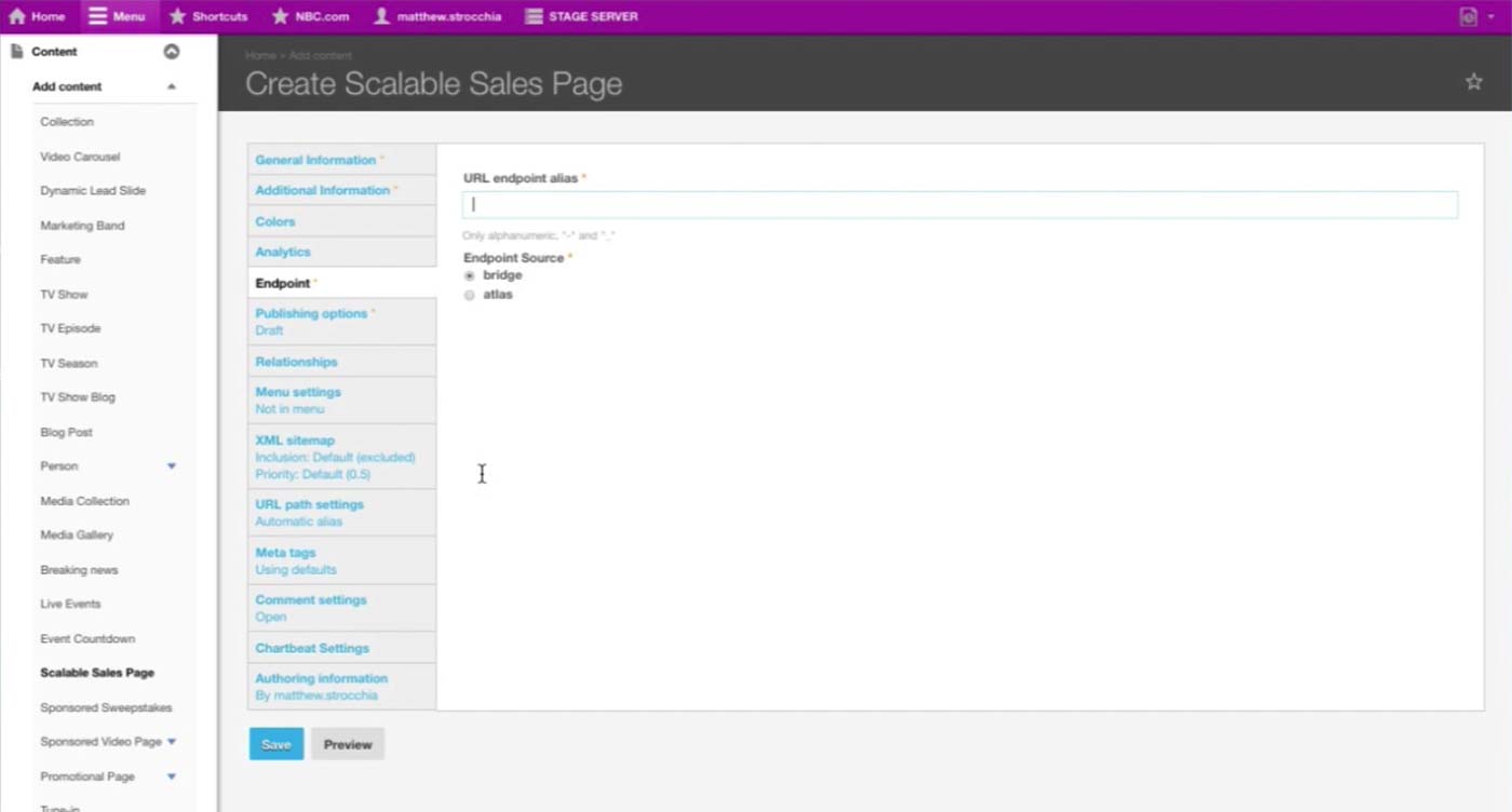
Endpoint tab has additional required information, which the Product Manager we interviewed wasn’t sure of the functionality.
For future reference, here are some screenshots of how the Sponsored Sweepstakes Content Type looks like. (1/4)
(2/4)
(3/4)
(4/4)
Catchall Page & Microsite Next Steps
Catchall Page &
Microsite Next
Steps
Microsite Next
Steps
We will consult the Engineering team and explore further on the feasibility and implications of using the same Content Type for similarly functioning pages.
Then, we will conduct Ideation Session and User Testing (2-3 weeks) to create a prototype and validate our workflow and UI.
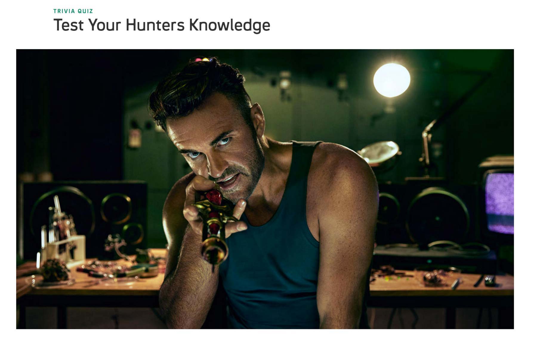
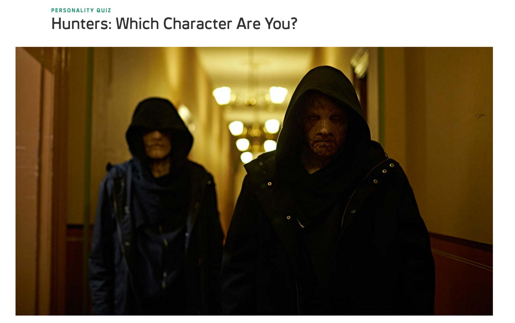
Quiz Introduction
Quiz Introduction
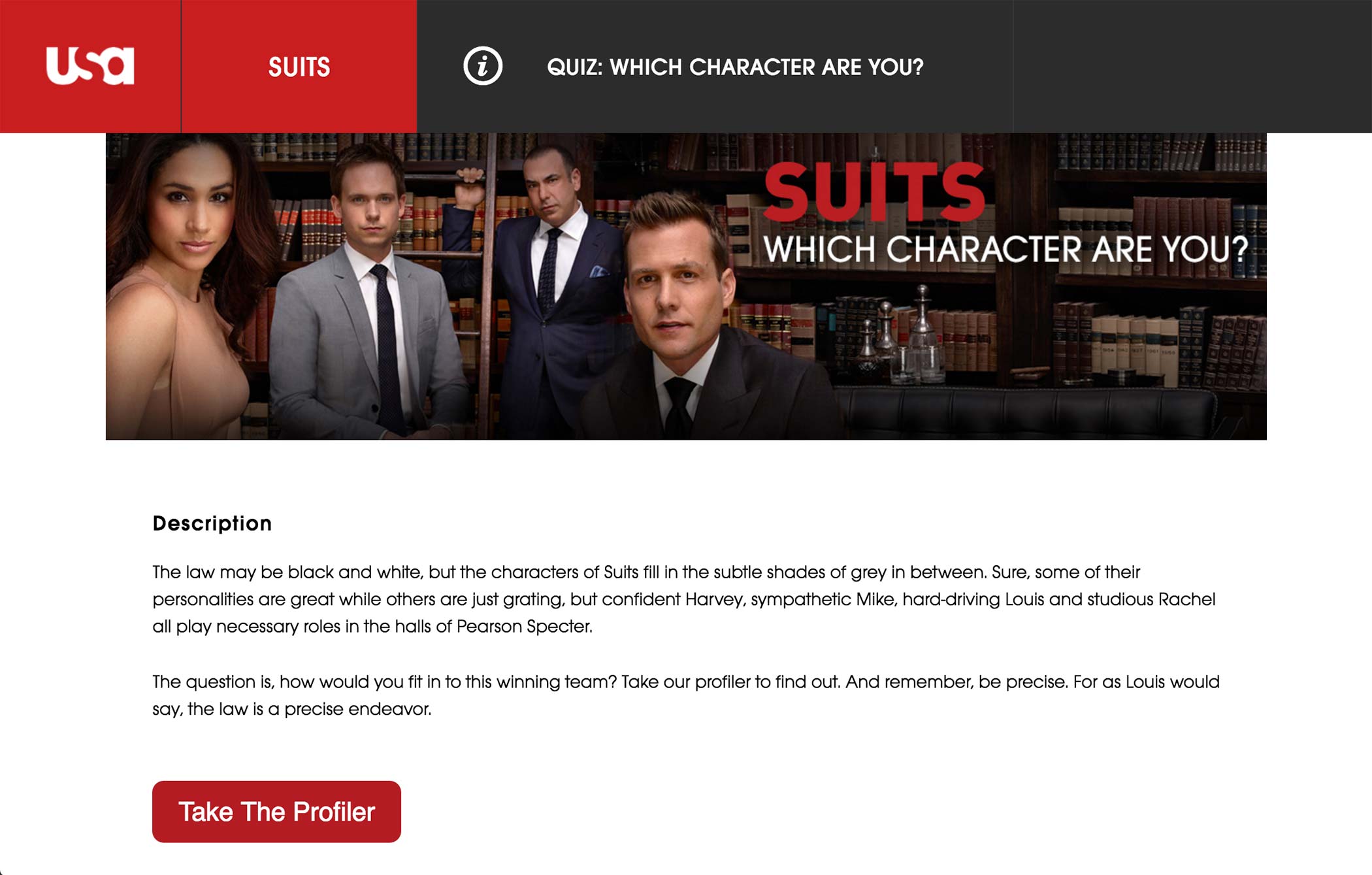
Quiz offers an interactive content where user can answer to questions about a show or about themselves.
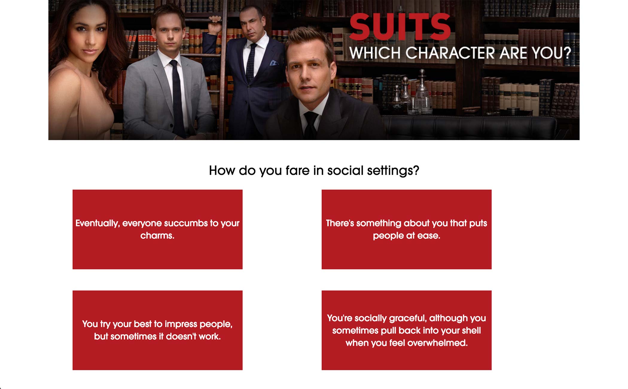
Each question has multiple answer choices, and the user selects what the answer is. Upon selecting an answer, next question appears.
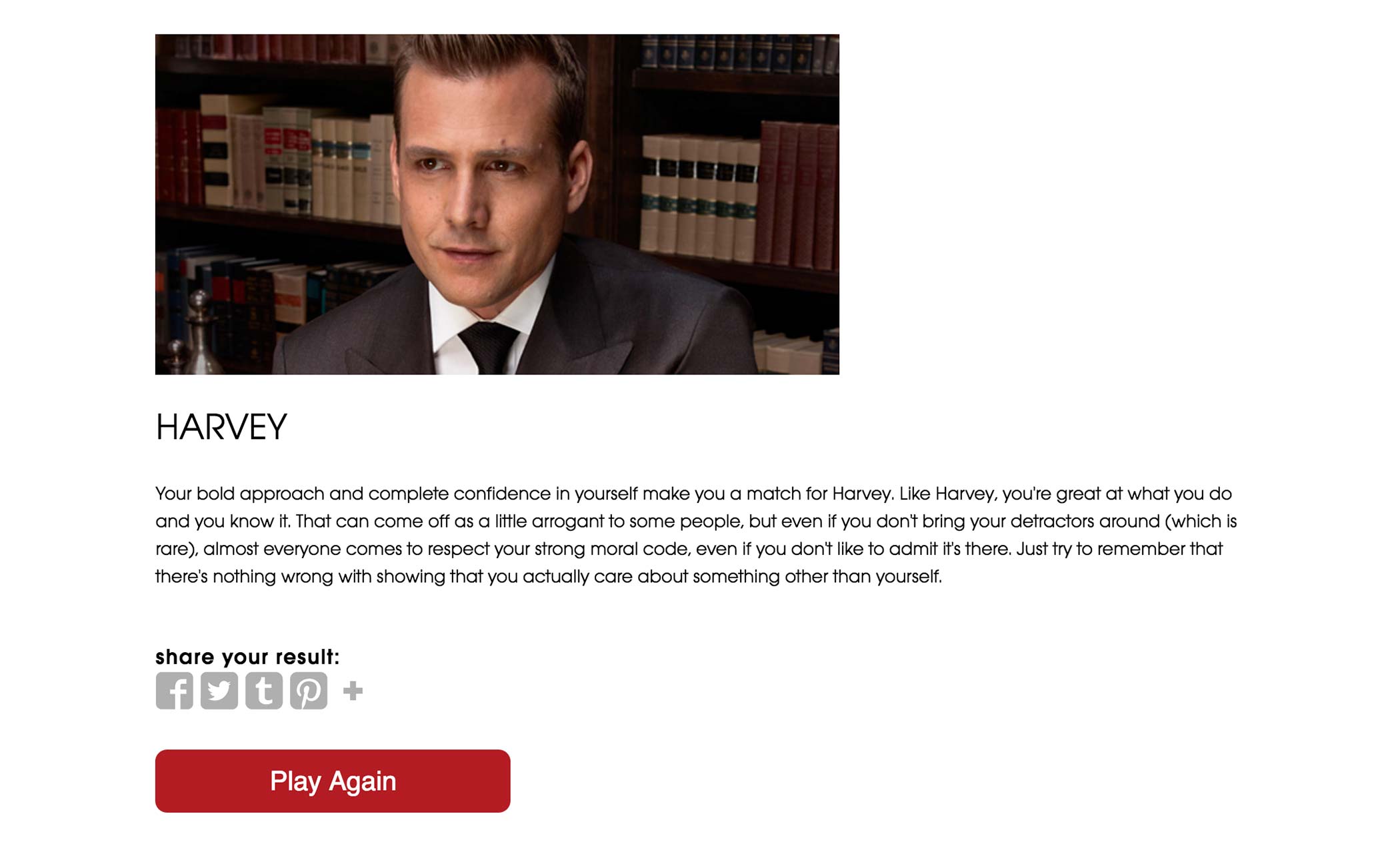
At the end of the quiz, the user sees the result of the quiz, whether it be a score or a character’s profile.
Quiz Current Workflow
Quiz Current
Workflow
Workflow
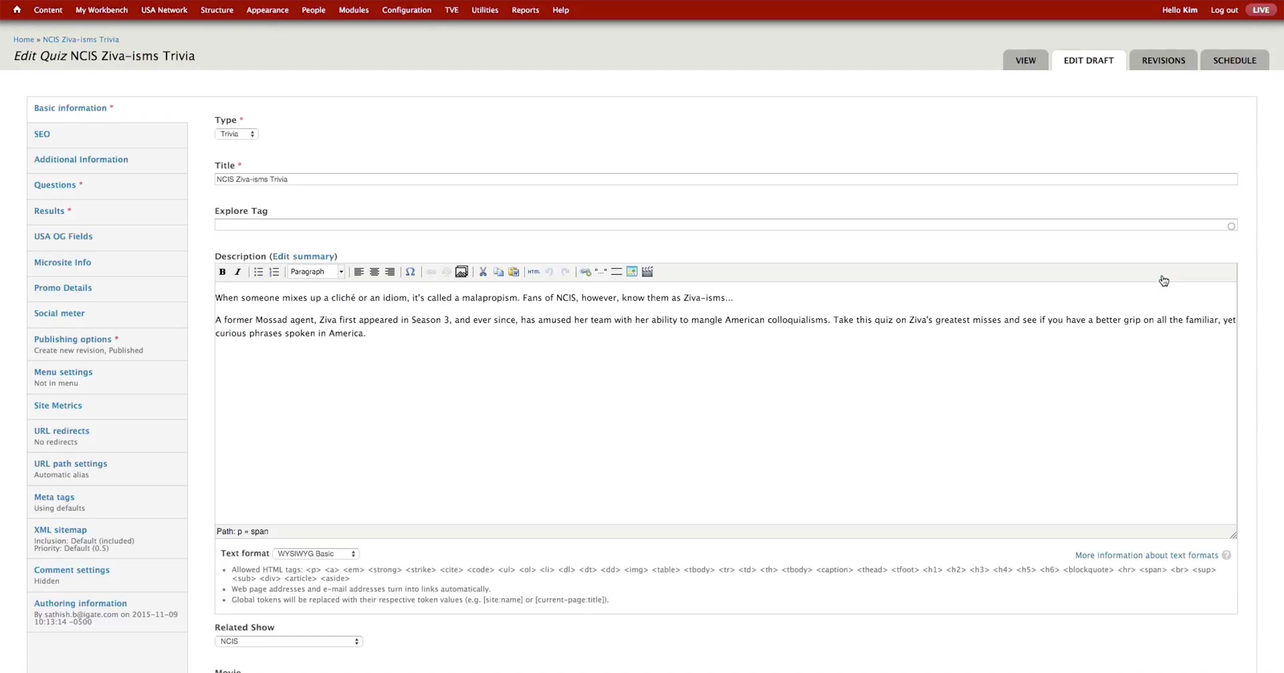
On the initial screen, producer chooses the type of the quiz - Trivia or Profiler. Trivia counts the number of questions the user got right and shows appropriate messages depending on the number. Profiler lets the user know which character is the most similar to them based on the user’s answers.
Producer enters Title, Description, and related show or movie.

In Additional Information tab, producer sets the images to be used on the front page of the quiz.
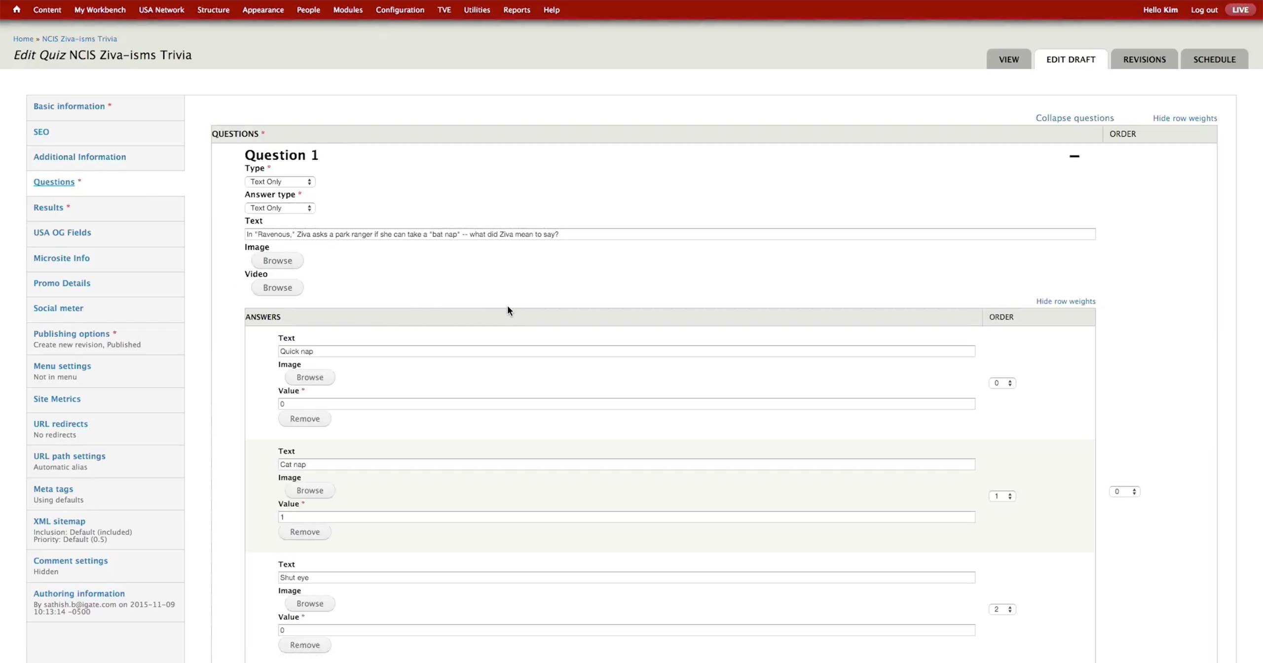
In the Questions tab, producer pastes the questions and values she got from the content writers.
- Type: Has Text Only, Image Only, Image and Text, Video Only, and Video and Text options. USA doesn’t use video option.
- Answer Type: Has Text Only, Image Only, and Image and Text options.
- Text: Question itself.
- Browse buttons: They are activated when the appropriate options are selected for Type.
- Answer Text: Text for the answer option.
- Value: For Trivia, the right answer is marked with 1 and the wrong with 0.
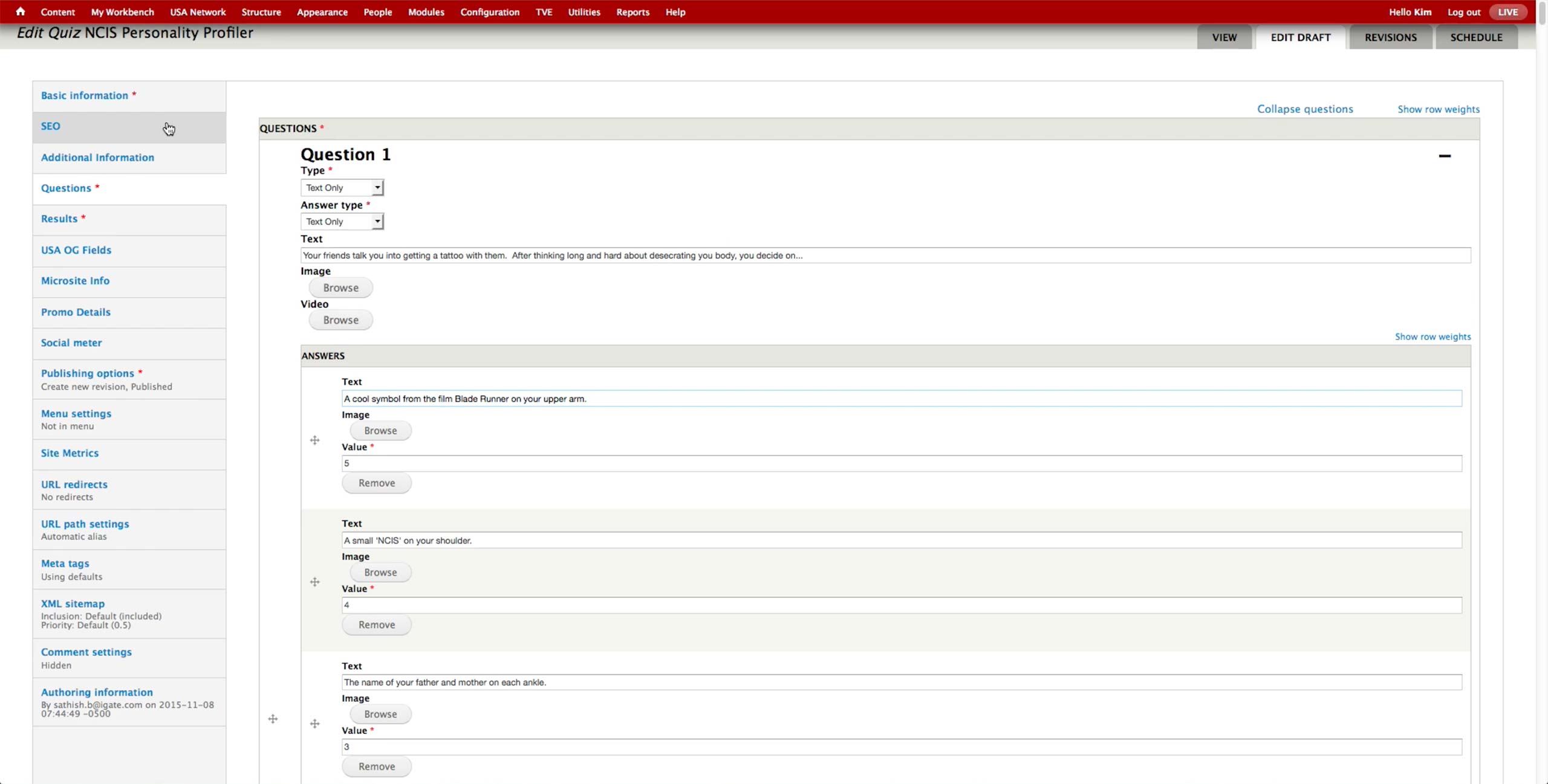
- Value: For Profiler, each answer gets a certain value, anywhere from 1 to 5 or more. At the end of the quiz, the values are added up to fall in a range of a specific character.
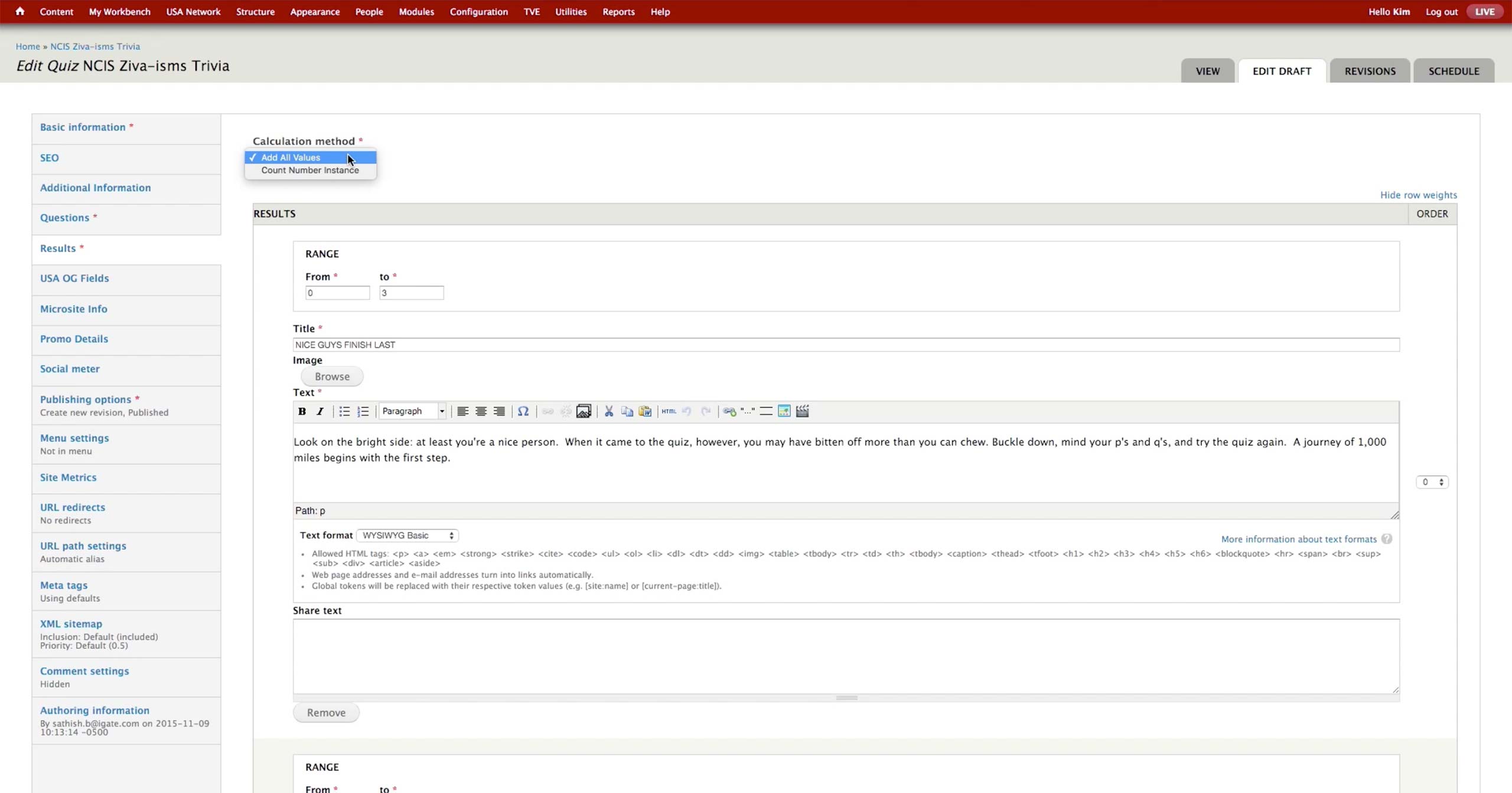
In the Results section, producer sets the Calculation method. USA uses Add All Values option only at the moment.
Results are consisted of the following fields:
- Range: Sets the value range for the sum of values.
- Title: Title of the result.
- Image: The image that appears at the top of the result.
- Text: The text that accompanies the result.
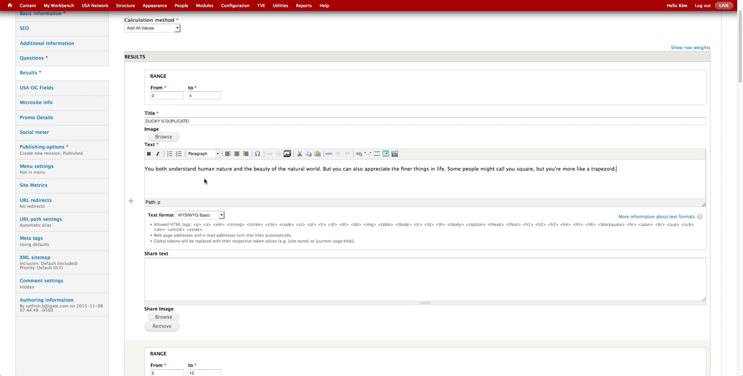
The layout is the same for the Profiler Quiz, just the text would have different content with Character’s name inside.
Quiz New Workflow
Quiz New
Workflow
Workflow
Concerto has already identified Quiz as a necessary feature. Details on the user interface is to be determined.
On top of Trivia and Profiler quizzes, we are considering having more templates for additional type of quiz, e.g. Swiper, Gallery Quiz, etc. Tech admin from each brand can configure which templates to be exposed in the CMS, depending on the use case of each brand.
Also, we will explore the better logic to generate results of the quiz. Instead of the results of the profiler quiz depending on the sum of the values from answer choices, the answer choices would give points to each result options to generate more accurate result.
Quiz Use Cases For Other Brands
Quiz Use
Cases For
Other Brands
Cases For
Other Brands
Like USA, Syfy offers two type of quizzes: Trivia and Personality. Trivia tests how many questions the users get right and shows the appropriate image and text as a result.
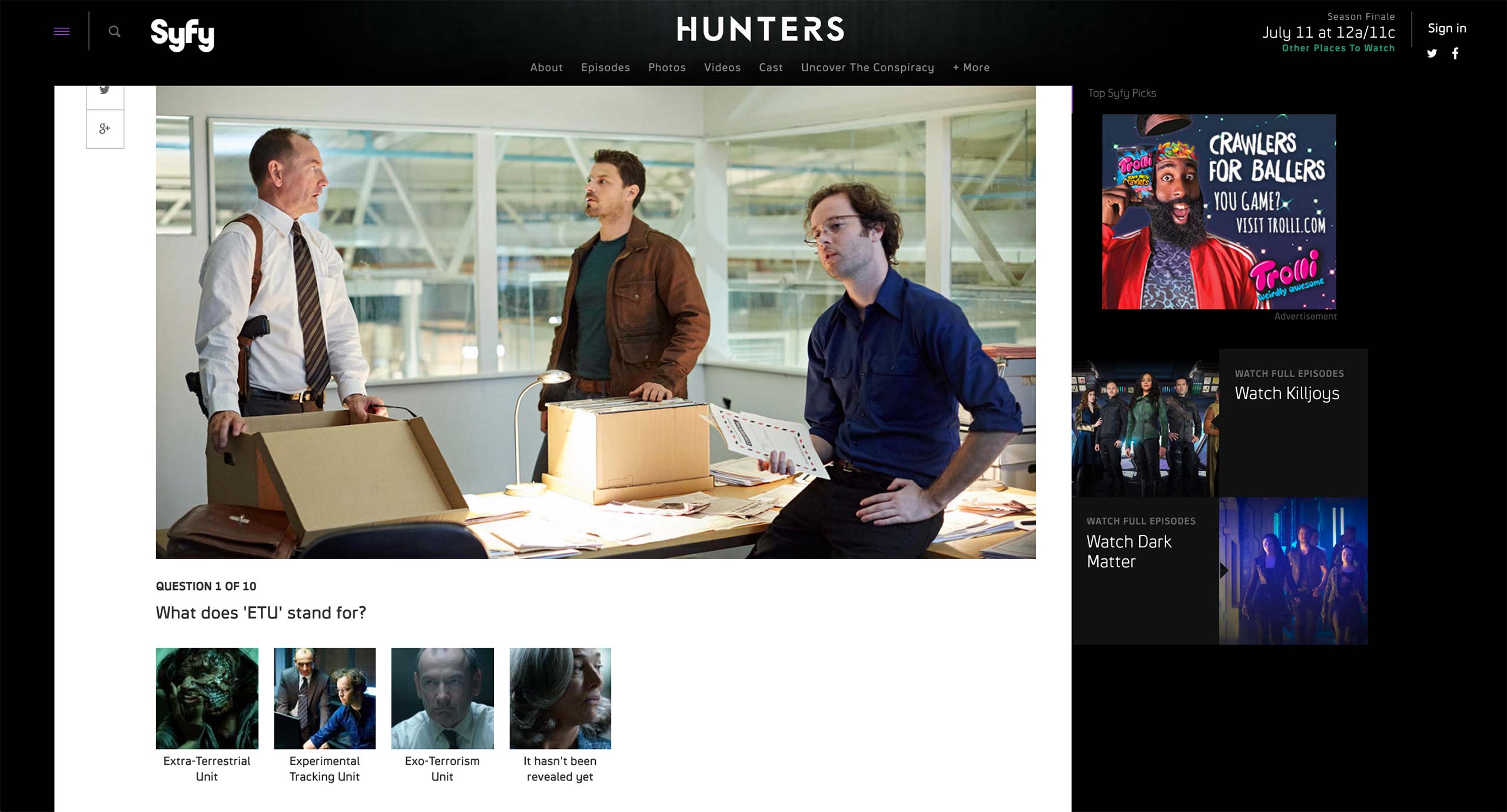
Each question features a question and multiple choices with image and text.
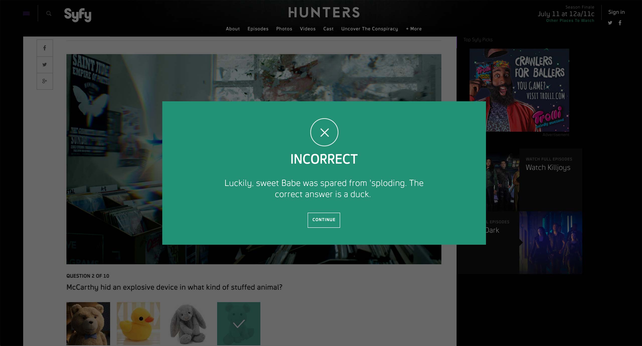
Depending on whether the selected answer is correct or not, the quiz shows a prompt with custom text per choice.
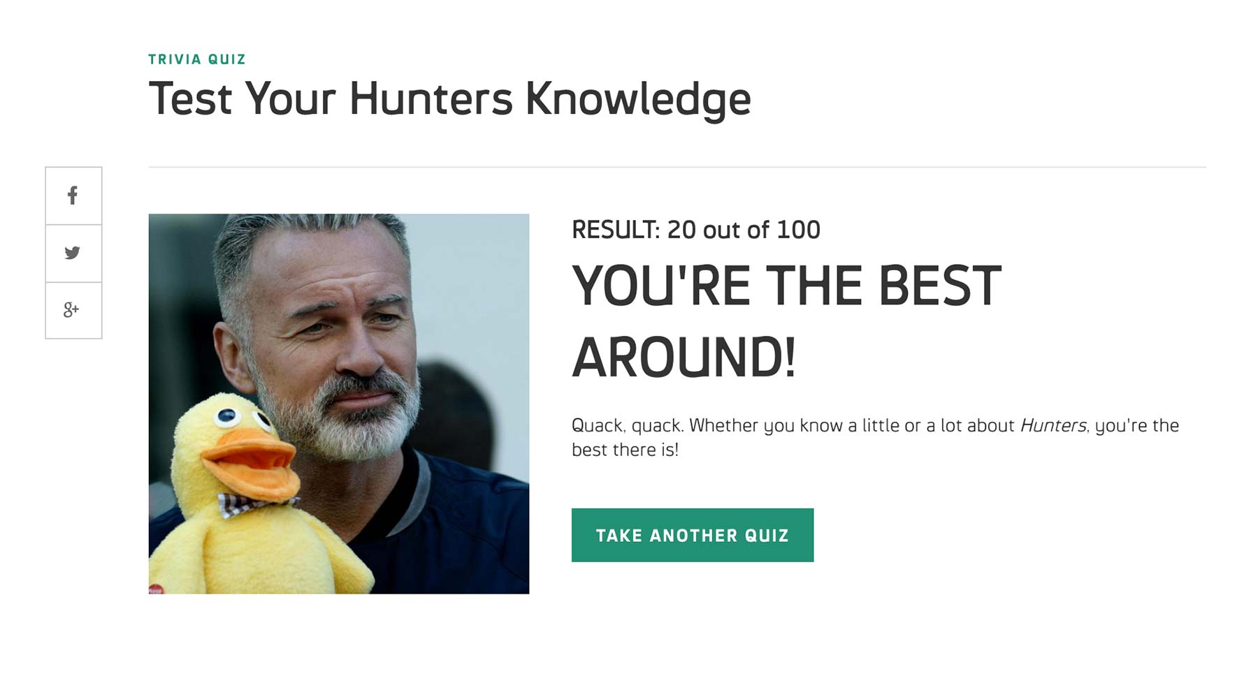
Final result shows the score and custom image and text based on how many questions the user got right.
Personality shows what character the user is the closest to based on the response. The components on the landing page is the same with the Trivia.
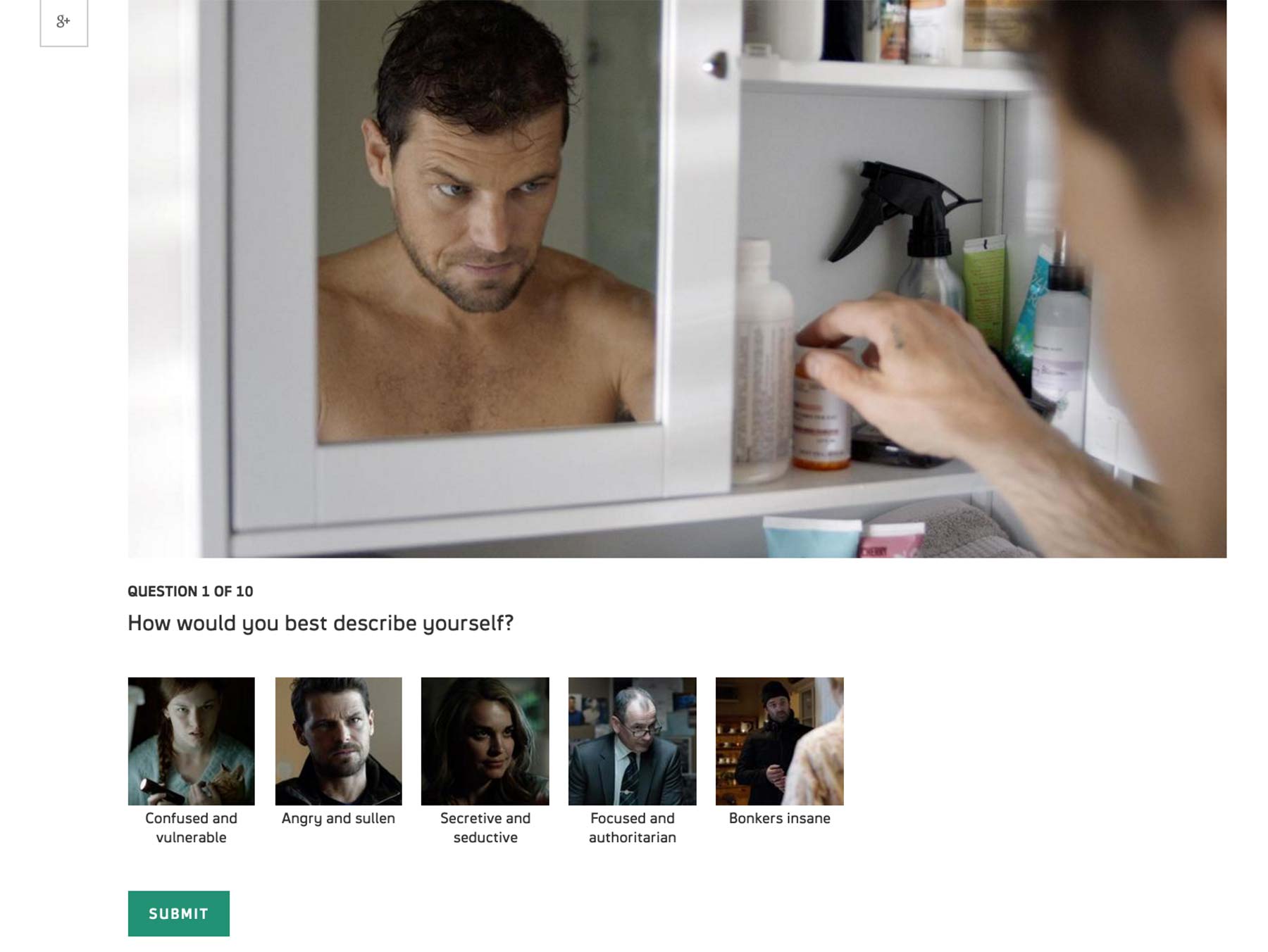
Also like Trivia, multiple options per question appear with image and text.
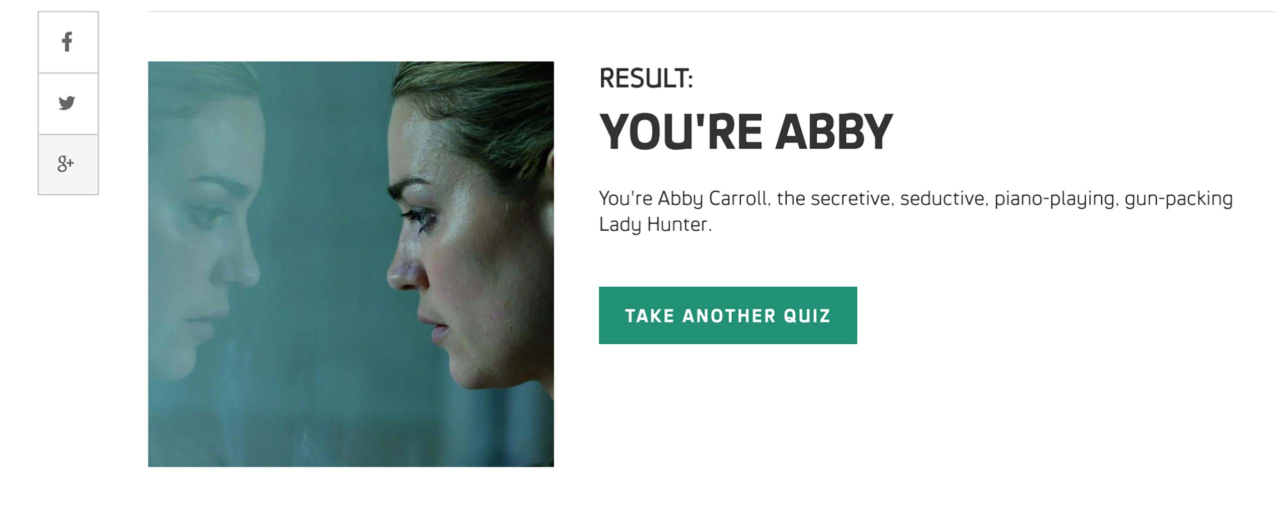
At the end of the quiz, user sees a character’s photo and some description as a result.
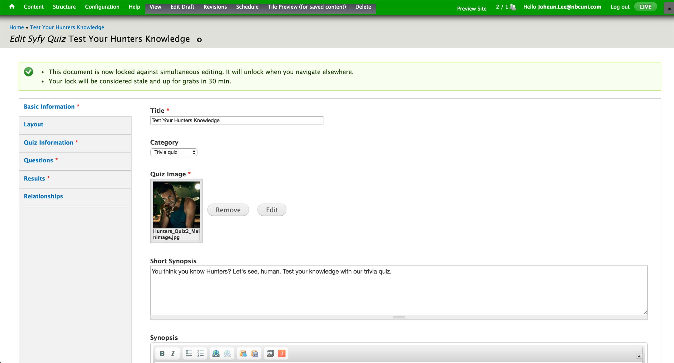
To create a quiz, producer selects to create new Syfy Quiz Content Type. In the Basic Information tab, he sets the title, category, image, and synopsis of the quiz. There are Trivia and Personality quizzes under the Category dropdown. Category, Image and Synopsis appear on the landing page of the quiz.
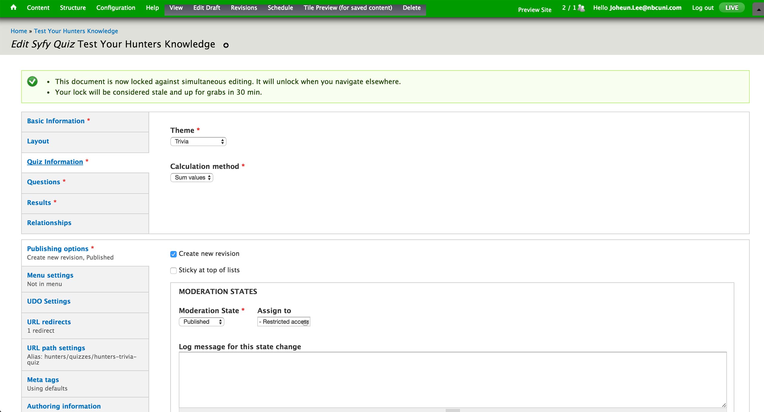
In the Quiz Information tab, producer sets the theme of the quiz to be Trivia, Multi-paged quiz, or Single-paged quiz. Trivia theme would display the pop-up feedback, whereas the latter two would only show the result at the end of the quiz.
Right now, there is only Sum value under Calculation method.
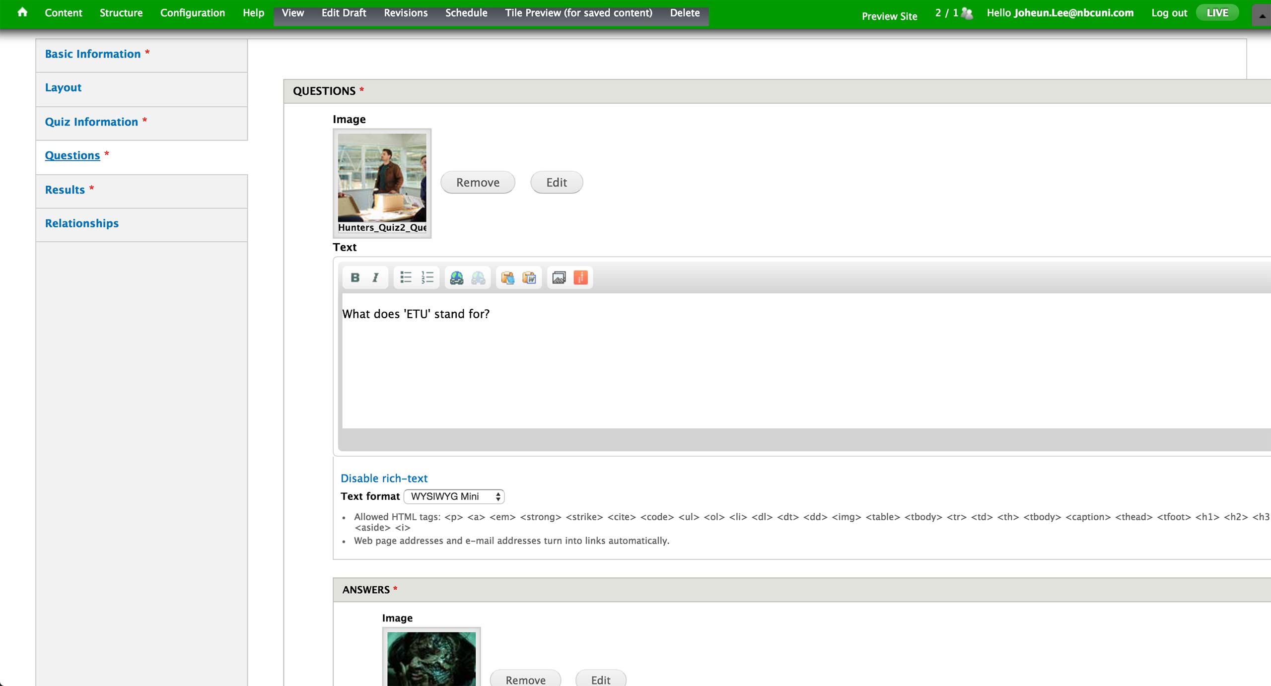
Under Questions tab, producer can add as many questions as they want; but there are usually 10 questions so that the result would be out of 100 points, 10 points per correct answer. Each question features an image and accompanying text.
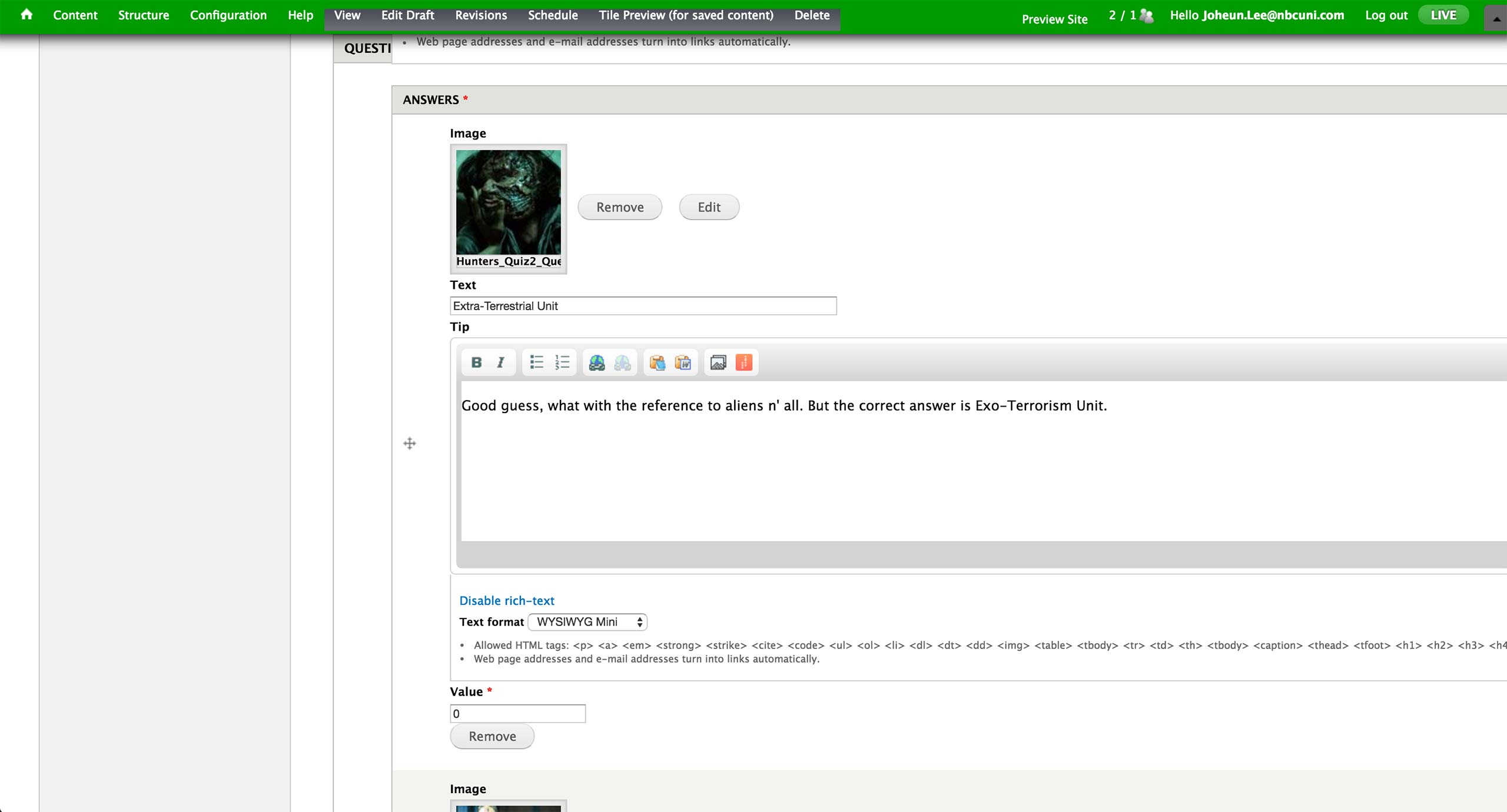
For Trivia quiz, Values for the correct answer is 10 and incorrect 0. Tip becomes the customized pop-up screen message.
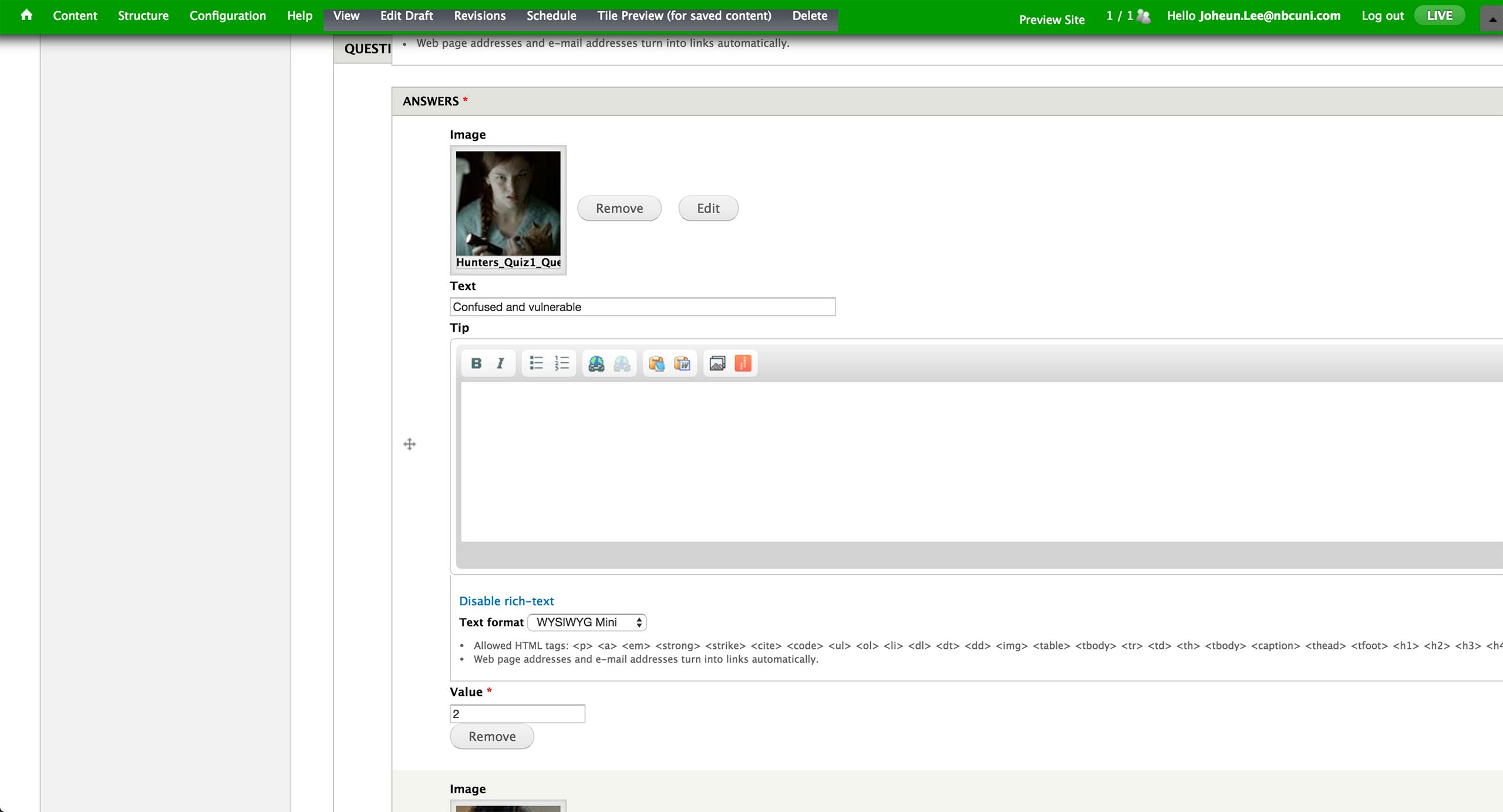
For Personality quiz, Tip is left empty and Value ranges from 2 to 10, in increments of 2. All the text and values are given by the writers, and result is calculated by the sum of these values.

The result section for both type of quizzes looks identical - each result gets a range of numbers within 0 to 100, image, title, and text.

Finally, an association to a show and season is made under Relationships tab.
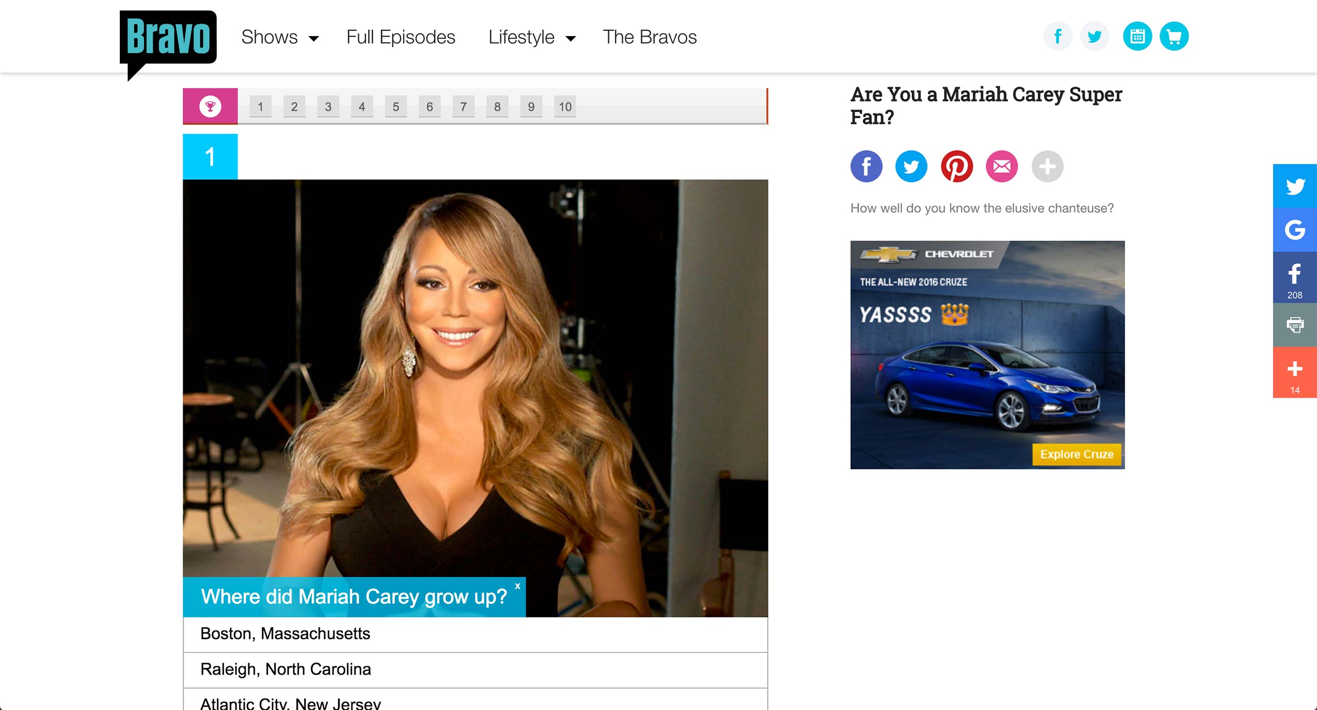
In Bravo, quizzes are powered by a 3rd party service called PlayBuzz. The embed code for the quiz simply gets pasted into a separate Game Content Type.
Bravo also has Vote content type, which works similar to quizzes - it merely acts as a wrapper for the embed code.
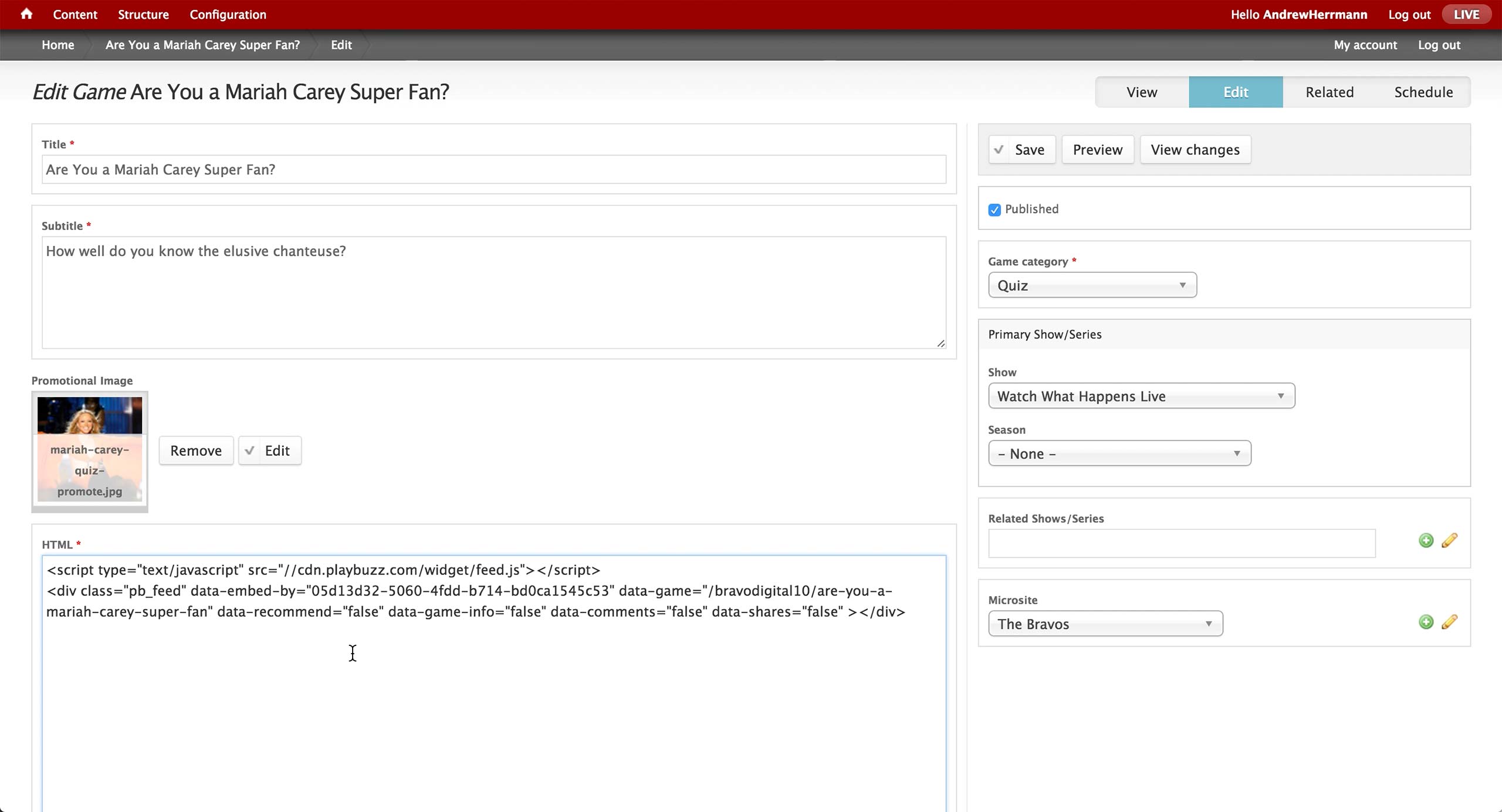
This is the screen of the Game Content Type in CMS. Title and subtitle are the text items that appears on the right rail in the quiz page, and promotional image will appear in the tiles once the quiz is promoted in a Layout.
On the right, producer sets the Game category to either Quiz or Puzzle. Recently, only Quiz option is used - Puzzle category holds legacy games involving heaving graphics.
Show and season associations are made appropriately, as well as any other related shows and microsites. The microsite association will display the microsite banner on the top of the quiz.
Then, the embed code from PlayBuzz gets inserted in the HTML field.
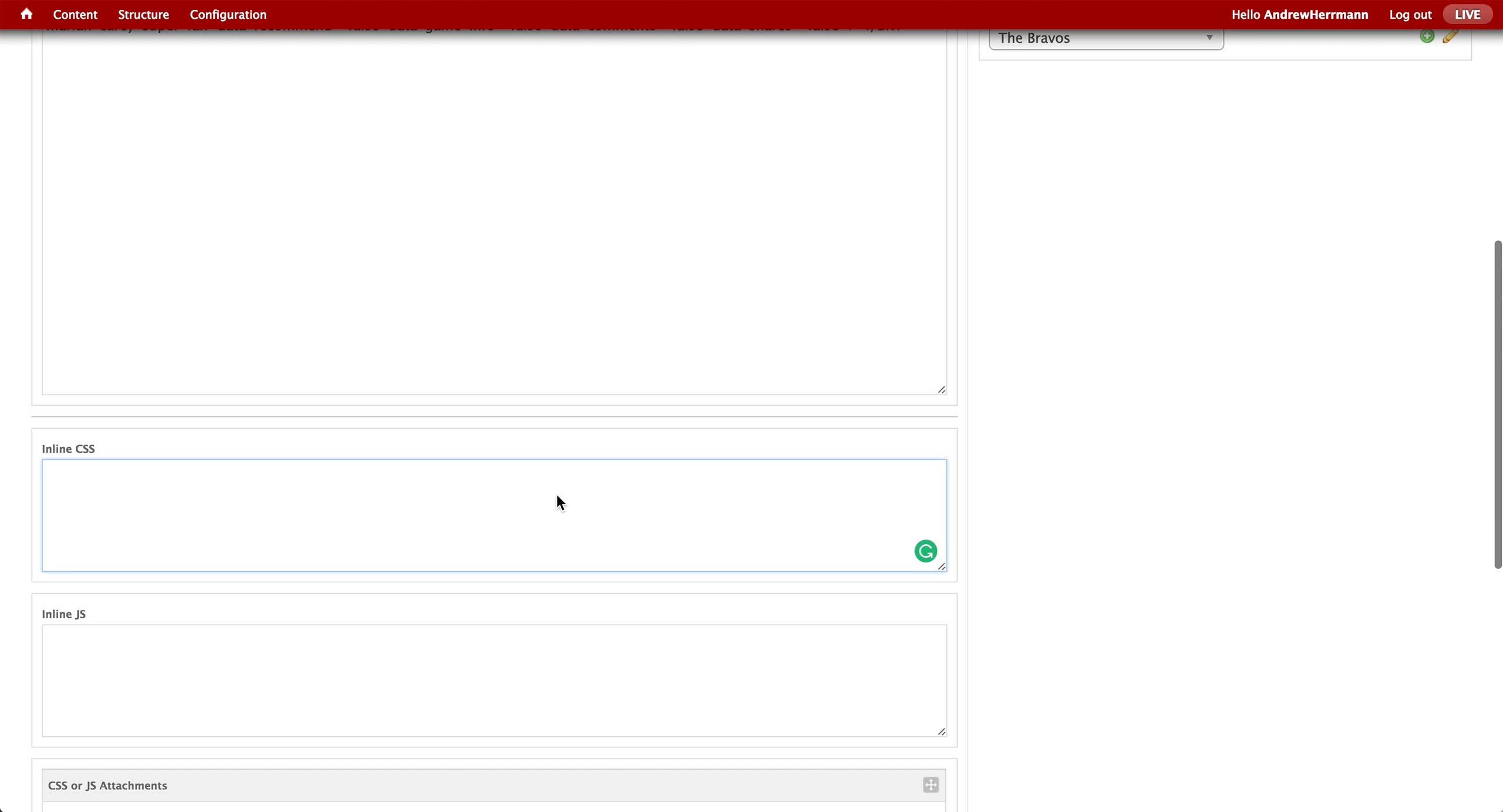
Below are custom CSS and JavaScript boxes in case more interactivity is required.
Quiz Competitive Analysis
Quiz Competitive
Analysis
Analysis
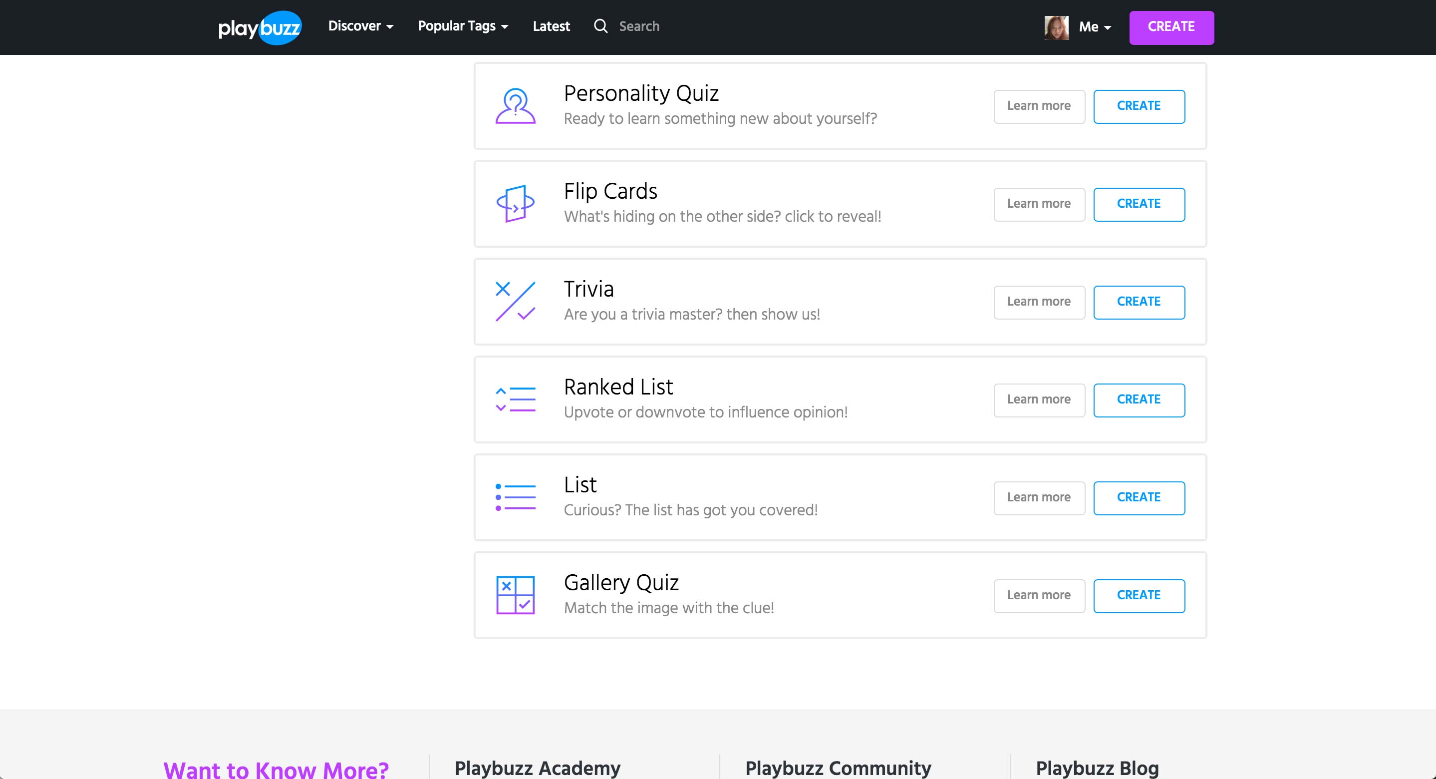
PlayBuzz
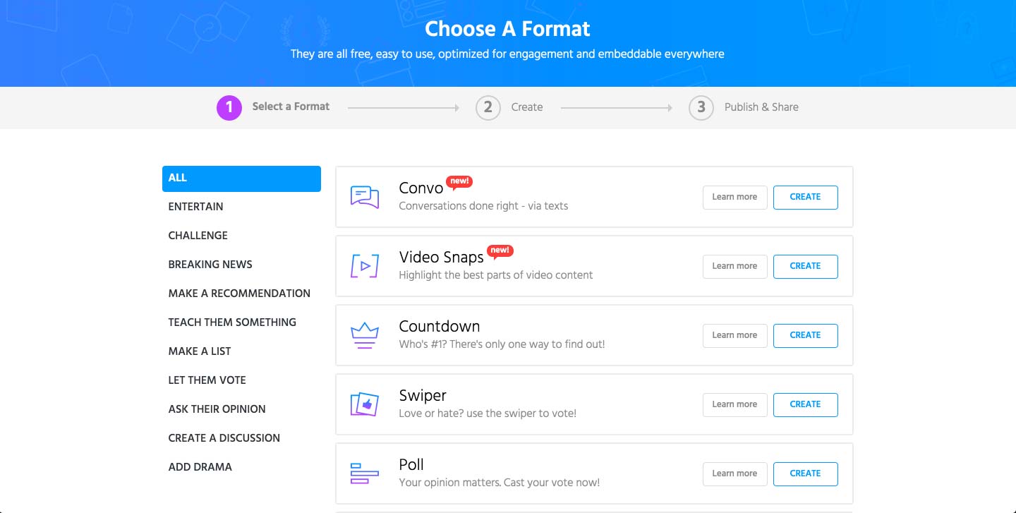
Playbuzz is the 3rd party service that Bravo uses for quiz.
Once the user clicks on a create button, it shows the 3 steps to take in order to create and publish the quiz. In the first step, it offers multiple formats of games that the brands can potentially use for more traction to their website.
More types of games featured in Playbuzz.
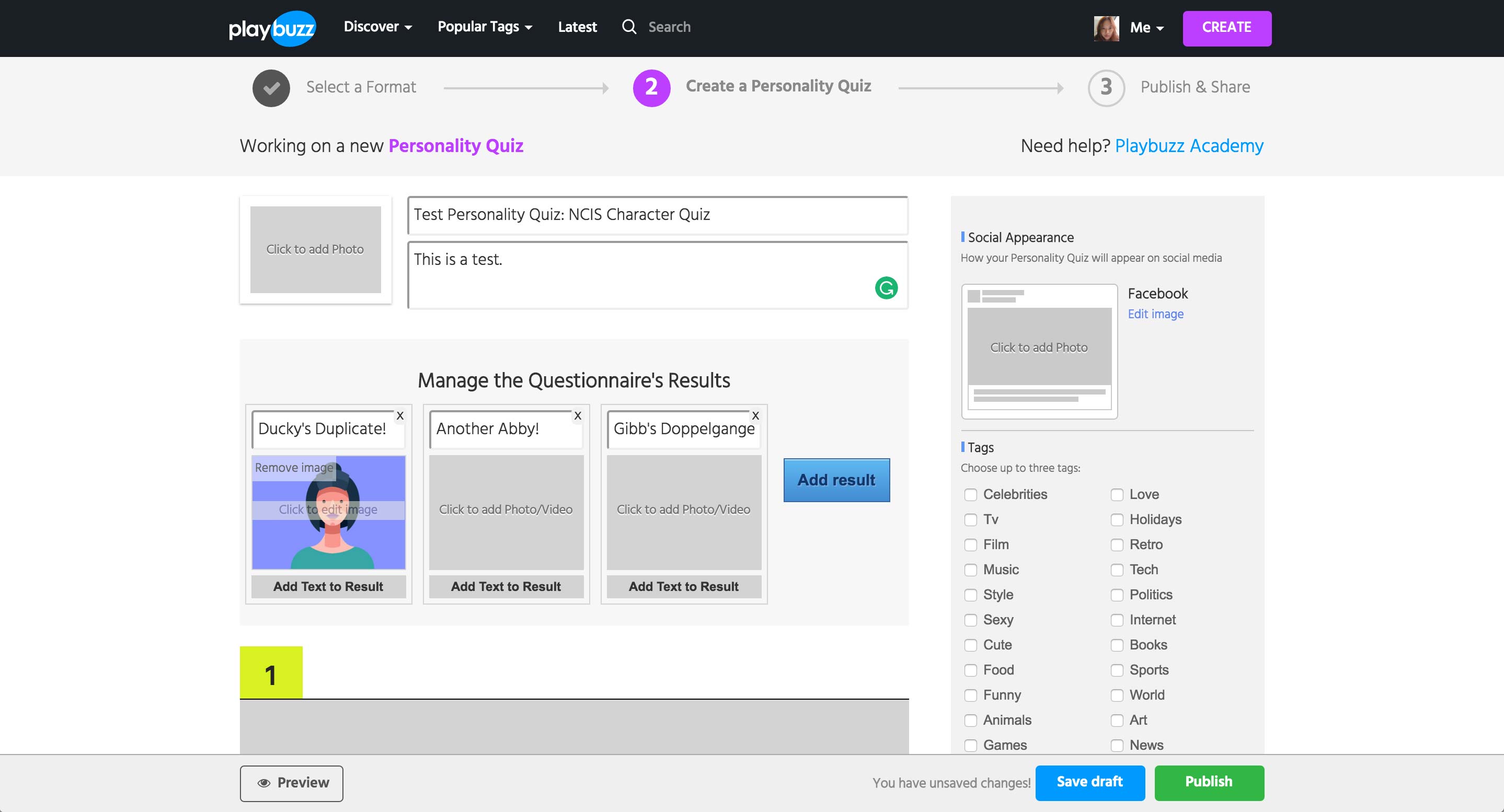
Once entering into Personality Quiz, user enters the title and description of the quiz.
In Personality Quiz, user needs to enter the Results first. Each result can have a title, a media item, and text.
Issue
Even when the text is entered, this view doesn’t show the full text nor whether if there is text entered.
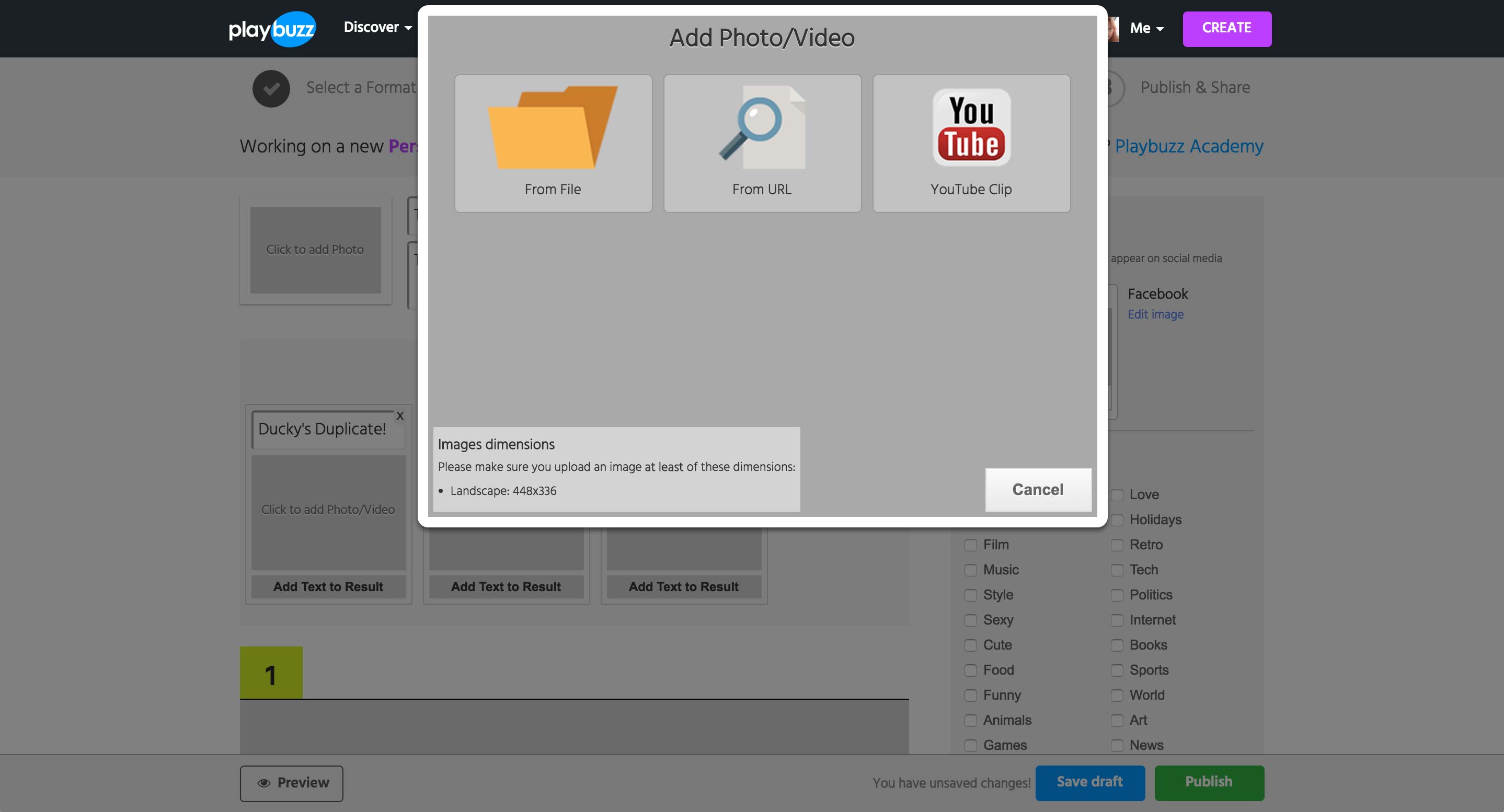
Clicking on any media area shows this popup to upload from local or paste in the URL of the asset.
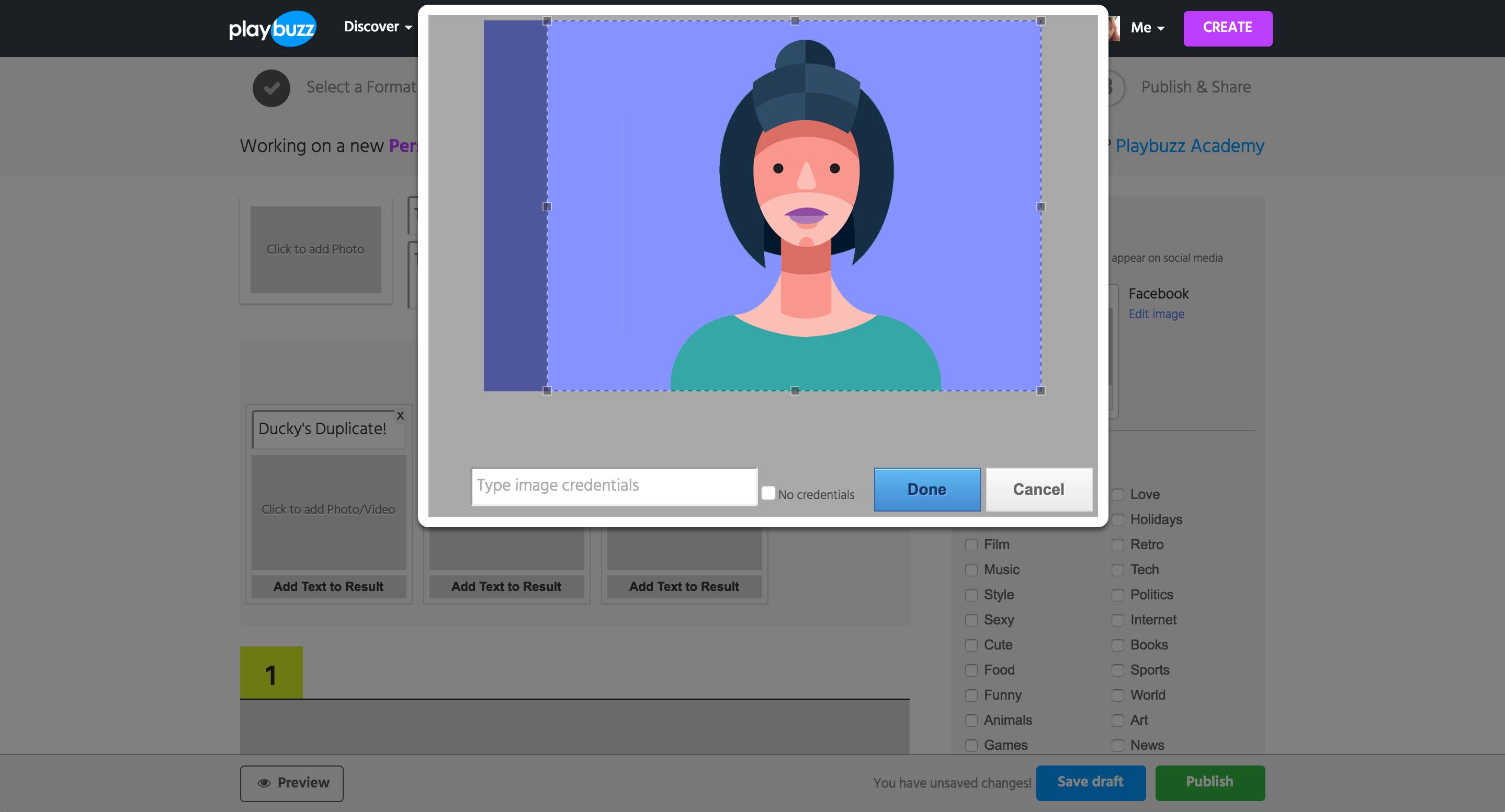
Uploading or using the URL of a Photo will show a cropping tool as well as the credential field. If the image is from an URL, the field is automatically filled with the image’s URL.
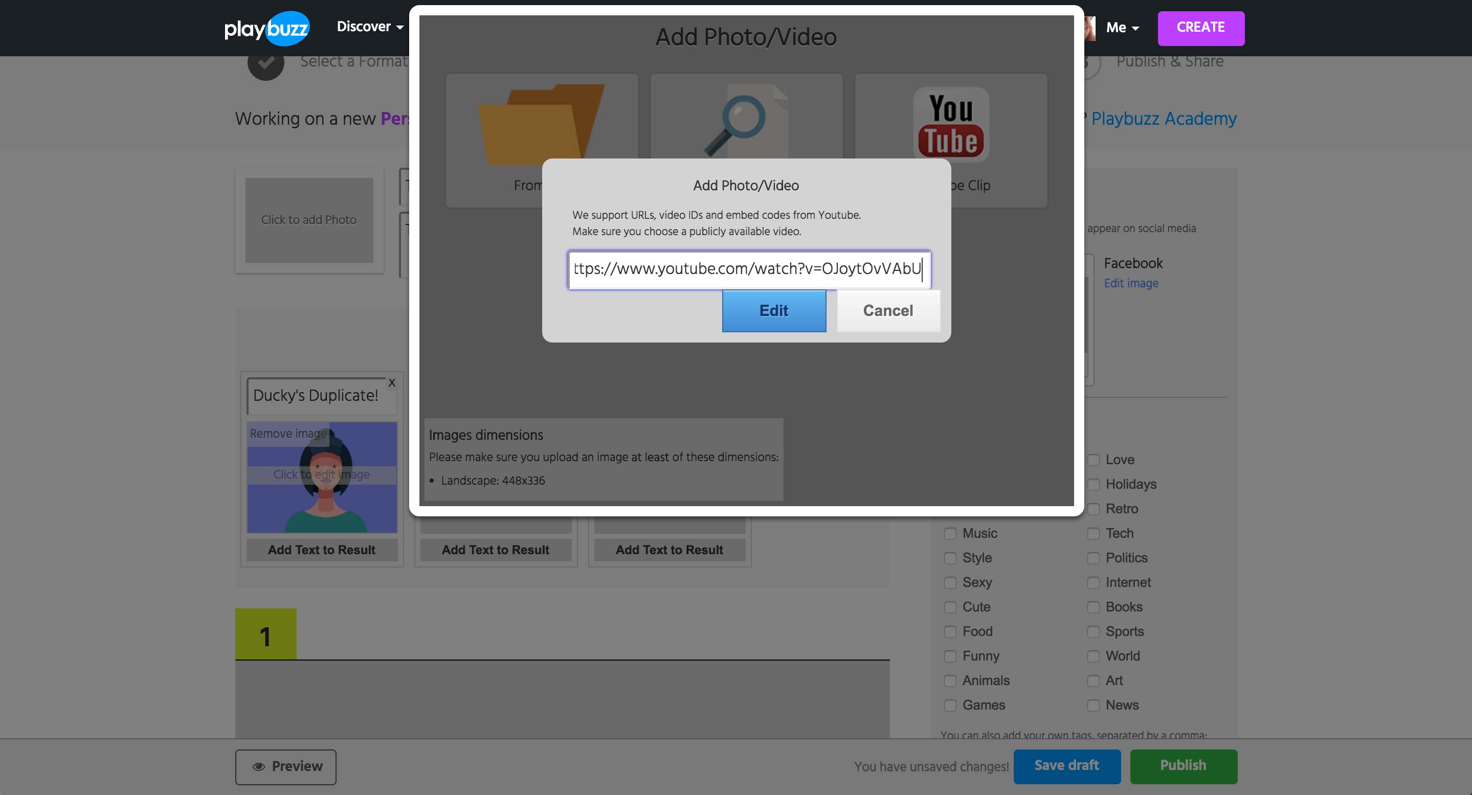
When the YouTube option is selected, a field to enter either the URL, video ID, or the embed code appears.
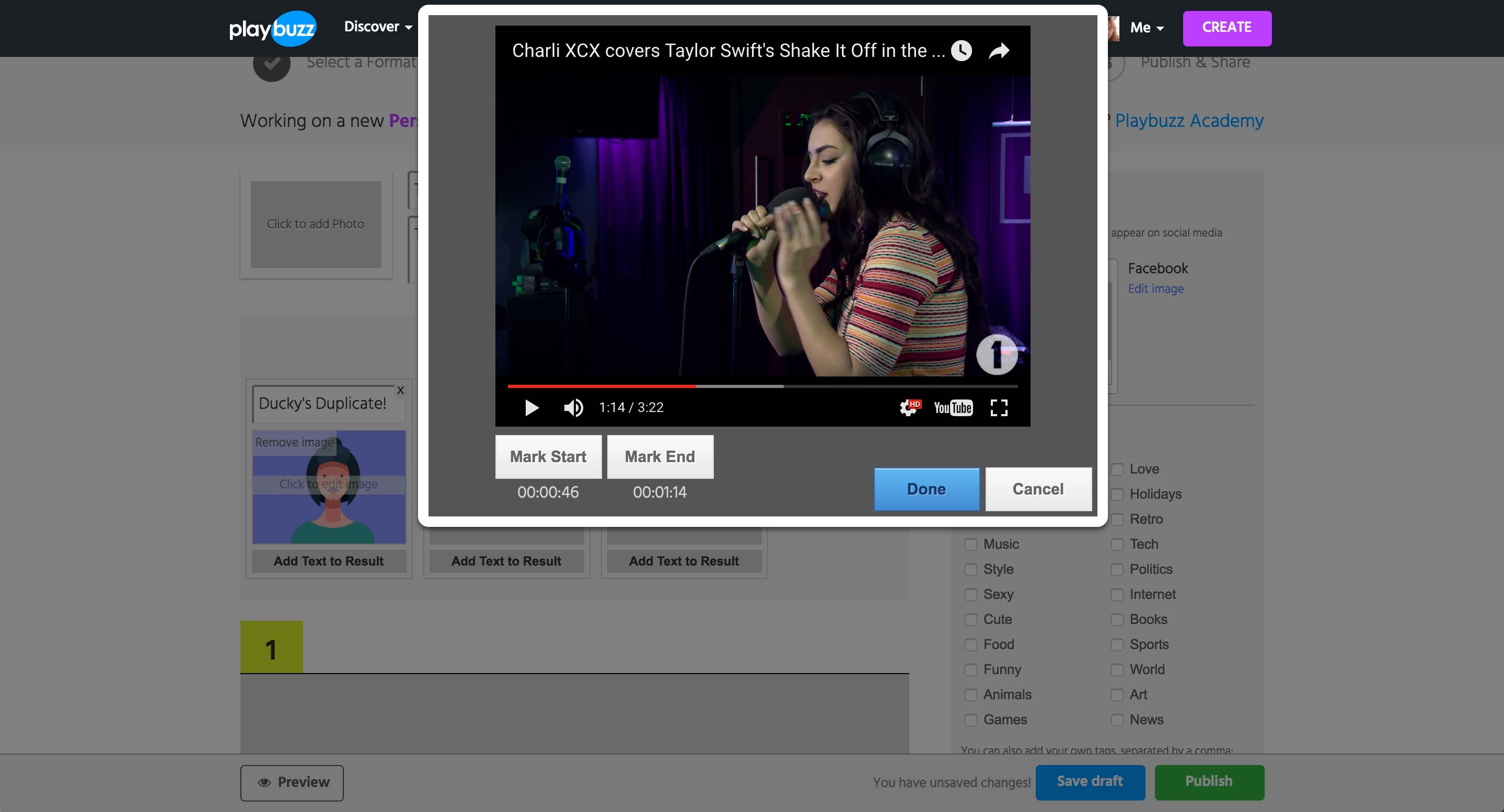
Upon hitting the Edit button, the preview of the YouTube video appears. While playing the video itself, user can set the start and end time of the video to be shown.

For a question, user can add a media item and a description. Clicking on the media area gives the same popup as the page before.
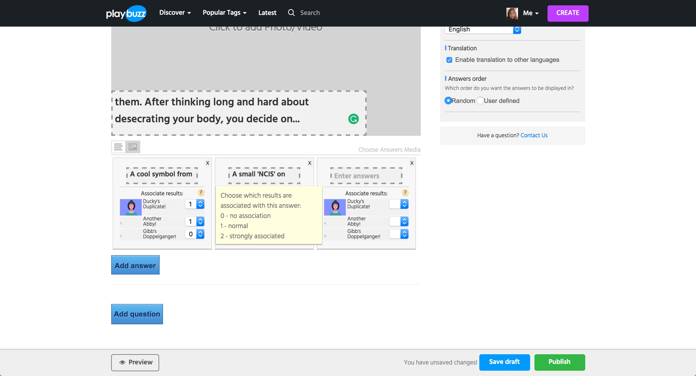
User can add multiple answer options per question, and each option is pre-populated with the result created above. Then, each result option can be assigned a number depending on how related the specific answer choice is to the result.
Add question option populates the form with another question and answer choices.
Quiz Next Steps
Quiz
Next Steps
Next Steps
We need to conduct further discovery with quiz content writers and learn how they currently create the logics for quiz, improvements that can be made, and their ideal way of creating a quiz.
We will also look into creating different formats of quiz through CMS, which will involve researching the brands’ user base - their expectation, interaction, etc. Our ultimate goal would be to increase traffic to the brands’ sites through Quiz content type.
Then, we will conduct Ideation Session and User Testing (2-3 weeks) to create a prototype and validate our workflow and UI.
Timeline Gallery Introduction
Timeline Gallery
Introduction
Introduction
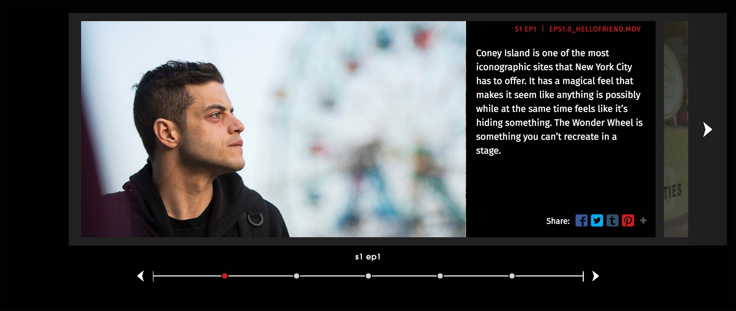
Timeline Gallery shows events from a show in chronological order of the episodes. Content is consisted of text and an image or a video, and user can use the arrows or the bottom navigation to jump through the scenes and episodes.
Timeline Gallery Current Workflow
Timeline Gallery
Current Workflow
Current Workflow
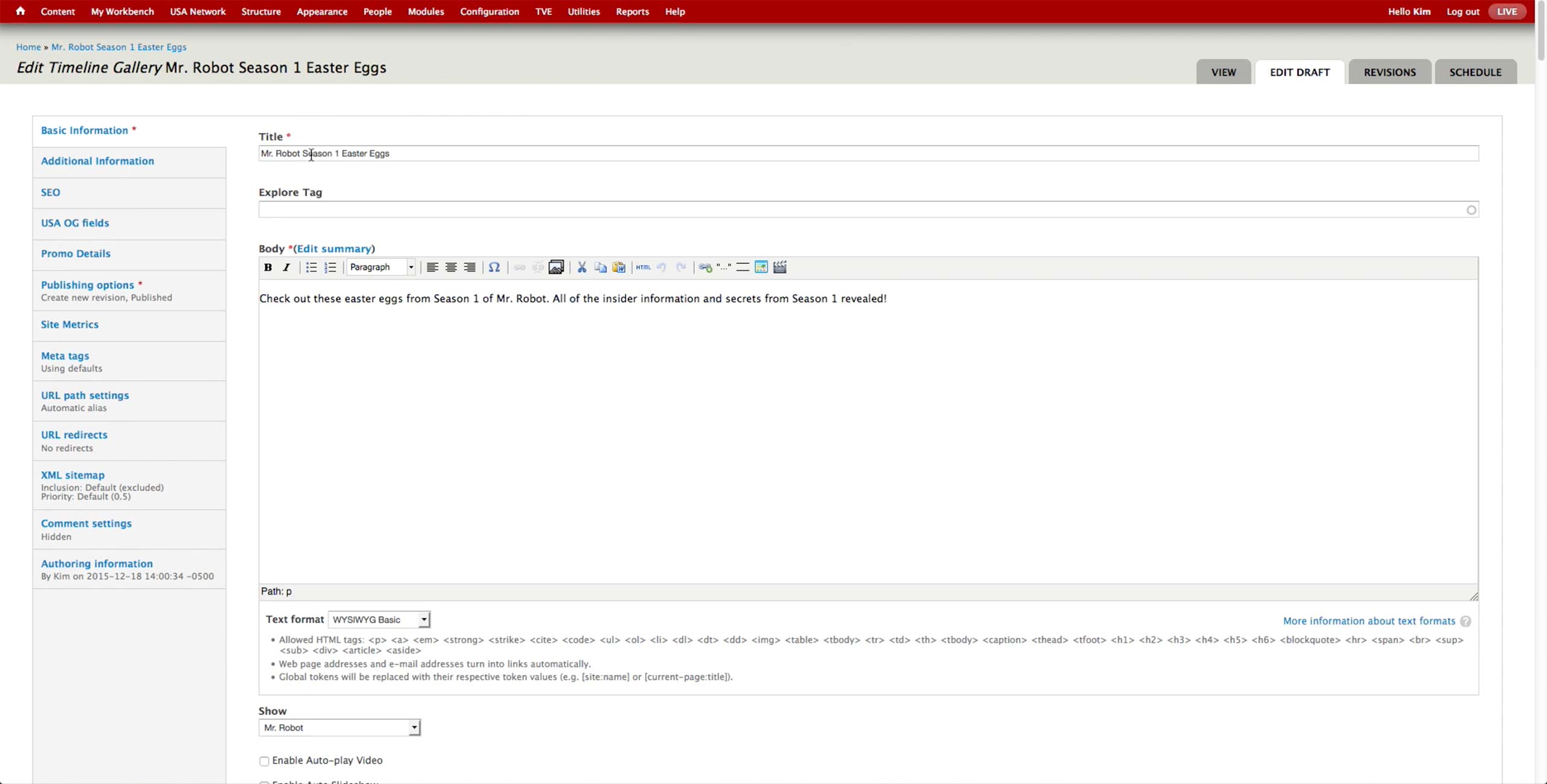
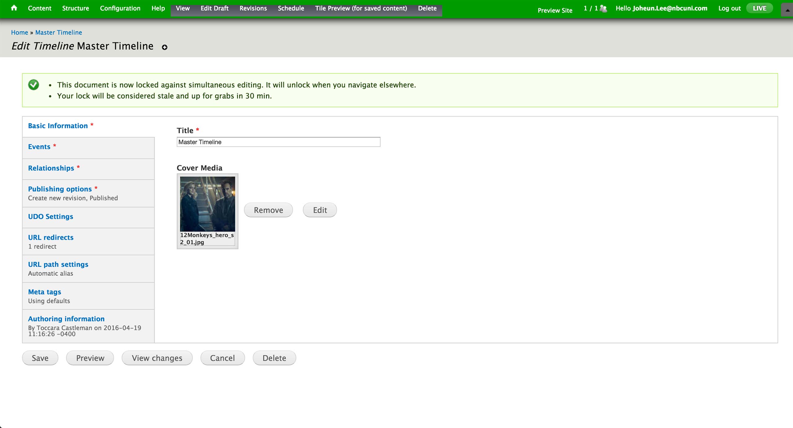
When creating a new Timeline Gallery, producer enters Title, Body text, and Show relationship. The Body text isn’t displayed in the current website design of USA, but it is used as the SEO description.
At the bottom on the same tab, there are options to autoplay video and the slideshow of the image, as well as the Cover Item field to set the representative image of the gallery.
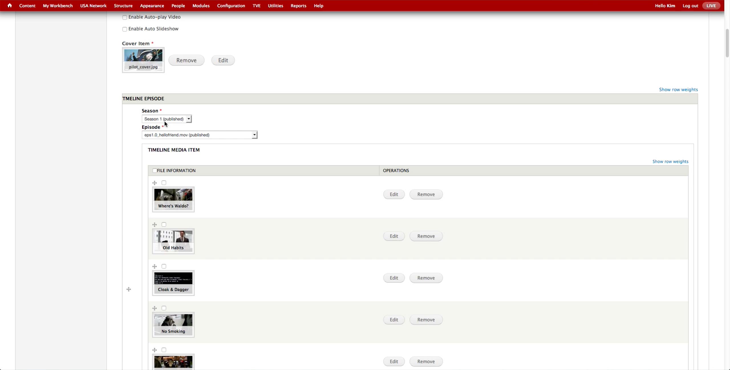
For each page of the gallery, producer selects the Season & Episode of the show and the images or videos to display. In case of the videos, producer needs to upload them through MPX and manually run Cron to leave the video in the CMS but unpublish them from the site. Then, she needs to select them one by one, which takes a long time.
Timeline Gallery New Workflow
Timeline Gallery
New Workflow
New Workflow
We identified that the Timeline should be able to generate a timeline with text, image, and/or videos. It would also be able to section off the items, e.g. by season or by the year of the event, have custom titles and season/episode association for each item.
When the new section is added, the association would automatically be set to the next episode, which reduces the mistake of making a duplicate or skipping ahead of episodes. If the producer chooses, she can change the episode to whichever she wants.
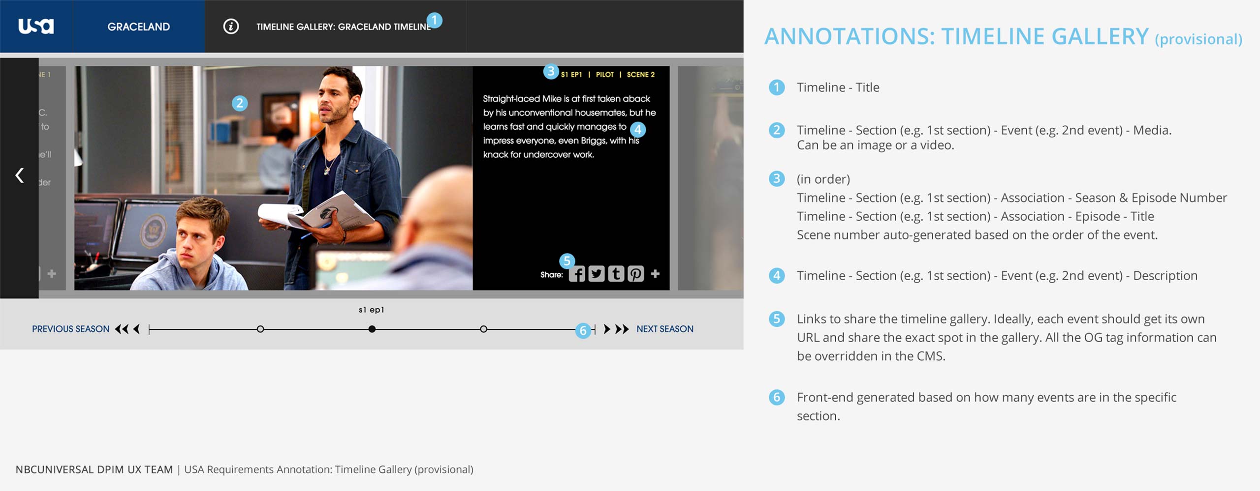
Timeline Gallery Annotations
Timeline Gallery
Annotations
Annotations
Timeline Gallery Use Cases For Other Brands
Timeline Gallery
Use Cases For
Other Brands
Use Cases For
Other Brands

Syfy has a similar content type called Timeline to showcase the events that happened during the season. It’s about a specific show and a season with the events laid out in chronological order.

Timeline can feature images, videos, and also text only, and the placement of the media assets can be either left or right of the shelf.
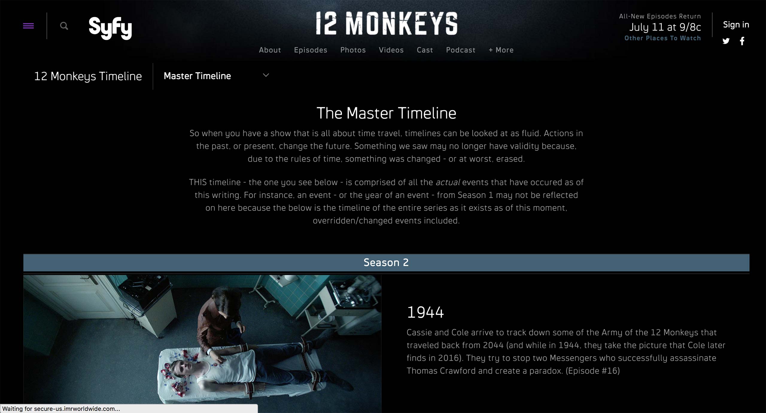
Entire timeline can also feature some text, and shelves can be categorized with separators, e.g. Season 2 in this example.
This is the initial screen of the Timeline Content Type. Here, producer sets the title and the cover image of the timeline.

Events tab is where all the event shelves are created. Each shelf can have label, title, text, image or video.
- Layout: There are 6 options: Text, Image Left, Image Right, Full Image, Video Left, and Video Right. This determines how the materials are presented in the timeline.
- Label: Text on the section separator.
- Title: Title of the shelf.
- Description: Text for the shelf.
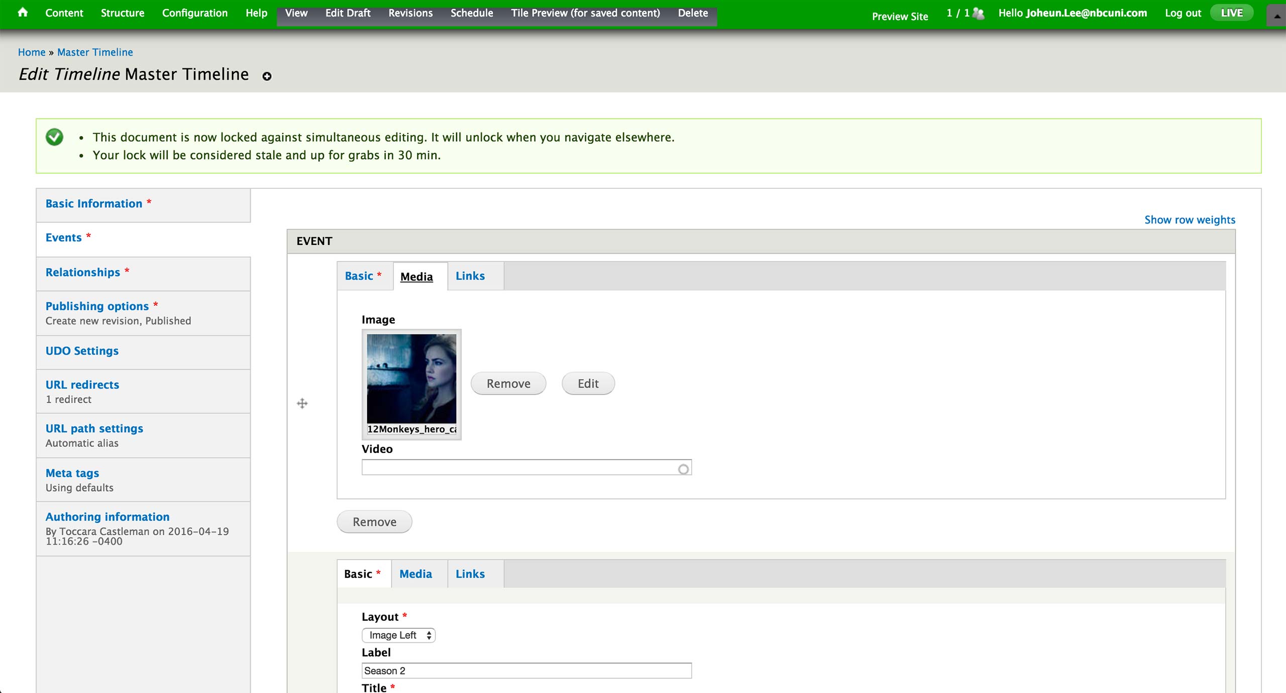
Based on the Layout selection, producer attaches an image or a video to display in the shelf.
Currently, there is no real use cases of Links tab.
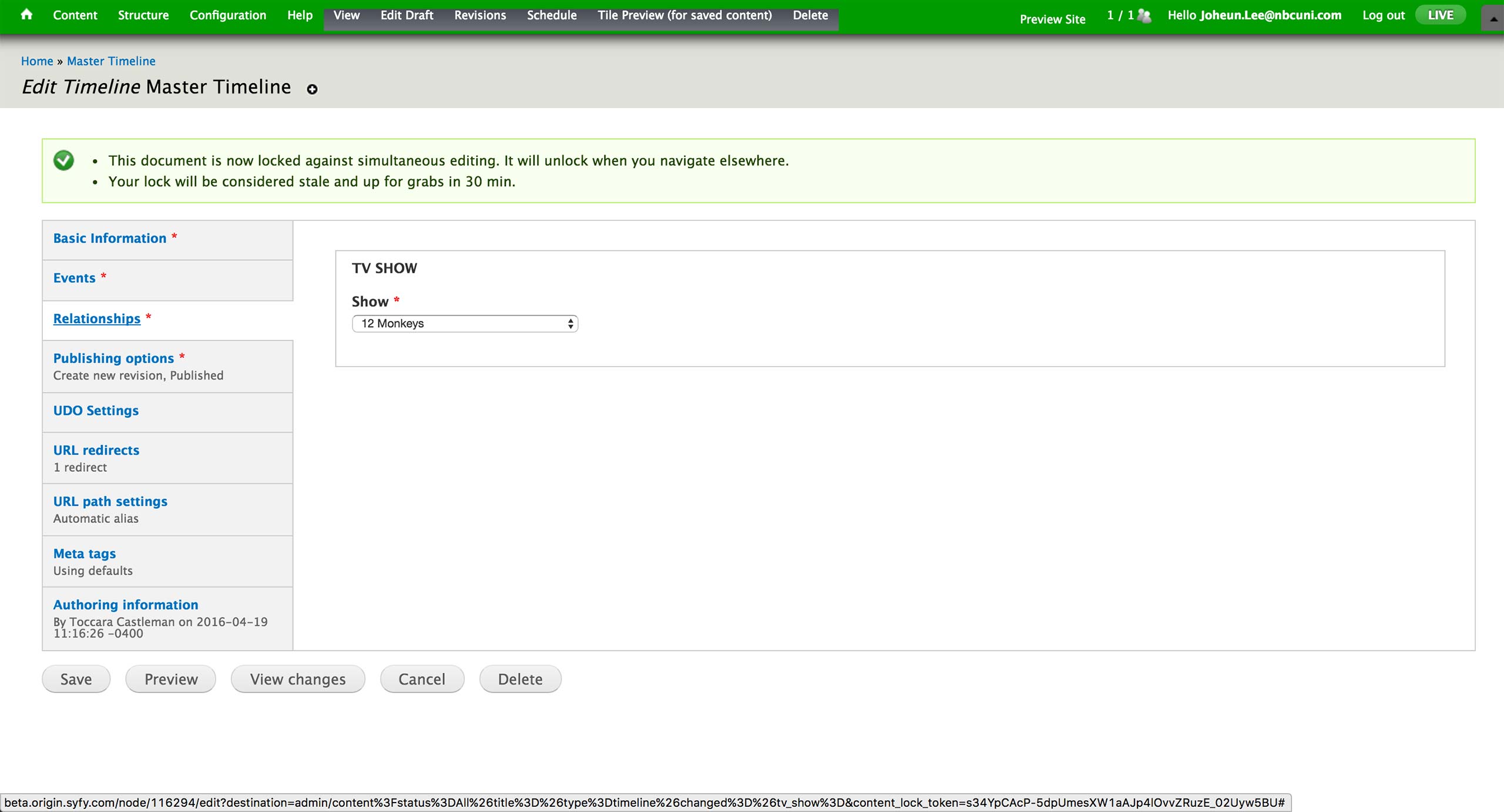
In the Relationship tab, producers are required to fill in the association to a show.
Timeline Gallery Next Steps
Timeline Gallery
Next Steps
Next Steps
We will explore any other application of Timeline Gallery to engage and attract more users.
We will also consult the Engineering team with the technical details on how Timeline Gallery would be implemented - it can use the same Gallery content type with a flag, or become a separate content type.
Since we have a UI set for Gallery content type, Timeline Gallery would only require the User Testing (1 week) to validate the workflow.
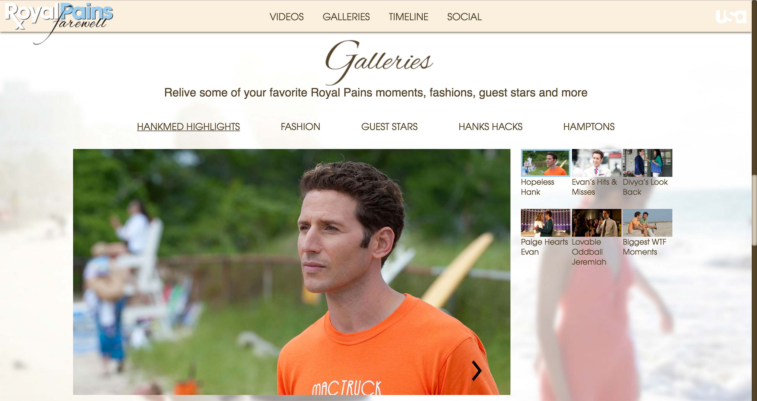
Top 3 Gallery Introduction
Top 3 Gallery
Introduction
Introduction
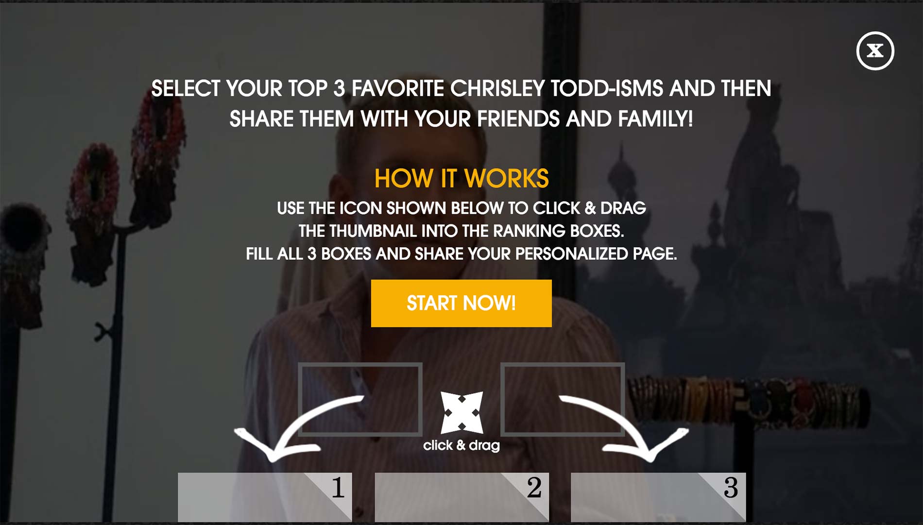
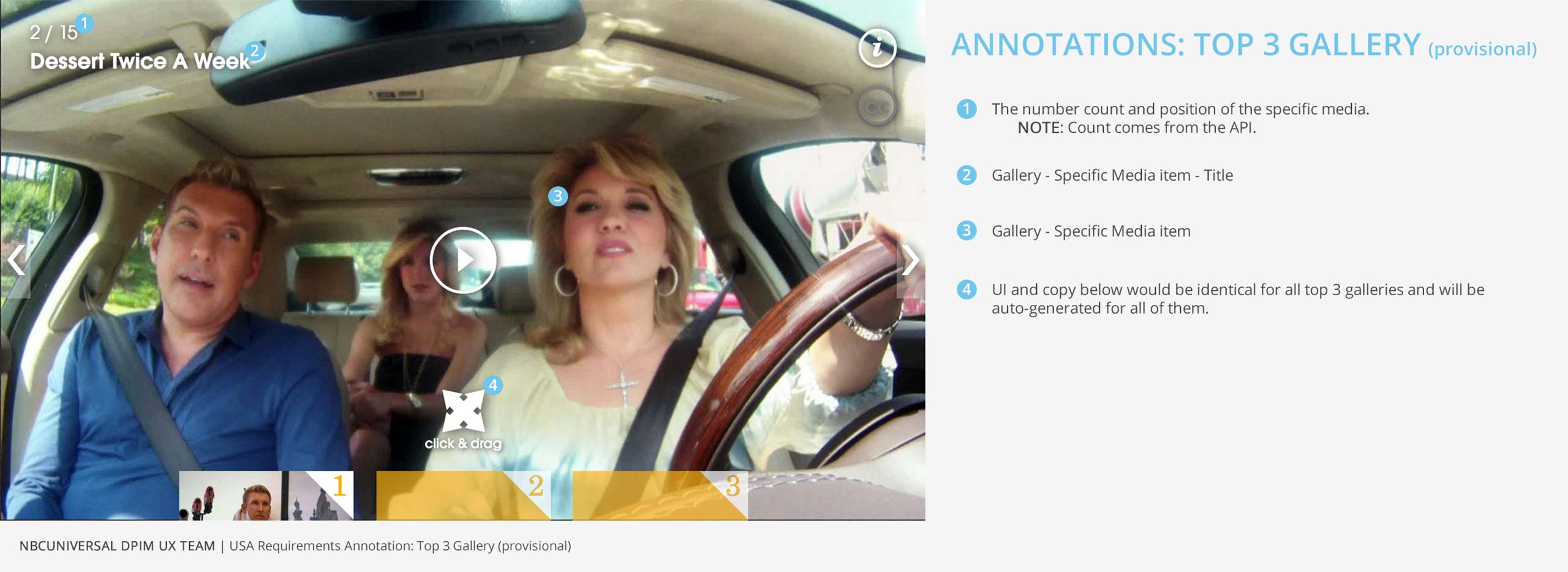
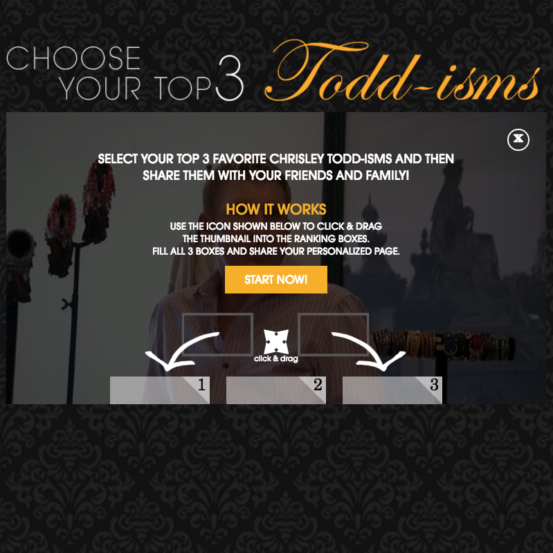
Top 3 Gallery allows the user to choose top 3 videos out of the ones that are presented to them.
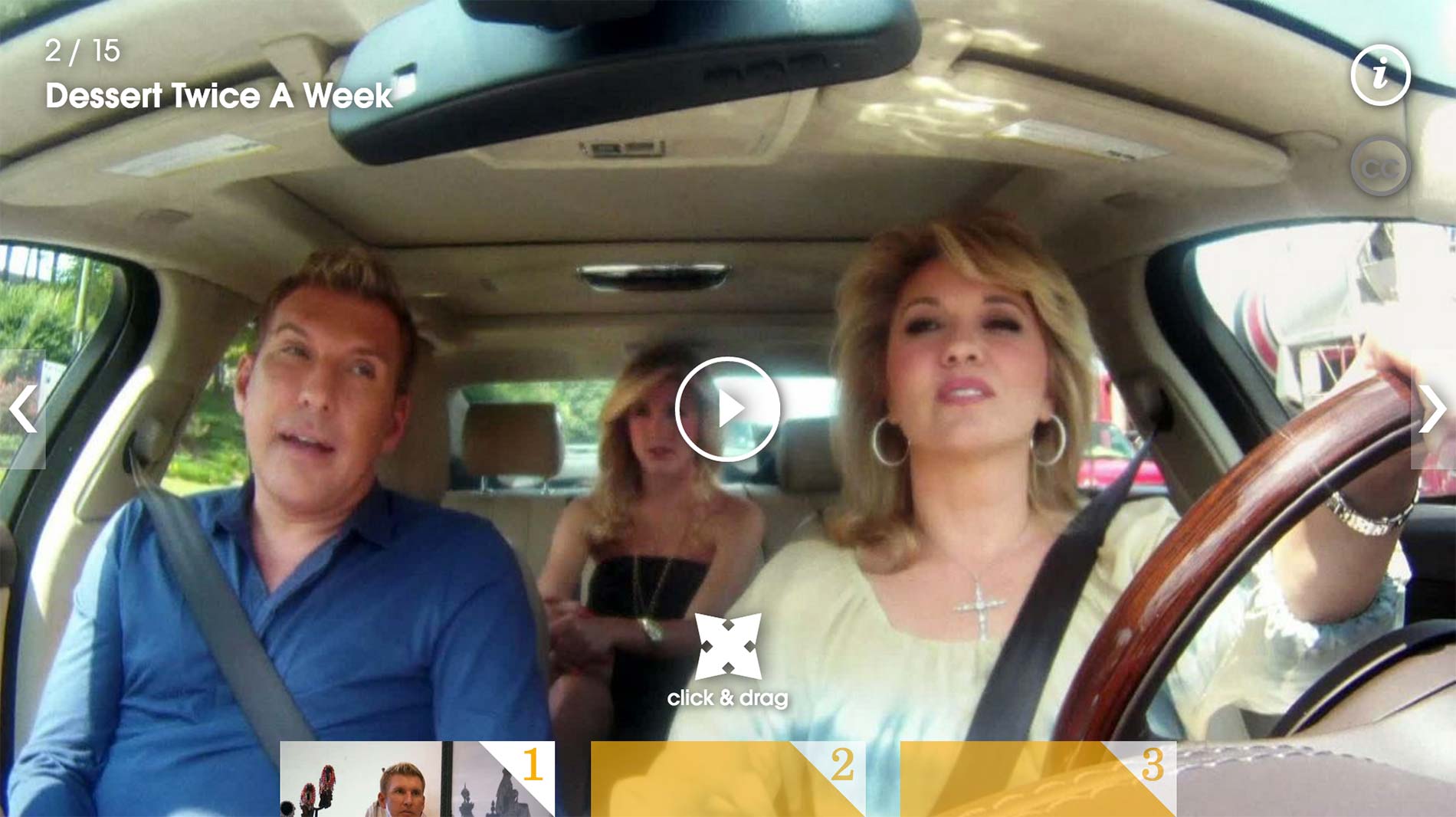
After hitting Start Now! Button, they can play the video clip and click and drag the ones they like to the bottom slots.
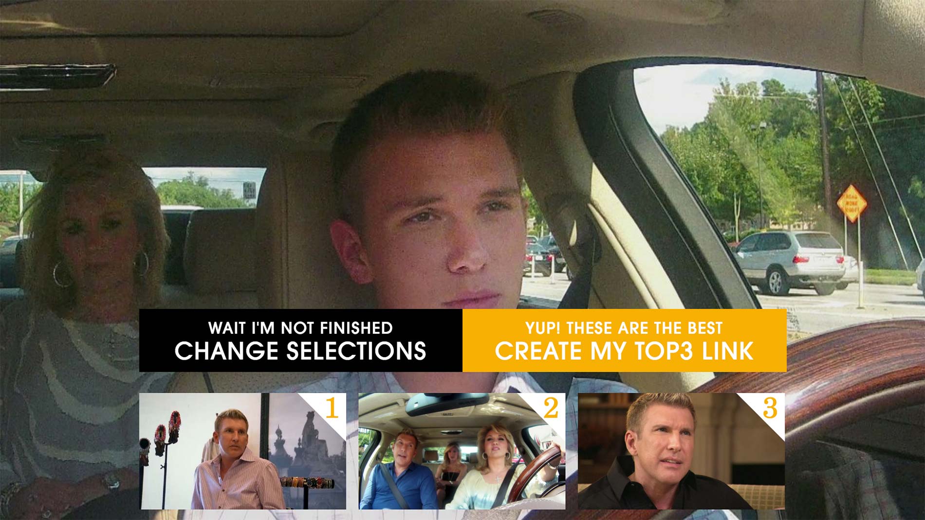
After choosing all 3, they are prompted with confirmation that they in fact like the 3 videos chosen.
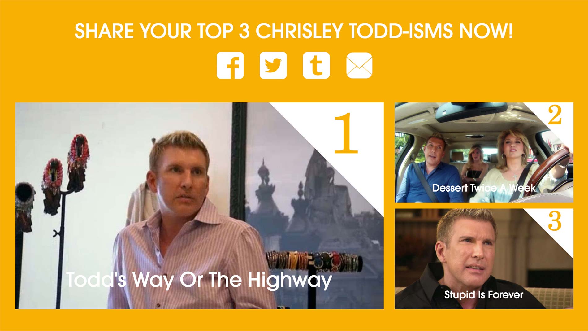
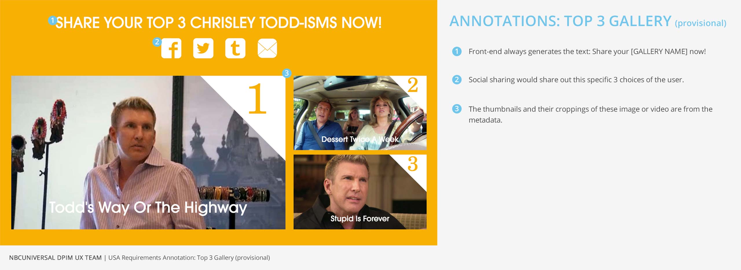
At the last step, a link is generated for the user to share their choices on social media.
Top 3 Gallery Current Workflow
Top 3 Gallery
Current Workflow
Current Workflow

In order to create a Top 3 Gallery, producer has to wait until the full episode is in Envato and then pull the clips from it. Since Envato archives videos older than 30 days, she needs to unarchive older videos in order to get the clips.
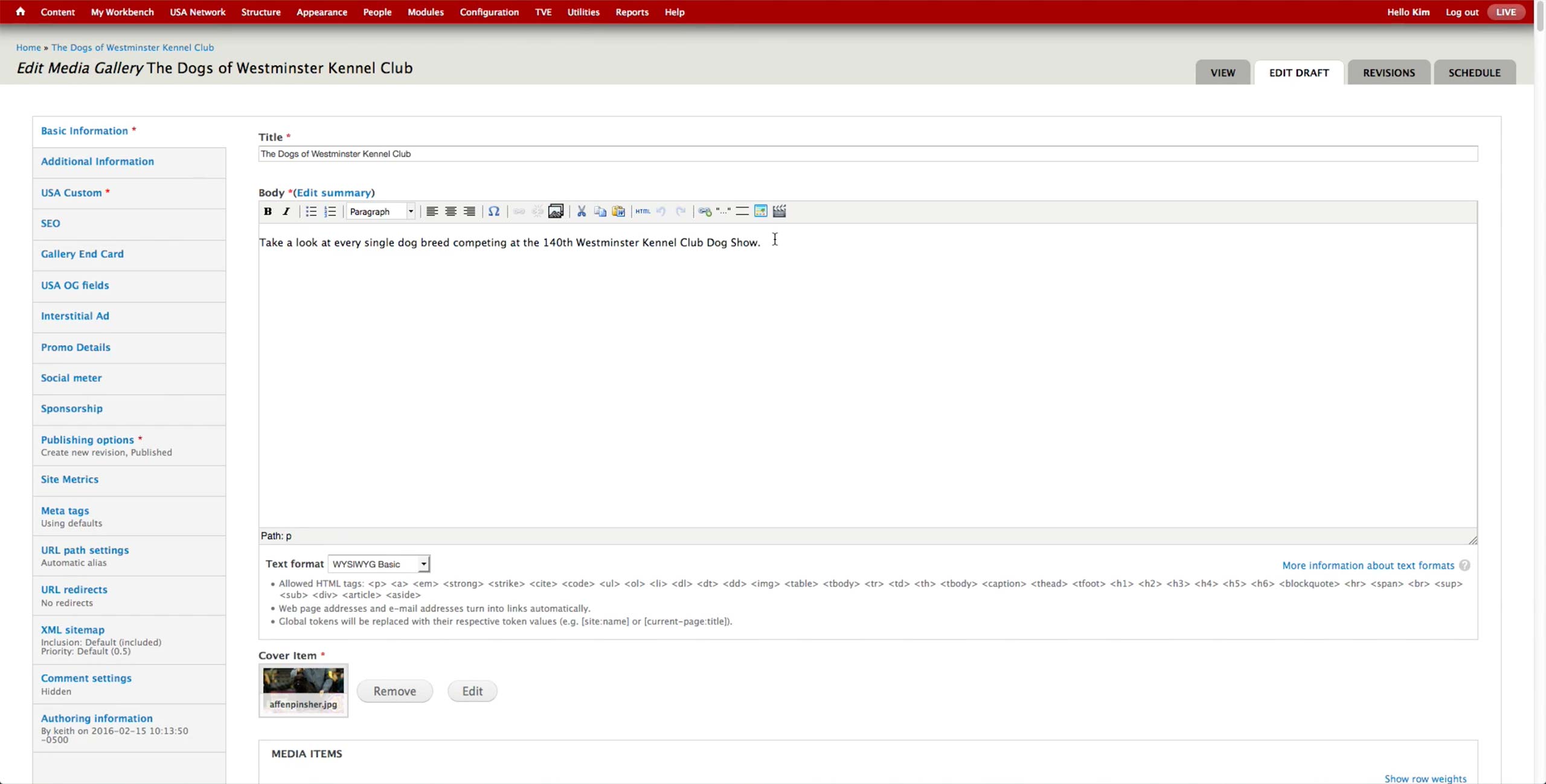
Process of creating the gallery is similar to Timeline Gallery; producer sets the Title and Body first.
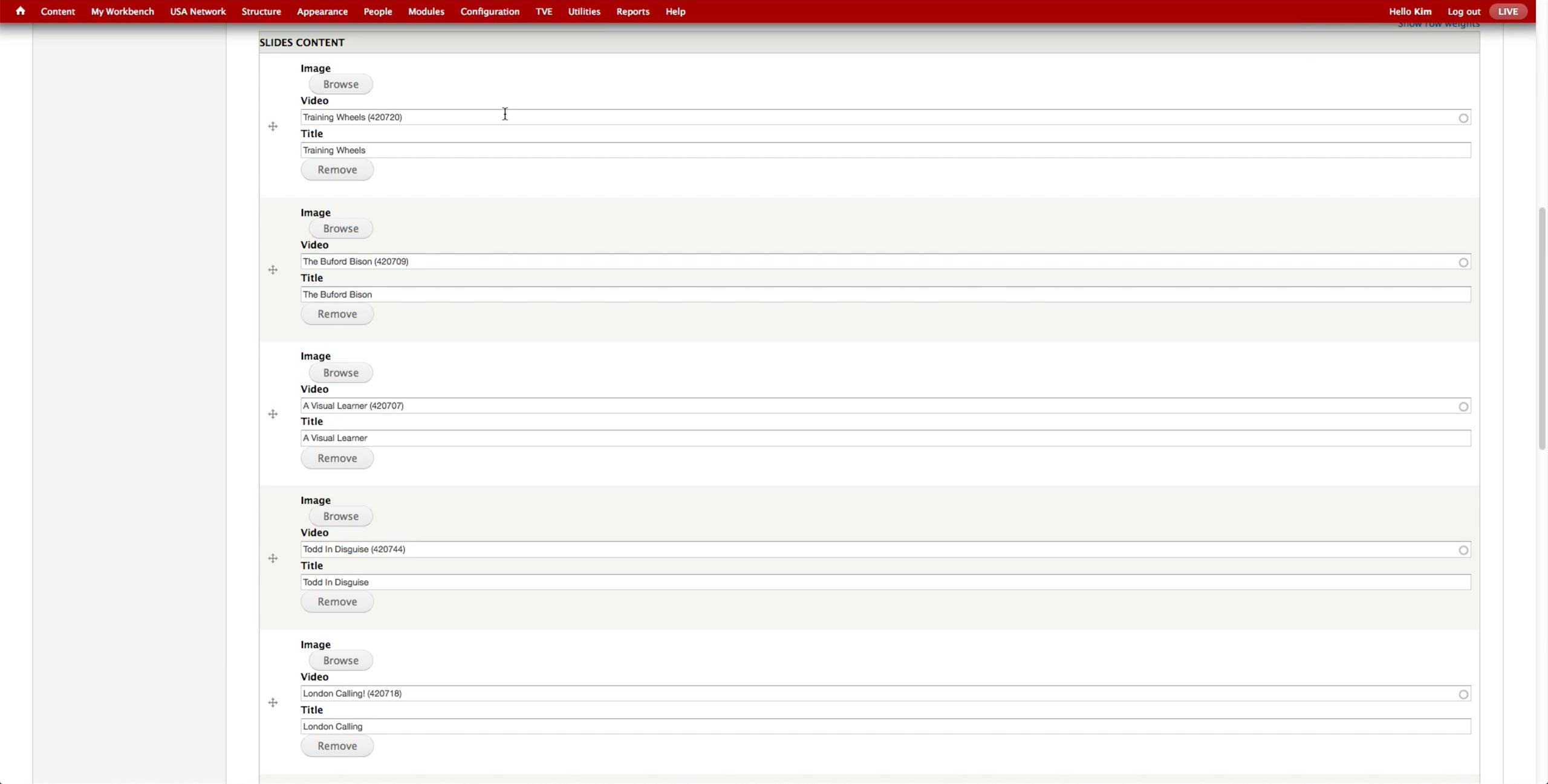
Uploading the videos in the similar manner as in the Timeline Gallery, producer finds the video clip and titles it accordingly. The thumbnail of the videos are automatically pulled, so producer makes sure that the images associated to the video is high resolution.
*NOTE: This feature was developed in Telemundo, and USA pulled it in.